


What is reporting software?
Reporting software translates data from spreadsheets, databases, software as a service (SaaS) tools, and multiple data sources into easy-to-understand visualizations and interactive reports. Most reporting software includes some sort of BI reporting, but advanced reporting tools can bring in data from multiple sources to combine and visualize it in beautiful ways. It can also send graphs out to other platforms as PDF reports, in-app dashboards, and more.
Many businesses also require reports for audit trails, and automated reports can reduce some of the manual work required to maintain compliance within the reporting process.
We reviewed more than 20 top accounting software solutions and narrowed it down to the best vendors on the market:
- Domo: Best for integrating multiple data sources
- Looker: Best data exploration
- Zoho Analytics: Best for SMBs
- Sisense: Best for embedded analytics
- Salesforce Marketing Cloud: Best for connecting marketing data and KPIs
- Tableau: Best for data visualization
Featured partners
Our picks for the best reporting software
Domo: Best for integrating multiple data sources
Pros
Cons
Data Integration: Domo offers over 1,000 pre-built connectors.
BI & Analytics: With over 150 chart types, Domo provides powerful data visualizations and analytics capabilities, underpinned by AI and data science.
Self-service Analytics: Domo empowers users with self-serve analytics, enabling them to create their own reports and set up data alerts.
Dashboard Capabilities: Domo’s dashboards offer features like data storytelling, collaboration, and interactivity.
AI & Data Science Capabilities: Domo integrates AI and machine learning, offering features like AI model management, Jupyter integration, and augmented analytics.
Standard: $83 user/month
Professional: $160 user/month
Enterprise: $190 user/month
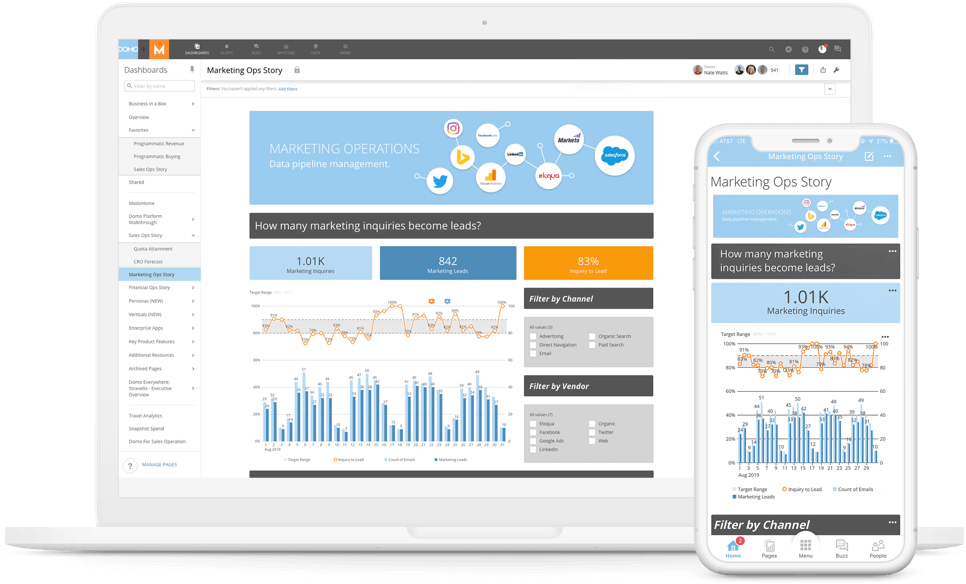
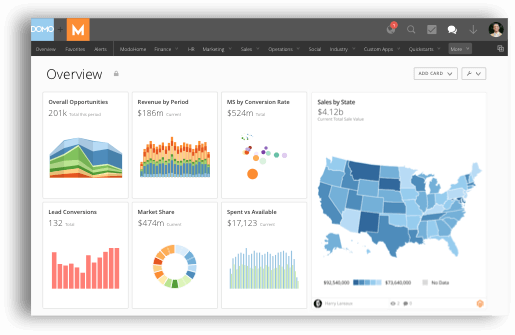

We chose Domo because of its unparalleled connectivity. Domo offers more than 1,000 pre-built connectors, ensuring seamless integration with both on-premise and cloud sources. This vast array of connectors eliminates the need for complex engineering projects, streamlining the data consolidation process. Furthermore, Domo’s cloud-native platform ensures real-time data access, making it easier to derive insights from diverse datasets. Its intuitive interface, combined with powerful analytics capabilities, makes Domo an ideal choice for businesses seeking a comprehensive solution to their data integration challenges.
Domo is a BI tool that gives companies insights into data from any tool through over 1000 native app connections, database querying, and API connections for on-premises or proprietary systems. Use the reporting software to build applications from your data to drive business goals or embed graphs to serve data to stakeholders. Domo’s platform has connections to Amazon Sagemaker Autopilot machine learning (ML) tools, so your team can build models for predictive insights.
Looker: Best for interactive data visualization
Pros
Cons
Modern BI & Data Exploration: Looker offers a modern platform for data exploration and visualization, allowing users to dive deep into their data and derive meaningful insights.
LookML Data Modeling: LookML provides a layer of abstraction over SQL, enabling scalable and maintainable data models.
Embeddable Analytics: Businesses can embed interactive dashboards, reports, and analytics directly into their applications, websites, or portals.
Integrated Development Environment: Looker provides an in-browser IDE for developing, documenting, and versioning data models, ensuring a seamless development experience.
Advanced Collaboration Features: Looker promotes data-driven collaboration by allowing users to share, discuss, and iterate on data visualizations and insights.
Free trial available
Free version available
Paid plan starts at $20,000/year. Contact Google for a customized quote.
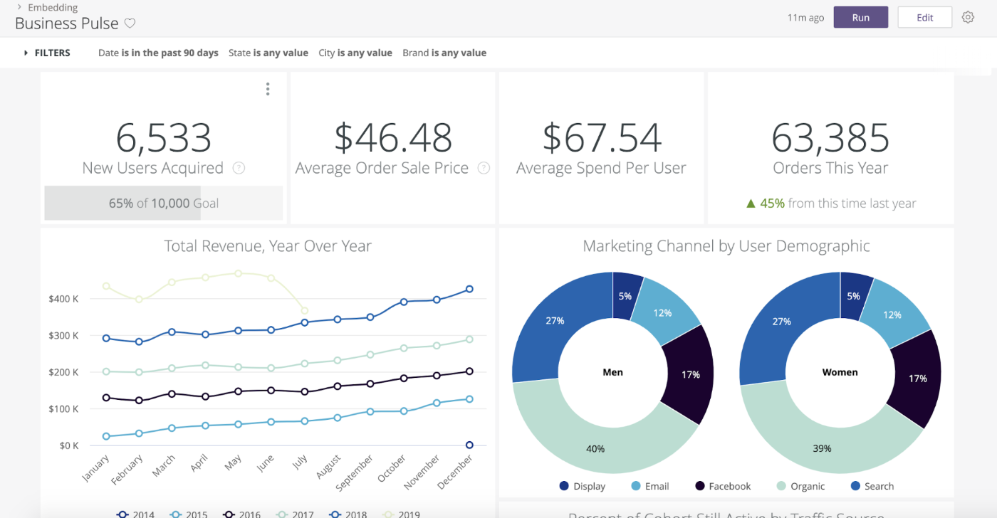

After thorough research, we gravitated towards Looker for interactive data visualization needs. What stood out was Looker’s LookML feature, which streamlines data exploration in a way that feels intuitive. The ability to embed analytics directly into applications is a game-changer, bridging the gap between data and decision-making. The custom visualizations offer a tailored approach, allowing users to present data with precision and flair.
Looker is a data analysis and business intelligence platform with flexible database options, multiple implementation types, and prebuilt or custom workflow capabilities. The platform gives companies a single place for BI and analytics and can help teams build dashboards, embed analytics, or build business applications based on data.
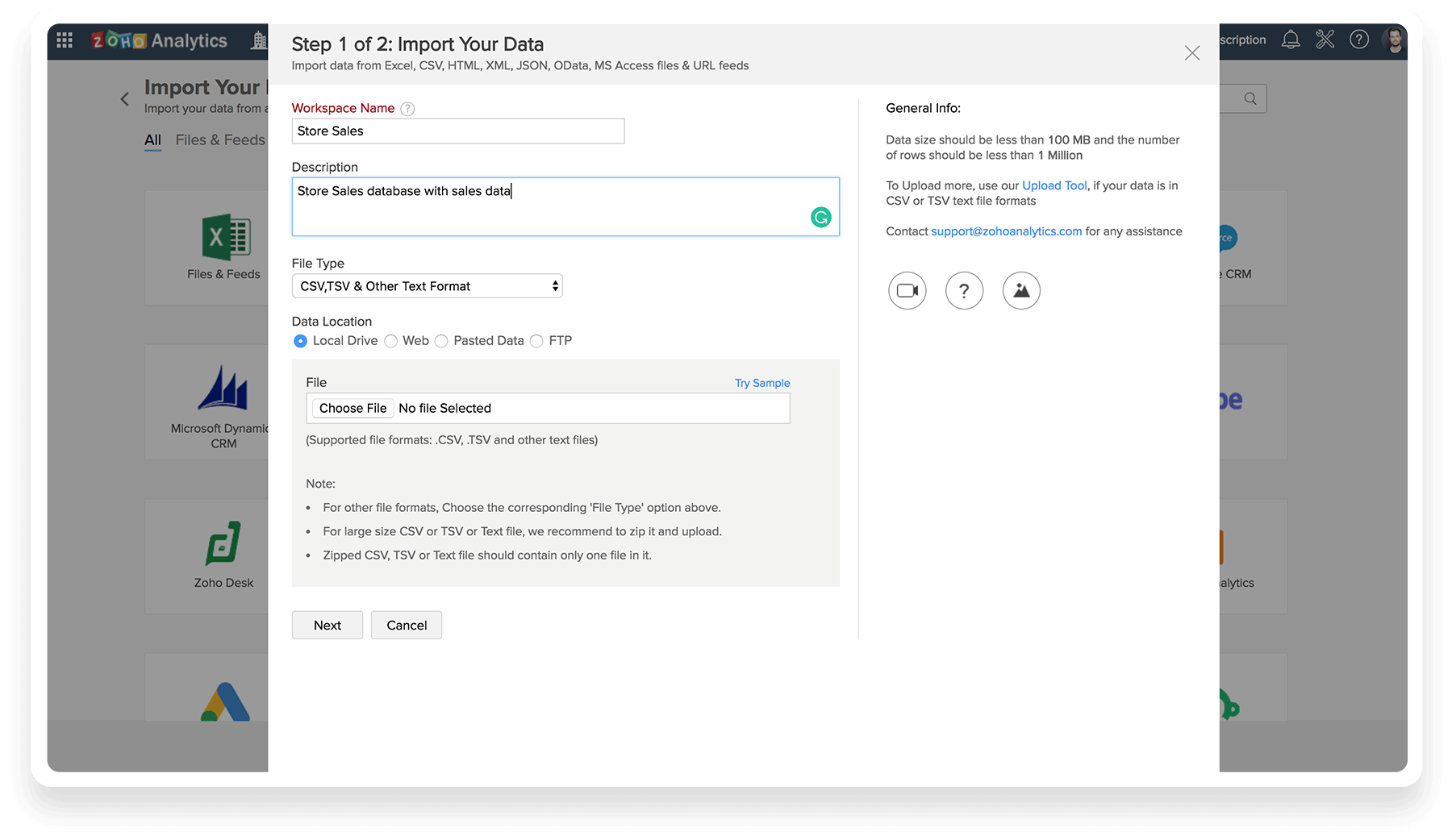
Zoho Analytics: Best for SMBs
Pros
Cons
Data Integration: Users can analyze data from over 250+ data sources, including files, feeds, web URLs, databases, and various business apps.
Data Preparation & Management: With Zoho DataPrep, users can cleanse, transform, and enrich raw data for better analysis, leveraging features like auto model identification, smart cleansing, and ML/AI-powered data enrichment.
Visual Analysis: Zoho Analytics offers a plethora of visualization options, enabling users to create insightful reports and dashboards using charts, widgets, pivot views, and more, with interactive options like drill-downs and contextual filters.
Augmented Analytics: This feature augments data analysis with technologies like AI, ML, and NLP/G, offering insights beyond visualizations, predictive analytics, what-if analysis, and data alerts.
Unified Business Insights: Zoho Analytics unifies business data across various organizational functions, offering end-to-end insights by blending data from multiple apps and providing pre-built visualizations.
- Free trial available
- Basic: $24/2 users/month
- Standard: $48/5 users/month
- Premium: $115/15 users/month
- Enterprise: $455/50 users/month


We were drawn to Zoho Analytics as the go-to reporting tool for SMBs because of its seamless data integration from a myriad of sources. The visual analysis tools transform raw numbers into insightful stories, making data discussions engaging and productive. The augmented analytics, powered by AI and ML, feel like having an expert analyst on your team, guiding you toward data-driven decisions.
Zoho Analytics is self-serve BI software that connects to the Zoho network of apps and a host of other business data or SaaS tools. Users can access advanced analytics without code through a drag-and-drop report builder and natural language queries. The analytics come with custom branding to make your highly accessible reports all your own.
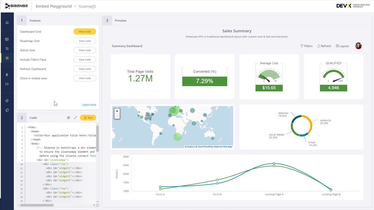
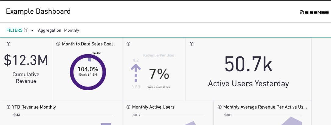
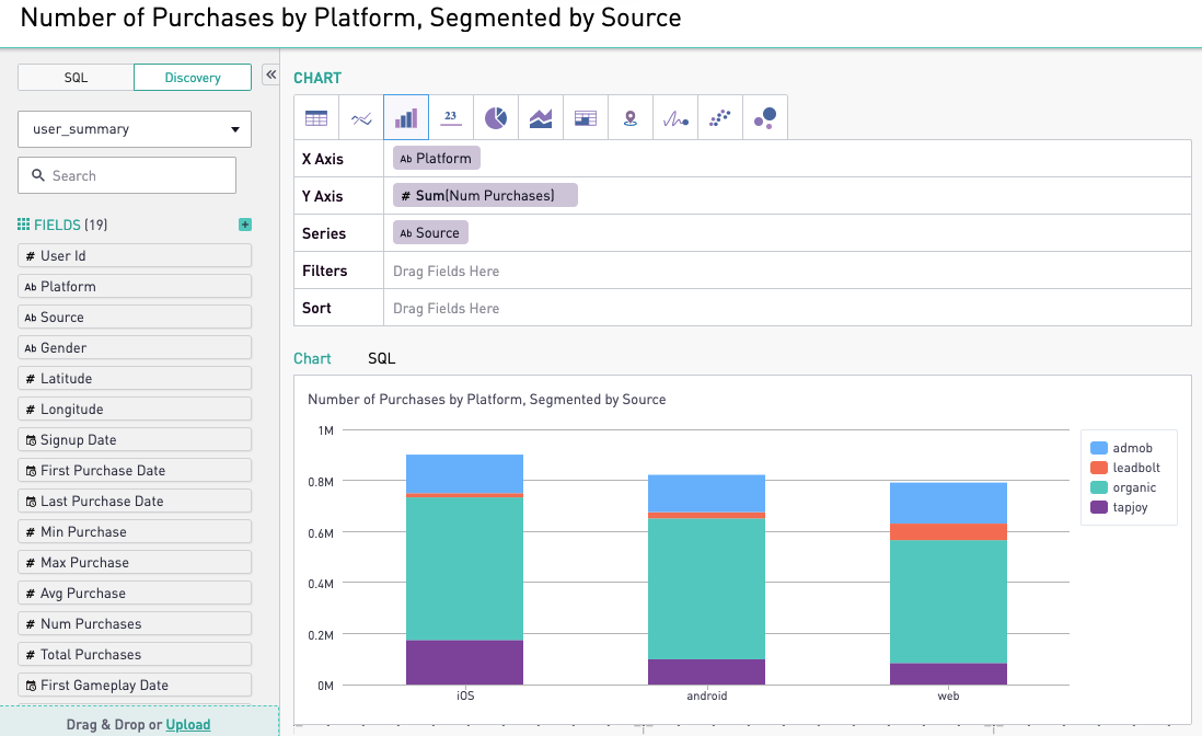
Sisense: Best for embedded analytics
Pros
Cons

Comprehensive Analytics Platform: Sisense Fusion Analytics Platform offers a set of tools to build intelligent analytics into various products.
APIs and SDKs Integration: Users can build analytics into their products quickly using APIs and SDKs.
Predictive Insights: Sisense offers real-time monitoring and predictive insights.
Actionable Insights: The platform provides clear data stories, enabling users to find answers and take action quickly.
- Starting at $10,000/year for a self-hosted solution
- Starting at $21,000 for cloud-hosted up to 5 users
- Contact Sisense for a customized quote based on your specific business needs

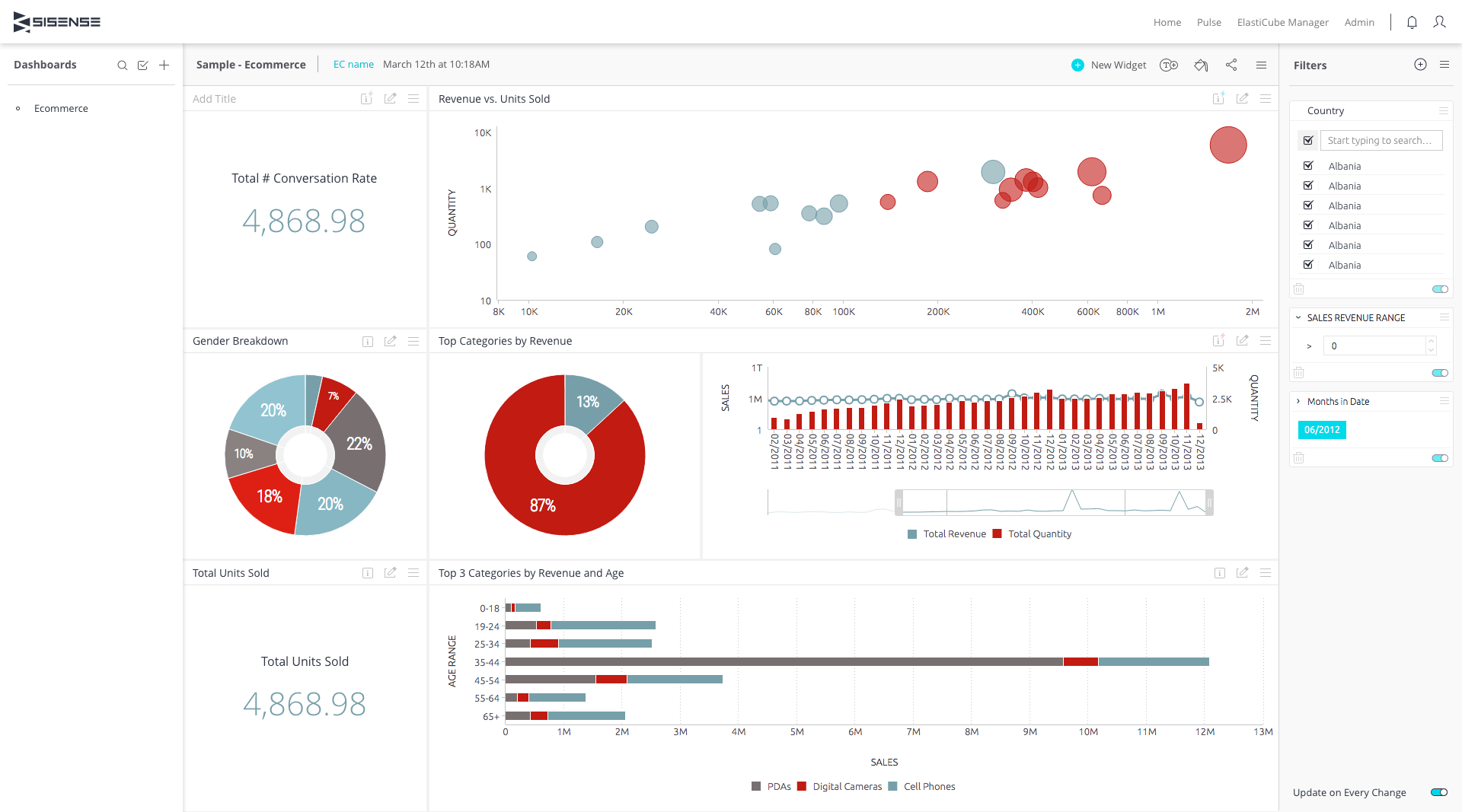

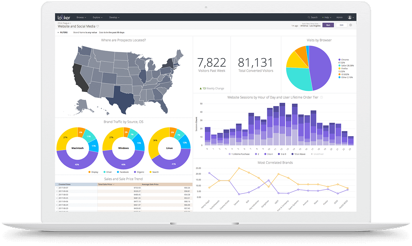
Sisense offers unparalleled flexibility and scalability. Its Fusion Analytics Platform seamlessly integrates with products, leveraging APIs and SDKs. Its predictive insights and real-time monitoring empower proactive decision-making. The platform’s customizable visualizations facilitate interactive data exploration, while actionable insights drive informed actions. And if that’s not enough, operating in any cloud environment, Sisense offers deployment versatility.
Sisense is a data analytics platform that provides companies with powerful data discovery and decision-making tools. This reporting software uses several coding languages like SQL, R, and Python, or can be accessed code-free by business users. Use the in-app analytics feature to publish insights directly to internal or customer-facing applications and build better insights with analytic AI.
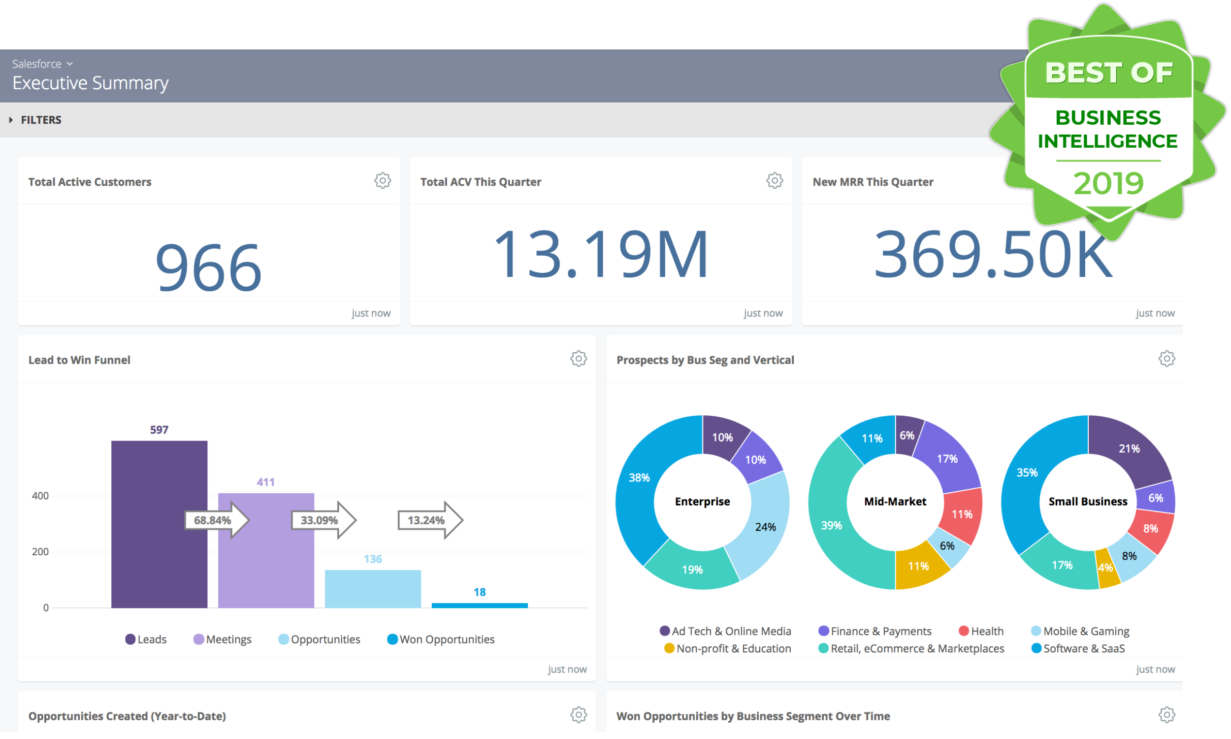
Salesforce Marketing Cloud: Best for marketing data and KPIs
Pros
Cons

Unified Customer Profiles: Salesforce Marketing Cloud offers unified customer profiles, allowing businesses to have a comprehensive view of their customers across various touchpoints.
Real-time Personalization: This ensures customers receive relevant and timely content tailored to their preferences and behaviors.
Cross-Channel Engagement: Increase conversion rates by engaging customers across multiple channels, including email, mobile, ads, and web.
Data-Driven Insights: Optimize marketing campaigns with unified marketing performance data and AI insights.
Account Engagement: Align marketing and sales efforts around every account, facilitating lead generation and effective account-based marketing (ABM) strategies.
GPT-Powered Marketing: Salesforce Marketing GPT leverages AI to provide advanced marketing capabilities.
$3,000/organization/month
We selected Salesforce Marketing Cloud largely for its integration capabilities and AI-driven insights. The platform offers a unified view of customer profiles, ensuring data-driven marketing strategies. Its real-time personalization enhances customer engagement, while the cross-channel approach ensures consistent experiences. The platform’s advanced analytics provide invaluable insights, optimizing campaign performance. Additionally, Salesforce’s reputation for reliability and comprehensive support made it a top contender in the space.
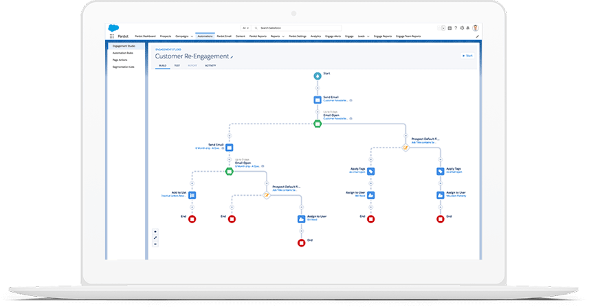
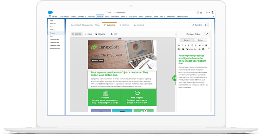
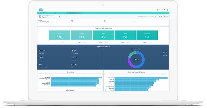
Salesforce Marketing Cloud is an AI-powered, cloud-based digital marketing platform within the Salesforce Customer 360 ecosystem. It enables marketers to segment audiences, deliver personalized messages, track campaign performance, and optimize strategies using real-time insights. The platform comprises five main capability areas: Data Cloud for Marketing, Personalization, Engagement, Account Engagement, and Intelligence. Salesforce Marketing GPT is the next-gen version of Marketing Cloud, fully powered by AI. It’s the first GPT-powered marketing platform built on Salesforce CRM. Recent features emphasize AI-driven personalization, real-time next-best actions, and enhanced analytics.
Tableau: Best for data visualization
Pros
Cons
Intuitive Drag and Drop Interface: Tableau offers an intuitive drag and drop interface that allows users to easily visualize and analyze their data, uncovering hidden insights and making smarter decisions faster.
Tableau Prep: This feature allows users to combine, shape, and clean their data efficiently. It aids in data preparation, ensuring that the data is in the right format and structure for analysis.
Tableau Data Management: This solution combines the power of data flows, preparation, and cataloging.
Tableau Catalog: The native analytics catalog of Tableau provides a full view of data assets and sources. It aids in understanding data lineage and offers metadata in context for quick data discovery. It also surfaces data details, including data quality warnings, right where the data is consumed.
Tableau Prep Conductor: With this feature, users can publish and run flows in their server environment.
Tableau Advanced Management: This feature is designed to manage, secure, and scale mission-critical analytics.
- Tableau Viewer: $15/user/month
- Tableau Explorer: $40/user/month
- Tableau Creator: $70/user/month
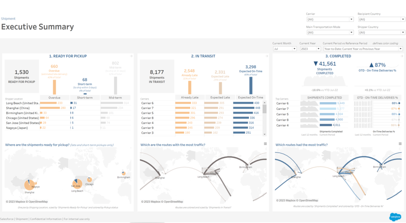
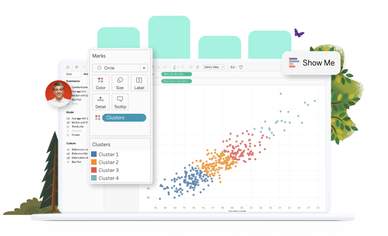

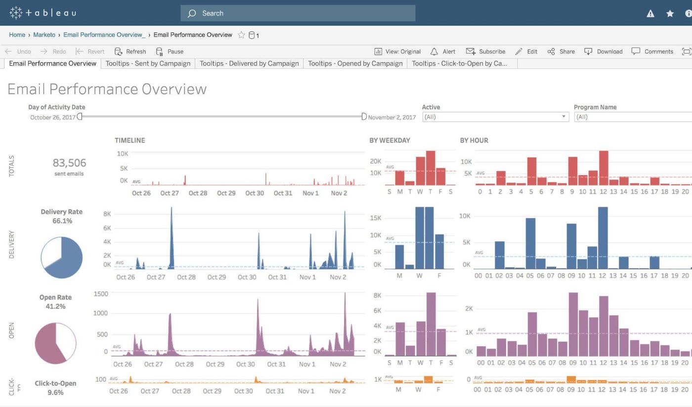

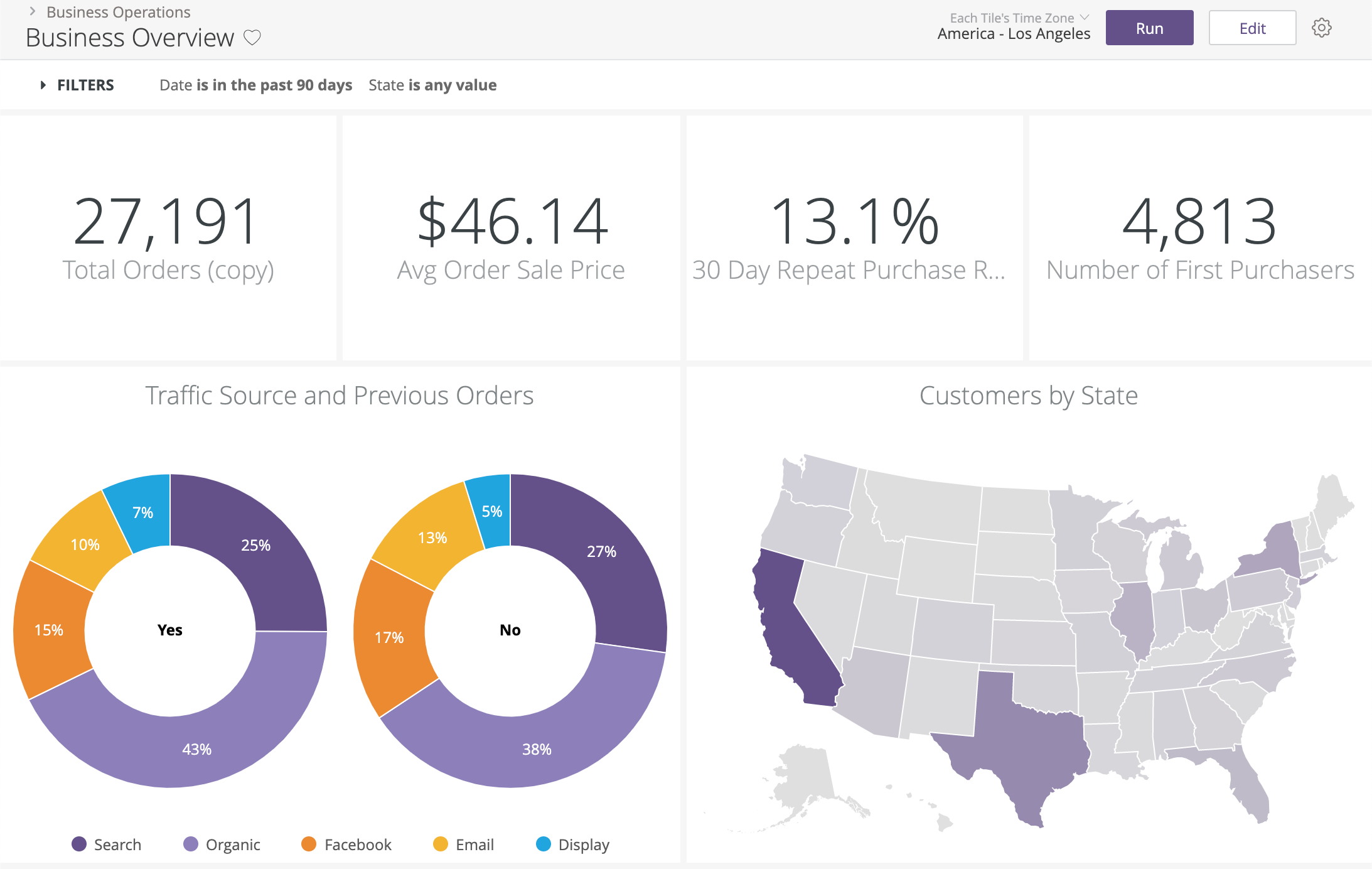
Tableau offers unparalleled data visualization capabilities. Its intuitive drag-and-drop interface simplifies complex data analyses, making insights accessible and actionable. With Tableau, users can seamlessly integrate diverse data sources, ensuring comprehensive reporting. Its advanced features, like Tableau Prep and Data Management, empower users to refine and trust their data. The collaborative tools foster team synergy, enhancing the decision-making process.
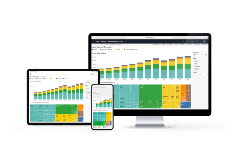
Tableau is a leading business intelligence platform. It comes in several implementation styles for desktop, cloud, on-premise, and even a public version. Tableau’s tools cover the full range of data needs from data prep through publication. While the reporting tools are built for business analysts and data scientists, they are also friendly to users in other roles due to a drag-and-drop interface and natural language querying tools.
Also Read: Top Tableau Alternatives For Visualizing & Analyzing Data
Find your new reporting software
What are the types of reporting tools?
Reporting is fundamental to business operations in that it shows how the company is performing against its goals. If your company doesn’t have set performance goals for revenue, process improvements, or customer service, enterprise reporting tools help you understand whether your efforts make a difference. Most business software contains some form of reporting tool that shows how using the software has affected your business processes.
Standalone data reporting tools bring together data from lots of different systems via API, native connections, or data uploads. These tools combine different data sets into a single location, which gives your team a contextual basis for understanding your data. Different types of reporting tools will have connections to software types, making them better suited to reporting on that type of data. These are the major types of reporting tools you may find.
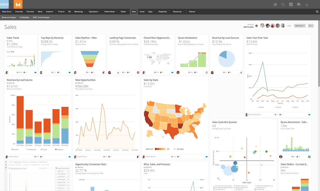
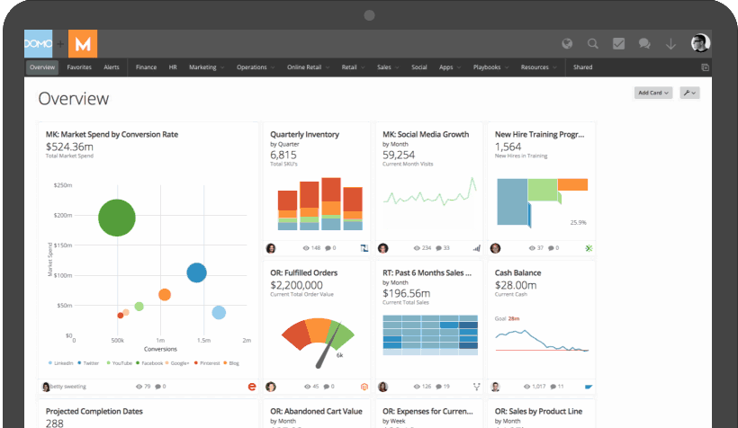
Business intelligence (BI) software
Business intelligence tools will connect reporting software and database data from across a company. You can find BI software for companies of all sizes and industries, and there are even open-source reporting tools. BI software is particularly helpful for teams that need to combine, compare, and visualize data from different departments and draw connections across complicated data sets. Find out more about business intelligence software on the BI software buyer’s guide.
Corporate performance management (CPM) software
Corporate performance management software is a subset of both reporting and BI software. It performs many of the same functions as BI software but is specifically designed to help companies define key performance indicators (KPIs) of growth and success, including financial reporting, and show performance toward those goals. To do this, CPM software must allow for connections to all business-critical data sets from accounting software, customer relationship management (CRM) software, marketing software, supply chain software, enterprise resource planning (ERP) software, and any other reporting tools.
Marketing reporting software
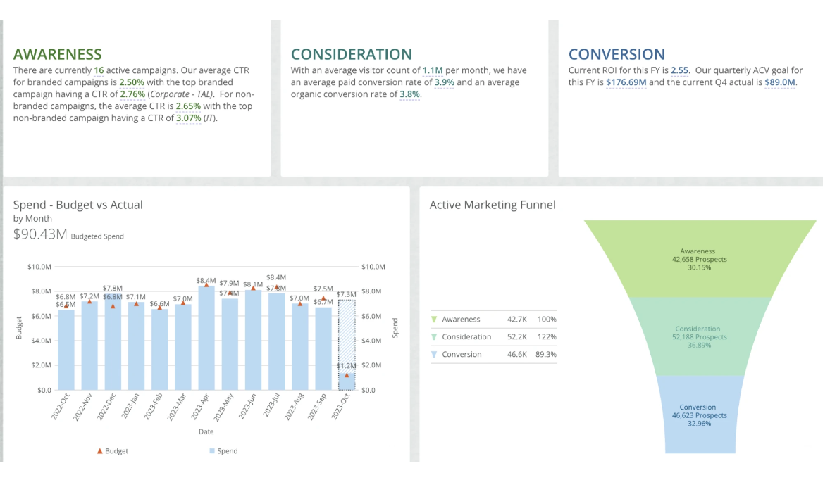
Today’s digital marketing requires decision-makers to aggregate, combine, and compare data from many different channels, including social media, paid advertising, e-commerce, email, chatbots, voice search, and website data. Understanding how each of these channels contributes to the overall success of an individual campaign can be extremely difficult. Marketing reporting tools help marketers see all of their most crucial marketing metrics in a single interface, build marketing reports for clients and stakeholders, and analyze campaigns to improve future sales.
Information technology (IT) reporting software
IT reporting systems take metrics from across different tools to help the IT team monitor the systems that keep a business running. These tools can track telemetry metrics, logged-in users, email box size and usage metrics, messaging app usage, and much more. These tools may also be classified under security information and event management (SIEM) software, IT software or network monitoring software.
Features to look for in the best reporting software
Reporting software showcases data for consumption by business stakeholders. Some of these reporting tools also provide other features that improve how you deliver those data presentations and how the team reacts to unexpected changes in data. Look for these features to enhance your reporting software.
Embedded analytics
Embedded analytics are data visualizations that are coded into a separate application or tool and updated automatically via a data feed from the reporting platform. These tools make it possible to pull a few charts from your reports into an application where they are easily accessible to business users.
These analytics can be used to provide reporting to customers within a mobile app, give software as a service its own embedded reporting tools, or provide interactive dashboards.
Predictive or prescriptive analytics
At the most basic level, the best reporting tools provide charts and graphs that employees, clients, or stakeholders use to perform analysis and draw conclusions from the data. Predictive and prescriptive analytics, like those found in Cognos by IBM, use artificial intelligence or machine learning algorithms to train models that predict the probability of potential outcomes. These models can account for previous market and human factors that you define and can be trained to manipulate data according to hundreds of other factors. Predictive and prescriptive analytics tools take the human bias out of prediction and can set up infinitely complicated if-then scenarios.
While not every company has complicated forecasting needs, these tools can give you valuable insights into the factors that drive potential growth or contraction to make highly complex decisions with confidence.
Natural language querying
Natural language queries use human language instead of mathematical or coded queries to understand data interactions. This allows users to ask questions like:
- How much inventory should we have on hand at the beginning of December?
- What product drives the most revenue per quarter?
- Which sales team converts the most opportunities?
- What marketing channels drive the highest conversion rates?
- Which users have the most devices connected to our network?
Natural language querying is useful for teams with highly developed data discovery cultures. Teams that expect and encourage employees to become literate users of their data, understand how their data affects business outcomes, and use data to back up business decisions would do well to look into reporting solutions with natural language querying features.
APIs and data connectors
Reporting tools automate the data visualization capabilities of Excel or Google Sheets: The ability to transform rows and columns of data into visual representations that are easy to understand. When a user connects business tools, SaaS applications, and databases to a reporting tool, they can quickly build financial reports and access a range of data from a single interface.
APIs and data connectors provide a steady stream of data into the tool, which gives users access to up-to-date data at the time of access. Some reporting tools provide real-time data updates, so companies can run business processes from their dashboards with confidence that they’re looking at the most recent data. Your reporting tool should also connect to your Facebook, Instagram, and other accounts to gather social media analytics.
Also read: How to Use an API
Visualizations
Data visualizations are a given for reporting tools, but not all of them are built the same. Some reporting tools will provide simple bar charts and line graphs but not much else. Other tools provide complex options like scatter plots, maps, heat maps, flowcharts, and webs. Consider the complexity and variety of data visualizations you need, and make sure that your chosen reporting software offers all the charts you require.
Automated reporting
While many companies use their reporting software to run dashboards or create custom reports, some companies find that automated reporting solves the headache of preparing and sending monthly reports.
Beware, however: automatic reporting does not mean hands-free reporting. The nature of SaaS tools means that a refreshed API or a security setting may cause missing report data. Scheduled reporting sends your reports on time every month, but you will still need to check them to ensure accurate data before publication.
Notifications and alerts
Some of today’s software options have borrowed notifications and alerts from software monitoring tools to help companies react quickly to changing business environments. Look for reporting tools that will send email alerts to users at high or low thresholds, or will notify you of data that is out of character for your company. These tools can alert your sales or marketing teams to new opportunities, identify a botnet attack on your website, or alert you to a supply chain issue before it causes a business emergency.
Benefits of data reporting tools
Why would you purchase a reporting tool instead of building your own reports in a spreadsheet? These benefits should convince you.
Promotion of a data-driven culture
Today’s companies live and die by their data, and their employees must become data literate in order to compete in today’s market. Implementing reporting software within your company or team puts data at the center of every conversation. Teams that see their data regularly are more likely to use it to make decisions, forecast their goals, and understand their shortfalls.
The software can be used to create team and company dashboards or to send BI reports to clients. All of these tools ground company culture in data for decision-making.
Time savings
Why build your reports manually every month when they can run automatically? Reporting tools give employees access to metrics at any time, so they don’t have to wait for the BI team to run the report to understand the data.
Marketing agencies, SEO teams, and managed service providers find reporting solutions especially useful to keep clients informed regularly, but without the monthly hassle of building reports from scratch.
Better forecasting
Forecasting is hard work, but it’s easier to do when you have predictive analytics tools or even just a consistent library of data to work against. Reporting tools can show you trends in your data that you might otherwise not see, which gives you a leg-up when building your forecasts.
On-time and up-to-date reporting
Reporting time never fails to sneak up on you, but a good reporting platform can automatically generate reports, alert you of an upcoming reporting period, or generate ad-hoc real-time reports at any point. Check to make sure your data is connected correctly when you’re notified of an upcoming report send, and relax knowing your reports will be on time.
Choosing the best reporting software
Reporting is available in nearly every SaaS tool on the market, but the best reporting tools have the distinct advantage of aggregating many data streams in a single interface. Before you purchase your next reporting tool, make a list of all of the types of data you need and the tools you need to connect. Figure out what data visualizations work best, and ask the team whether predictive tools would help with forecasting.
More reporting tools resources

Lead Generation Platforms: What They Are and How to Choose
>A lead generation platform helps businesses identify, capture, qualify, and manage potential customers. For B2B sales and marketing teams, the right platform can make it easier to find high-fit accounts, collect accurate contact data, track buyer interest, and move prospects into the right sales or marketing workflow. In my experience evaluating sales and CRM software, […]

What Is Sales Intelligence? A Complete Guide
>Sales intelligence is the data, tools, and processes sales teams use to identify the right prospects, understand buyer needs, prioritize outreach, and improve sales conversations. For B2B teams, sales intelligence helps reps move beyond basic contact lists by adding context such as company size, industry, and buying intent. In my experience evaluating sales software, the […]

Essential Recruiting Metrics You Need to Be Tracking
Are you tracking the right recruiting metrics to evaluate the success of your strategies?

The Best AI-Powered BI Tools to Stay Ahead
AI BI tools use machine learning to deliver smarter insights fast. Explore the best options to drive better decisions and outpace competitors.
Best Tableau Alternatives: Top BI Tools for Data Visualization
If you’re looking for a data visualization tool and Tableau doesn’t quite fit the bill, check out this comprehensive guide of Tableau alternatives.
Essential Recruiting Metrics You Need to Be Tracking
Are you tracking the right recruiting metrics to evaluate the success of your strategies?