


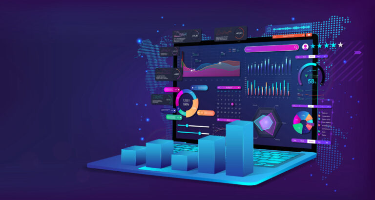
What is business intelligence dashboard software?
Business Intelligence (BI) dashboard software is a data visualization tool aggregating and displaying key business metrics in real time. It is a central hub for decision-makers, transforming complex data from various sources into easily digestible visual insights. This includes charts, graphs, and other data representations, offering a clear overview of business performance. These dashboards provide actionable insights, helping users track KPIs, identify trends, and make data-driven decisions. Some BI dashboards even employ AI and machine learning for predictive analytics.
This article features some of the best business intelligence dashboard interfaces on the market, as well as what to look for when choosing a solution for your business. If you’re unfamiliar with BI software and its functions, check out our Business Intelligence Software Guide to learn the basics.
Now that you know the prerequisites for a good BI dashboard, let’s take a look at some of the vendors that not only fit the bill but also provide the best user experiences.
- Tableau is the best overall.
- Sisense is the best solution for remote teams.
- Microsoft BI is the best solution for enterprise businesses.
- Domo is the best cloud-based solution.
- Zoho Analytics is the best solution for small businesses.
- Looker is the fastest-growing solution.
- Salesforce Data Cloud: Best for CRM integration.
Featured partners
Our picks for the best BI dashboard software
Tableau – Best overall
Pros
Cons

Our Rating: 4.3/5
Tableau is a data visualization tool that transforms complex raw data into intuitive, interactive insights, empowering users across various roles to analyze, visualize, and share data-driven stories.
Recently, Tableau has introduced Tableau Pulse, a new feature designed to seamlessly integrate intelligent, personalized insights into daily workflows, enabling users to make quick, informed decisions without requiring extensive data analysis training. Tableau Pulse, which currently supports US English, offers a reimagined data experience built on the Tableau platform, highlighting the “why” behind data trends and patterns. Enhancing mobility, Tableau Pulse is accessible on Tableau Mobile, allowing users to check metrics and dive deeper into analyses directly from their mobile devices with ease, promoting data-driven decisions on the go.
Tableau has also expanded its cloud capabilities by launching Tableau Cloud on the AWS Marketplace. This will provide IT leaders with simplified billing and procurement processes and offer all Tableau Cloud sites 1 TB of data storage, with an increased 5 TB for customers with the Enterprise SKU and Advanced Management. These updates underscore Tableau’s commitment to making powerful data analytics more accessible and integrated into everyday business processes, reaffirming its position as an essential tool for organizations aiming to harness the power of their data.
Sisense – Best for data transformation
Pros
Cons

Our Rating: 4.2/5
Sisense is an end-to-end BI platform that offers a complete BI solution from data and analytics workflow to integration, visualization, and reporting. Users can connect and integrate data from various systems by supporting various data sources. Sisense’s proprietary Elasticube technology simplifies data preparation and management, allowing users to model and transform data without the need for complex ETL processes. Scalability and security are also highlights of Sisense’s BI software, as the solution is built to scale with growing businesses while providing robust security features to protect data.
Sisense’s L2023.3 update offers two deployment options—cloud-managed service or a cloud environment of the user’s choice. With the cloud-managed service, Sisense provides an environment for the user based on specific needs. Sisense can be set up for Linux on all major cloud platforms for users with their own cloud services.
Microsoft Power BI – Best for integration with Microsoft ecosystem
Pros
Cons

Our Rating: 4.3/5
Microsoft’s flagship BI software is a collection of software services, apps, and connectors that work together to turn unrelated sources of data into coherent, visually immersive, and interactive insights.
Power BI has the advantage of integrating with the Microsoft ecosystem, seamlessly drawing data from products and services such as Office 365, SharePoint, Azure, and other Microsoft apps.
The dashboard is clean, easy to navigate, and offers a variety of ways to organize, categorize, and drill down data into understandable visualizations. For example, users can access an overview of their sales analysis and then explore by year, quarter, product category, or geolocation as needed.
Powerful data transformation and modeling tools such as Power Query and Data Analysis Expressions (DAX) also help Power BI stand out from the competition.
As expected from a name like Microsoft, ease of use is one of the major selling points of the software, incorporating a drag-and-drop interface that makes it easy for users to create visualizations, reports, and dashboards. After all, what is the point of purchasing a software solution no one knows how to use?
Domo – Best for enterprises
Pros
Cons
Our Rating: 4.2/5
Domo’s dashboard interface is visually appealing, easy to navigate, and includes drag-and-drop features that are intuitive to inexperienced BI software users. Its robust collaboration features, mobile support, and built-in app ecosystem make it a popular choice for businesses with distributed teams or those looking for a comprehensive solution that goes beyond traditional data visualization.
Domo’s scalability and flexibility make it an ideal platform for both small businesses and enterprises. The platform’s extensive library of prebuilt connectors also allows for integration with various data sources, making it a versatile solution for organizations across many industries.
Zoho Analytics – Best for small businesses
Pros
Cons

Our Rating: 4/5
For 2023, Zoho Analytics has added a litany of new features. Most enhance user experience, but some improve performance on the already considerably powerful platform.
Enhanced charts with new interactive options allow users to plot large data to get a clearer, more holistic view of peaks and troughs in data.
Image support for KPI widgets enhances the dashboard experience and helps viewers grasp information more quickly. The dashboard’s preset user filter allows users to define preset filters by combining user filters, eliminating the need to click and select values from multiple users’ filters.
In addition to these updates, several other features have been added to the desktop and mobile app, fine-tuning user experience and improving overall performance and insights.
Looker by Google – Best cloud-based BI dashboard
Pros
Cons

Our Rating: 4.2/5
Looker is a cloud-based BI platform built on top of a powerful data modeling layer. Focusing on the “single source of truth” model, Looker’s dashboard combines information from multiple sources to give businesses an accurate reading of various metrics.
Looker stands out for its unique approach to data modeling, which allows users to define complex information and create reusable data models that can be leveraged throughout the platform. This approach streamlines data exploration and analysis so users can be confident about the data displayed on the dashboard.
There are several highlights and upgrades associated with the platform’s recent 23.4 release:
Looker Studio Connector and Connected Sheets are now available for all Looker-hosted instances, which means users can access and analyze Looker-modeled data in Connected Sheets and Looker Studio through the connectors, opening up new enterprise use cases.
The Performant Field Picker Labs feature also offers more refined search options, which let users more quickly and efficiently search for fields in large Explore field pickers.
As the BI arm of Google’s suite of products, Looker has a high standard to live up to—and it largely achieves its goal of being a worthy addition to the tech megalith’s software options.
Salesforce Data Cloud: Best for CRM integration
Pros
Cons
Our Rating: 4.5/5
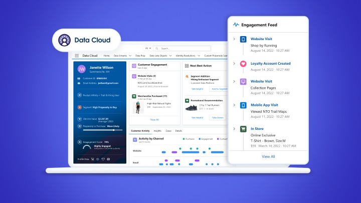
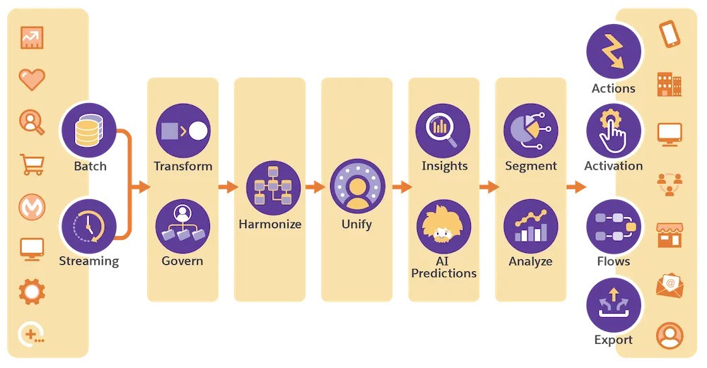
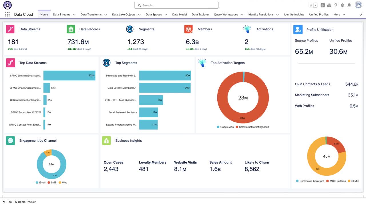
Unified customer profiles: Salesforce Data Cloud creates comprehensive customer profiles by integrating data from diverse sources into a singular view.
Real-time data processing: It processes and analyzes data in real-time, enabling immediate insights and actions.
Advanced analytics and AI with Einstein AI: The platform leverages Einstein AI for predictive analytics and machine learning, enhancing decision-making.
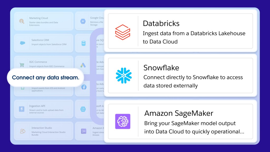
Extensive data integration and connectivity: Data Cloud seamlessly connects with various Salesforce and external systems, breaking down data silos.
Strong data security and governance: It offers strong security features and governance tools to ensure data compliance and protection.Customization and scalability: Salesforce Data Cloud is highly customizable and scalable, adapting to businesses’ evolving data needs.
Data Cloud is a free add-on with several Salesforce plans. However, there are several factors to keep in mind:
- Different editions may offer varying levels of functionality, with prices increasing as more features and higher capacities are included.
- Some aspects of Data Cloud are priced based on the volume of data stored or the number of operations performed, such as data queries or API calls.
- Additional costs for specific features like advanced AI capabilities, additional security options, or premium support services.
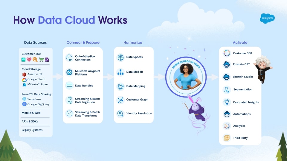
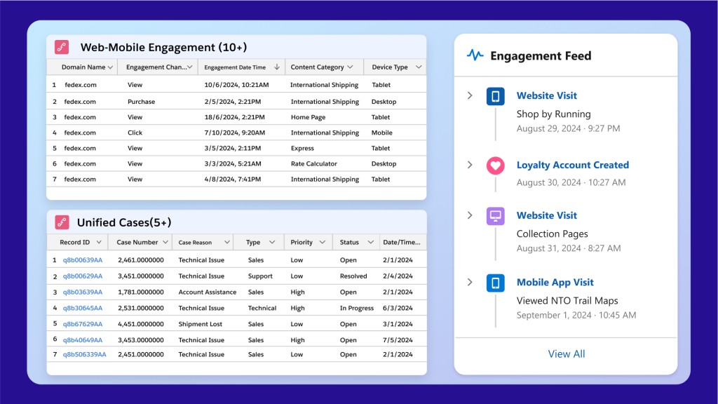
The crux of Salesforce Data Cloud’s value is its CRM-driven insights. Traditional dashboard tools like Tableau and Zoho Analytics are known for their strong visual data representation and intuitive interfaces, but Salesforce Data Cloud distinguishes itself by integrating CRM-driven insights with the ability to manage and analyze customer data across multiple touchpoints in real-time.
The incorporation of Einstein AI into Salesforce Data Cloud facilitates predictive analytics and machine learning right within the dashboard environment, delivering visualized data as well as actionable insights deeply integrated into customer relationship management.
The platform’s connectivity options are also noteworthy. While integrating flawlessly with Salesforce’s ecosystem, it also connects with a wide array of external databases and applications, bolstering its role as a centralized platform for accessing and interpreting enterprise data across different systems. This extensive integration capability makes it especially beneficial for organizations that need to handle complex datasets and seek a platform that does more than just display data—it also interprets and integrates it across various business functions.
Pricing: 4/5
General features and interface: 4.5/5
Core features: 4.7/5
Advanced features: 4.4/5
Integration and compatibility: 4.3/5UX: 3.8/5
Initially rooted in Salesforce’s various iterations of customer and data platforms, Data Cloud has grown into a comprehensive solution that integrates data across multiple Salesforce clouds and external sources.
Salesforce Data Cloud’s journey began as part of Salesforce’s broader Customer 360 strategy, which aimed to provide a unified customer view by integrating data across Salesforce’s suite of services. Over the years, Salesforce refined and rebranded its data capabilities, transitioning from earlier versions like Salesforce Customer 360 Data Manager to more sophisticated offerings. Salesforce Genie, announced in 2022, marked a pivotal development, laying the groundwork for what would become the Data Cloud.
At a high level, the platform helps companies create comprehensive customer profiles by aggregating diverse data sources into a single view, facilitating personalized customer interactions and more effective data-driven strategies.
Over the last year, its AI capabilities have been bolstered through deeper integration with Einstein AI, improving predictive analytics, and automated insights. The updates also include advancements in real-time data synchronization to ensure that customer information is consistently updated across all platforms. Additionally, Salesforce has increased the platform’s connectivity options, enabling better integration with external data systems such as Google BigQuery and Amazon AWS.
Find your new BI dashboard software
Critical elements of an effective dashboard
In the simplest terms, a good dashboard answers the question: How is my business (or a particular segment of my business) doing right now?
In addition to providing concise and intuitive display mechanisms, each BI interface detailed below provides the following critical elements of effective dashboards:
- Simplicity: Less is more. Choose metrics that matter.
- Clear key performance indicators (KPIs)
- Analytics: Businesses need high-level insights and the ability to analyze further.
- User customization: Not every person needs to see the same data.
- Maintainable, open architecture
- Real-time data: If you can’t tell how your business is doing right now, you’re looking at a report, not a dashboard.
Data as a business opportunity
When you hear the phrase “dashboard software,” what’s the first thing that comes to mind? If your answer involves analytics, data visualization, drill-downs, or KPIs, then you’re likely part of the growing number of people who see data as a business opportunity.
According to a RationalStat market report, the global business intelligence platform market is anticipated to grow considerably and reach a value of $45.2 billion by 2030. As the industry continues to grow, so does the push for design-focused, user-friendly dashboards that communicate the most important information and metrics clearly.
However, as vendors attempt to gain a competitive edge through their interfaces, it can be difficult to tell the bells and whistles from the necessities.
ALSO READ: Looker vs. Tableau: An In-Depth Data Analysis Showdown 2023
Real time is saved time
In an ever-changing marketplace, businesses must use analytics to build smarter strategies and maximize ROI.
The power of a good dashboard is invaluable. When done well, BI dashboards showcase the fundamental drivers of your business. While it’s true that not all BI solutions are great to look at, many vendors across the board are noticing the importance of a well-designed interface. Companies need to be able to see, understand, share, and act on their data quickly, making well-designed business intelligence software essential.
Looking for the latest in dashboard software? Check out our Dashboard Software Buyer’s Guide.
Choosing the best BI dashboard software
BI dashboard software offers unparalleled insights into data through real-time analytics, predictive modeling, and interactive visualizations. Catering to a wide range of users—from top executives seeking a bird’s-eye view of company performance, to data analysts delving into the nitty-gritty of datasets, to marketing teams aiming to predict the next big trend—BI dashboards streamline complex data analysis, making it accessible and actionable.
The ability to customize dashboards to specific business needs and integrate data from various sources further enhances their utility, facilitating informed decision-making across all levels of an organization.
More Dashboard resources
Best Tableau Alternatives: Top BI Tools for Data Visualization
If you’re looking for a data visualization tool and Tableau doesn’t quite fit the bill, check out this comprehensive guide of Tableau alternatives.

What is Data Mining?
What is data mining? Learn how you can use this process to analyze large databases effectively and efficiently.
Data Cleaning: Definition, Techniques & Best Practices
Data cleaning is the process of identifying and removing errors from data. Learn more about this vital part of data analysis and preparation.
What is Data Analytics? Definition, Tips & Best Practices
>Key takeaways What is data analytics? Data Analytics processes analyze data executed in a data analysis operation or Business Intelligence (BI) project. While data analysis is a process that collects, […]

5 Ways to Embed Analytics in Modern Applications
As data becomes more and more central to the success of businesses, the need to embed analytics into applications has never been greater.
Looker vs. Tableau: An In-Depth Data Analysis Showdown
Trying to decide between Tableau and Looker? Read our comparison to see which data analytics platform wins the data visualization & analytics race.