This article features some of the best business intelligence dashboard interfaces on the market, as well as what to look for when choosing a solution for your business. If you’re not already familiar with BI software and its functions, check out our Business Intelligence Software Guide to learn the basics.
Now that you know the prerequisites for a good BI dashboard, let’s take a look at some of the vendors that not only fit the bill, but also provide the best user experiences.
Featured partners
Product
Data Integration
Collaboration Tools
Mobile App
Starting Price

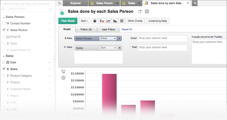
Tableau
Yes
Yes
Yes
$70
Sisense
Yes
Yes
Yes
$83

Microsoft Power BI
Yes
Yes
Yes
$10
Domo
Yes
Yes
Yes
$83

Zoho Analytics
Yes
Yes
Yes
$24

Looker
Yes
Yes
Yes
Custom Pricing
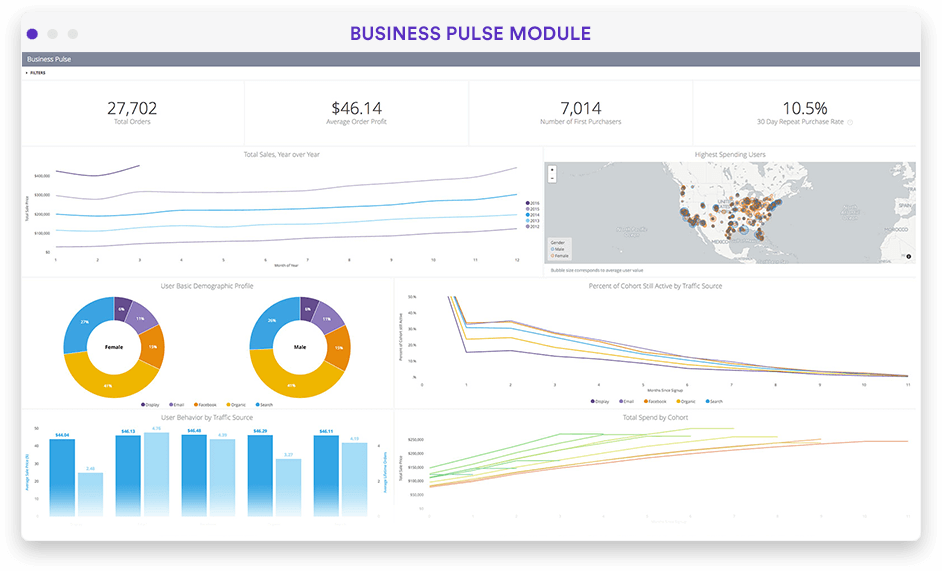
Top BI dashboard interfaces
Tableau – Best Overall
Pros
Cons

- Informative dashboard: Images, statistics, text, and other components are displayed on an easy-to-read, intuitive dashboard
- Connectivity with multiple data sources: Users can combine data from both live and external sources—a feature known as in-memory data connection
- Accelerator data mapping: The data-mapping UI allows users to pull outside data into the Accelerator and map fields
- AI: AI-driven features like natural language processing application Ask Data and Explain Data automatically analyze and explain data points in a visualization
- Free trial available
- Free version available
- Tableau Viewer: $15/user/month
- Tableau Explorer: $40/user/month
- Tableau Creator: $70/user/month
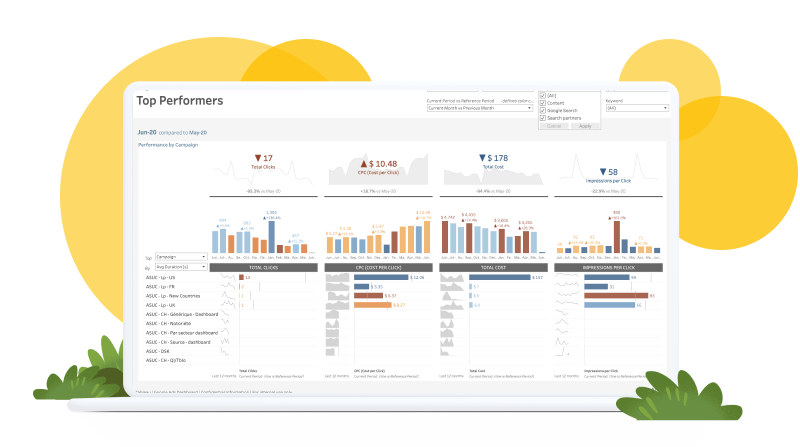


As a market leader in the BI space, Tableau has a lot to offer businesses of every size. The company has grown substantially over the last decade, and each update offers tangible improvements to user experience and analytics and reporting. Users can map data from various sources easily and creating data visualizations is less time consuming than ever with the help of AI.
With significant upgrades in the 2023.1 release, Tableau is moving from one of the fastest-growing BI solutions to a front-runner. Its easy-to-build personalized reports are as intuitive as ever, and now users can harness the power of data mapping to jumpstart analytics even faster.
Accelerator data mapping allows users to pull outside data into the Accelerator and map fields from their data source into the fields the Accelerator expects. This is made possible via the Data Mapping UI – a hybrid dialogue box that opens by default with any Data Mapping enabled Accelerator.
Tableau has also created new enhancements for Slack, allowing teams to collaborate more effectively and quickly through the popular work app. Upgrades include links as previews so teams can quickly recognize and act on relevant information, search and share Tableau content via direct messages and channels, and ‘Recent’ and ‘Favorite’ tabs on the homepage.
Sisense – Best for Remote Teams
Pros
Cons
- In-Chip Analytics Engine: Optimizes data processing and query performance ensuring faster results when working with large datasets
- ElastiCube: Simplifies data preparation and management, allowing users to model and transform data without the need for complex extract, transform and load (ETL) processes
- Free trial available
- $25,000+/capacity/year
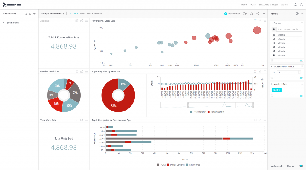

Sisense is one of our top selections primarily due to its performance on large datasets. Its powerful In-Chip technology enables rapid processing of complex data queries, facilitating real-time insights for organizations with massive data volumes.
Sisense is an end-to-end BI platform that offers a complete BI solution from data and analytics workflow to integration, visualization, and reporting. Supporting a wide range of data sources, users can connect and integrate data from various systems. Sisense’s proprietary Elasticube technology simplifies data preparation and management, allowing users to model and transform data without the need for complex ETL processes. Scalability and security are also highlights of Sisense’s BI software, as the solution is built to scale with growing businesses while providing robust security features to protect data.
Sisense’s L2023.3 update offers two deployment options—cloud managed service or a cloud environment of the user’s choice. With the cloud managed service, Sisense provides an environment for the user based on specific needs. For users with their own cloud services, Sisense can be set up for Linux on all major cloud platforms.
Microsoft Power BI – Best for Enterprise Companies
Pros
Cons

- Power Query: Microsoft’s proprietary data transformation and connectivity tool imports, cleans, and reshapes data
- Data Analysis Expressions: DAX is a formula language in BI for creating calculated columns, measures, and KPIs, allowing users to perform advanced data analysis
- Data connectivity: Power BI can connect to a wide range of data sources, including cloud-based, on-premises, Excel files, and web APIs.
- Free trial available
- Power BI Pro: $9.99/user/month
- Power BI Premium: $20/user/month OR $4,995/capacity/month
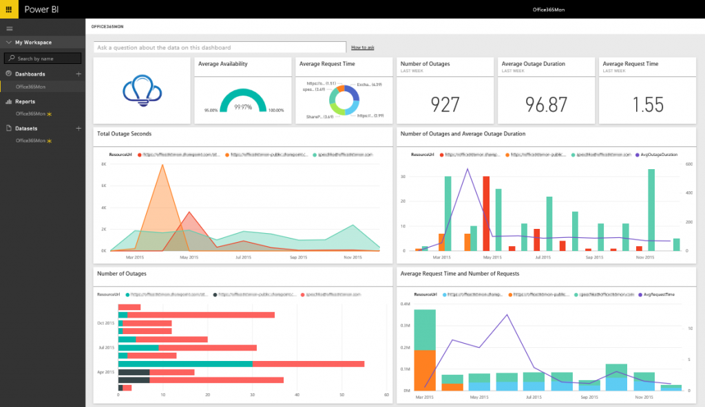
Microsoft Power BI emerged as a clear choice for several reasons. Another market leader in the space, Power BI is known for its unparalleled integration abilities, extensive range of customizable visualizations, advanced analytics tools, and real-time data reporting.
Microsoft’s flagship BI software is a collection of software services, apps, and connectors that work together to turn unrelated sources of data into coherent, visually immersive, and interactive insights.
Power BI has the advantage of integrating with the Microsoft ecosystem, seamlessly drawing data from products and services such as Office 365, SharePoint, Azure, and other Microsoft apps.
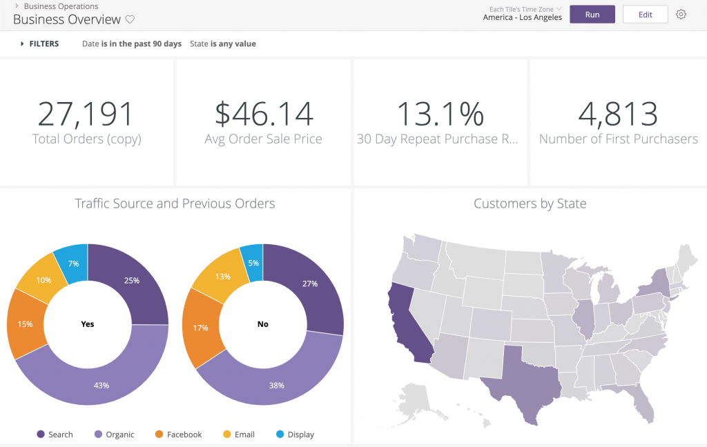
The dashboard is clean, easy to navigate, and offers a variety of ways to organize, categorize, and drill down data into understandable visualizations. For example, users can have an overview of their sales analysis and then explore by year, quarter, product category, or geo-location as needed.
Powerful data transformation and modeling tools such as Power Query and Data Analysis Expressions (DAX) also help Power BI stand out from the competition.
As expected from a name like Microsoft, ease-of-use is one of the major selling points of the software, incorporating a drag-and-drop interface that makes it easy for users to create visualizations, reports, and dashboards. After all, what is the point in purchasing a software solution no one knows how to use?
Domo – Best for enterprises
Pros
Cons
- Domo appstore: The platform’s built-in app store offers pre-built apps and custom solutions to enhance data analytics, visualization, and reporting
- Collaboration: Users can share dashboards, comment on insights, and assign tasks to team members
- Integration: Pre-built connectors integrate seamlessly with various data sources
- Free trial available
- Standard: $83 user/month
- Professional: $160 user/month
- Enterprise: $190 user/month
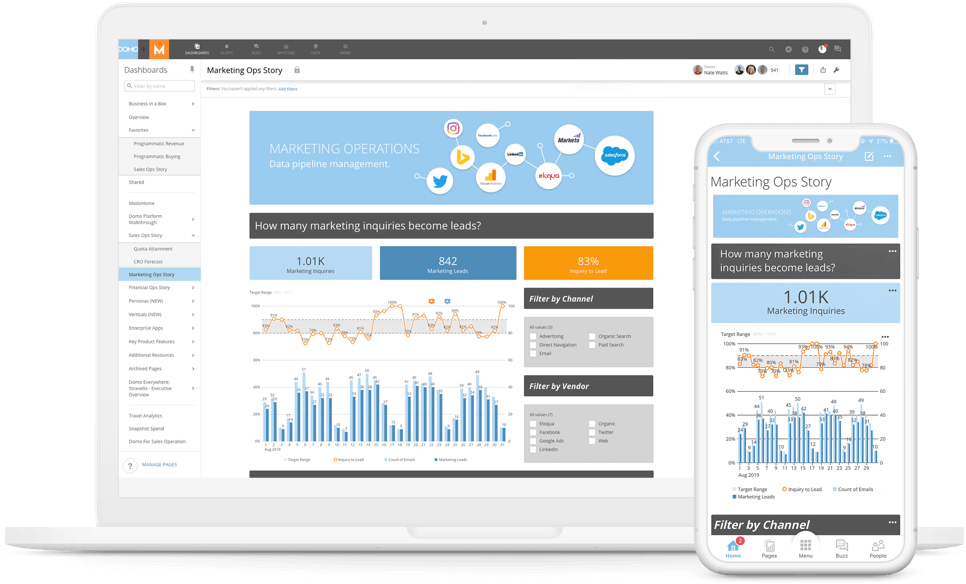

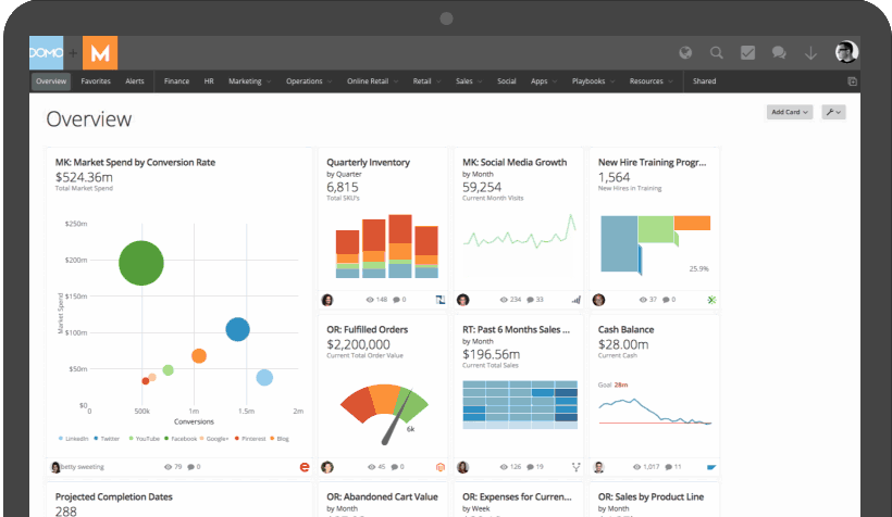
Domo earns a spot as a frontrunner due to its impressive flexibility, analytics, and collaboration features. The flatform stands out in the BI landscape for its intuitive, drag-and-drop interface that allows users of all technical levels to create customized, interactive dashboards. Its vast library of over 1,000 data connectors integrate with virtually any data source, streamlining the data collection process.
Domo’s dashboard interface is visually appealing, easy to navigate, and includes drag and drop features that are intuitive to inexperienced BI software users. Its robust collaboration features, mobile support, and built-in app ecosystem make it a popular choice for businesses with distributed teams or those looking for a comprehensive solution that goes beyond traditional data visualization.
Domo’s scalability and flexibility make it an ideal platform for both small businesses and enterprises. The platform’s extensive library of pre-built connectors also allows for integration with various data sources, making it a versatile solution for organizations across many industries.
Zoho Analytics – Best for small businesses
Pros
Cons
- Integration with Zoho ecosystem: As part of the Zoho suite of business applications, Zoho Analytics provides integration with all Zoho products including the company’s CRM and finance and project management software
- Embedding options: The platform supports embedding reports and dashboards into other applications
- Ask Zia: Zoho’s AI-powered virtual assistant can generate visualizations based on user queries and answer questions
- Free trial available
- Basic: $24/2 users/month
- Standard: $48/5 users/month
- Premium: $115/15 users/month
- Enterprise: $455/50 users/month

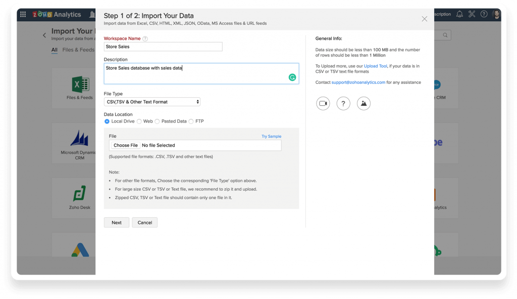
In our quest to find the best BI dashboard software on the market, Zoho Analytics emerged as a top contender due to its comprehensive features, ease of use, and cost-effective pricing.
For 2023, Zoho Analytics has added a litany of new features. Most enhance user experience, but some improve performance on the already considerably powerful platform.
Enhanced charts with new interactive options allow users to plot large data to get a clearer, more holistic view of peaks and troughs in data.
Image support for KPI widgets enhance the dashboard experience and help viewers grasp information more quickly. The preset user filter for dashboards gives the ability to define preset filters by combining user filters, eliminating the need to click and select values from multiple users filters.
In addition to these updates, several other features have been added to the desktop and mobile app, fine-tuning user experience and improving overall performance and insights.
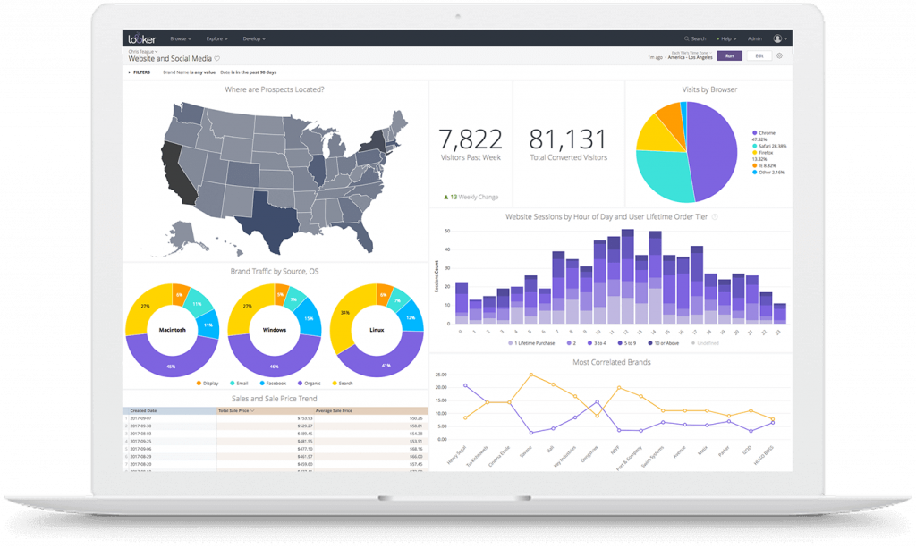
Looker by Google – Best cloud-based BI dashboard
Pros
Cons
- LookML: Google’s proprietary AI modeling language allows for complex queries and data modeling
- Data governance: Looker provides tools for managing data governance, allowing administrators to set permissions and controls around data access and usage
- Data modeling: Users can create customized data models that can handle large volumes of data from multiple sources
- Starting at $20,000/capacity


During our meticulous evaluation of the leading BI dashboard software options, Looker distinguished itself as a top choice due to its powerful data modeling capabilities, extensive customization options, and integration features.
Looker is a cloud-based BI platform built on top of a powerful data modeling layer. Focusing on the “single source of truth” model, Looker’s dashboard brings together information from multiple sources to give businesses an accurate reading of various metrics.
Looker stands out for its unique approach to data modeling, which allows users to define complex information and create reusable data models that can be leveraged throughout the platform. This approach streamlines data exploration and analysis so users can be confident about the data displayed on the dashboard.
There are several highlights and upgrades associated with the platform’s recent 23.4 release:
Looker Studio Connector and Connected Sheets are now available for all Looker-hosted instances, which means users can access and analyze Looker-modeled data in Connected Sheets and Looker Studio through the connectors, opening up new enterprise use cases.
The Performant Field Picker Labs feature also offers more refined search options, which let users more quickly and efficiently search for fields in large Explore field pickers.
As the BI arm of Google’s suite of products, Looker has a high standard to live up to—and it largely achieves its goal of being a worthy addition to the tech megalith’s software options. Here’s where Looker excels, and where it falls short of the mark.
Critical elements of an effective dashboard
In the simplest terms, a good dashboard answers the question: How is my business (or a particular segment of my business) doing right now?
In addition to providing concise and intuitive display mechanisms, each BI interface detailed below provides the following critical elements of effective dashboards:
- Simplicity: Less is more. Choose metrics that matter.
- Clear key performance indicators (KPIs)
- Analytics: Businesses need high-level insights and the ability to analyze further.
- User customization: Not every person needs to see the same data
- Maintainable, open architecture
- Real-time data: If you can’t tell how your business is doing right now, you’re looking at a report, not a dashboard
Data as a business opportunity
When you hear the phrase dashboard software, what’s the first thing that comes to mind? If your answer involves analytics, data visualization, drill-downs, or KPIs then you’re likely part of the growing number of people who see data as a business opportunity.
According to Reuters, the global BI market grew at a CAGR of 11.1% through the year 2022, reaching $29.48 billion—and it has no signs of slowing down. As the industry continues to grow, so does the push for design-focused, user-friendly dashboards that communicate the most important information and metrics with clarity.
However, as vendors attempt to gain a competitive edge through their interfaces, it can be difficult to tell the bells and whistles from the necessities.
ALSO READ: Looker vs. Tableau: An In-Depth Data Analysis Showdown 2023
Real-time is saved time
In an ever-changing marketplace, businesses must turn to analytics to build smarter strategies and maximize ROI.
The power of a good dashboard is invaluable. When done well, BI dashboards showcase the fundamental drivers of your business. While it’s true that not all BI solutions are great to look at, many vendors across the board are noticing the importance of a well-designed interface. Companies need to be able to see, understand, share, and act on their data quickly, making well-designed business intelligence software essential.
Looking for the latest in dashboard software? Check out our Dashboard Software Buyer’s Guide.