Key takeaways
Dashboards are an essential component of business intelligence (BI) software solutions. They help businesses display data visualization and analysis results as a dashboard that is easily understood by management and non-technical personnel. Web analytics dashboards can improve customer service, promote specific products better, enhance a business website, track marketing campaigns, or analyze online traffic.
Web analytics dashboards can be used in many functional areas of a business, and we’ll explore some dashboard examples, how to create them, and the benefits of using them.
What is a web analytics dashboard?
A web analytics dashboard visually represents data created by users visiting a business’s website. The user’s interaction with the website allows the IT staff to monitor its status to determine if it meets its intended purpose.
A web analytics dashboard tracks a website’s Key Performance Indicator (KPI) metrics, such as page views, percentage of emails open, user behavior, session duration, and digital marketers’ information. Web analytics dashboards allow businesses to monitor the day-to-day operations of a website in real time.
Looking for the right solution for your business? Check out our full Dashboard Software Buyer’s Guide for a comprehensive look into the best tools.
Examples of web and data analytics dashboards
One of the primary purposes of a web analytics dashboard is to provide immediate visibility and clarification of the information displayed in a dashboard. The analytics dashboard examples highlight critical information that can be easily understood and aid quick decision-making.
Microsoft Power BI IT Helpdesk Dashboard
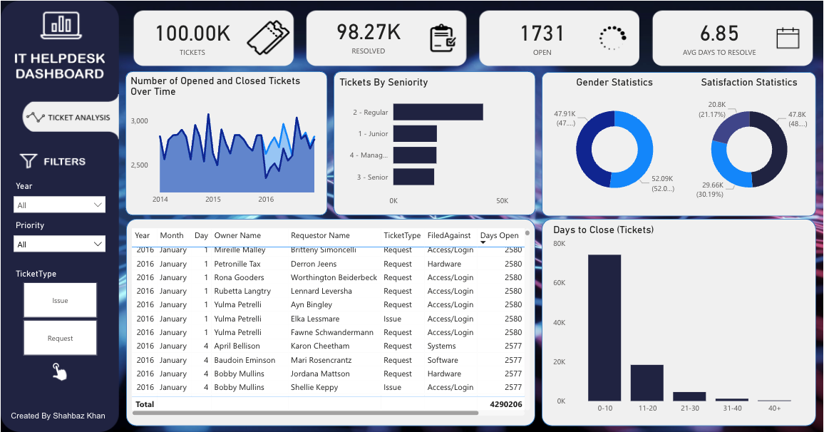
The displayed web analytic dashboard is a comprehensive IT helpdesk report containing vital ticket statistics. The interactive help desk allows users to filter by year, priority, and ticket type. The dashboard shows the number of tickets closed in 10-day periods starting from 0 to 10 and tickets still open after 40 days, and it displays the average number of days to resolve a ticket. The sample Microsoft Power BI dashboard provided can easily be integrated with other Microsoft solutions in a business office.
AgencyAnalytics Web Analytics Dashboard
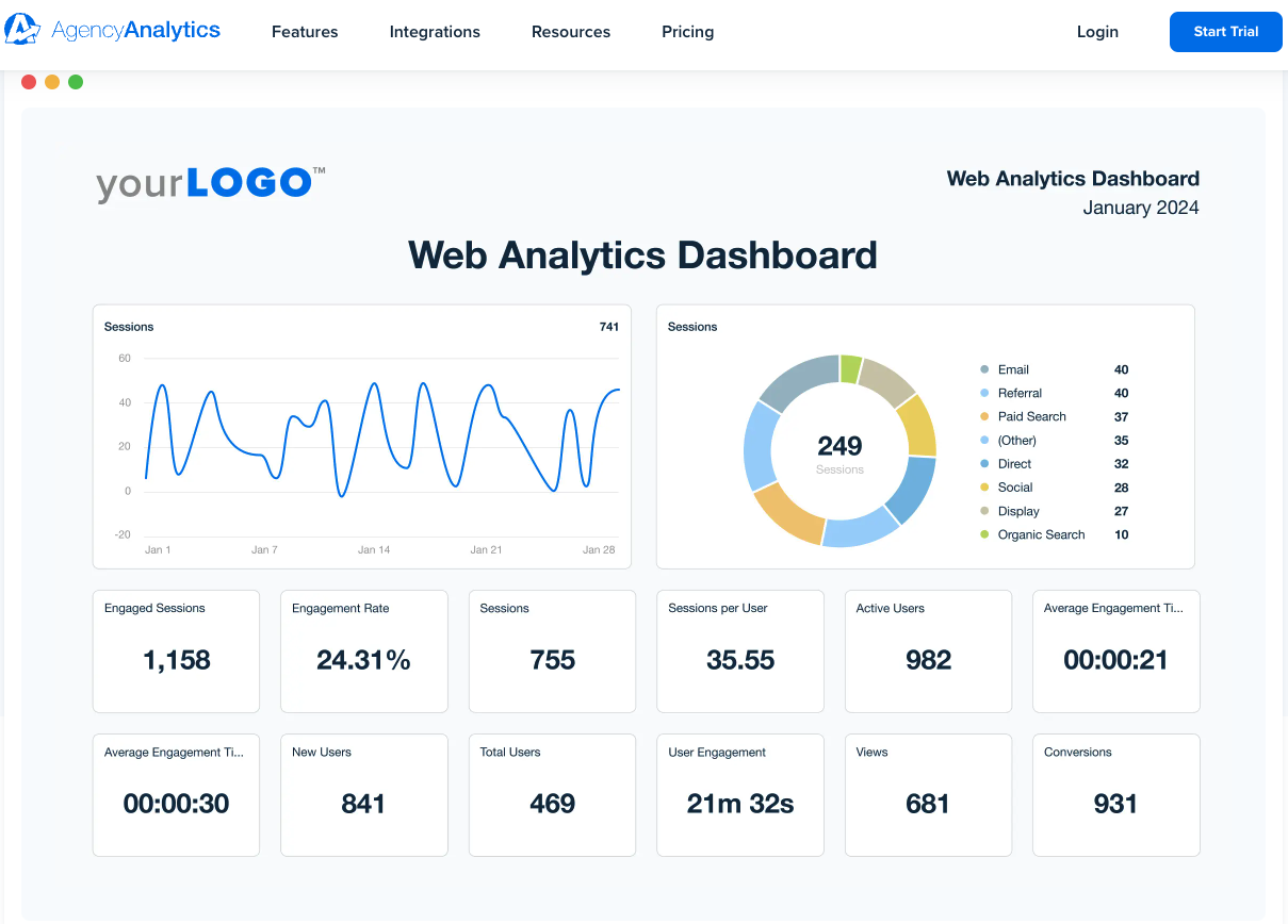
AgencyAnalytics dashboards provide a user-friendly view that lets you quickly understand customer behavior and other vital user details impacting business goals. For example, a company’s goals illustrate that the website engagement rate is below the expected 25%, or that the conversion rate does not meet the expected 1,000 conversion rate per the business goals. Dashboard examples like this allow businesses to adjust to meet business goals quickly.
Tableau executive summary dashboard
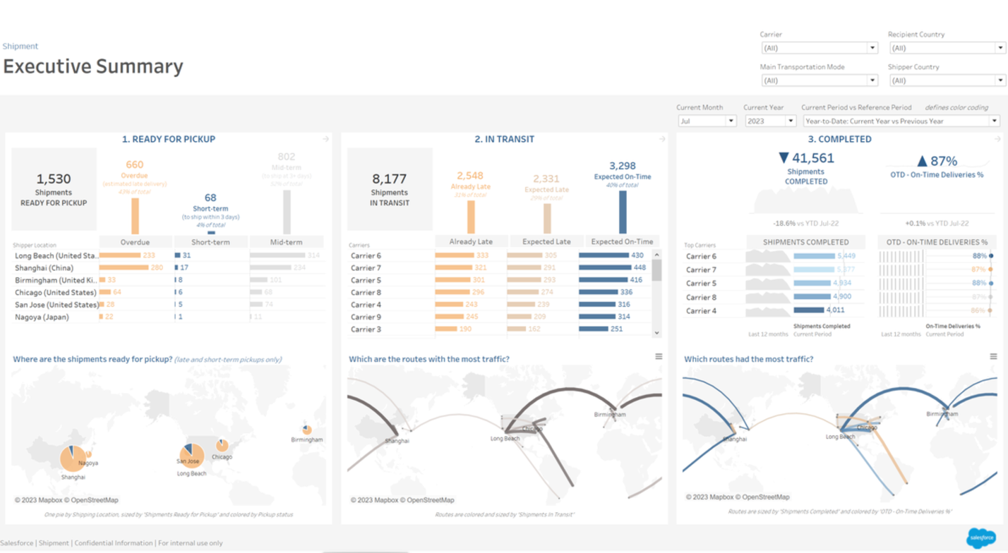
Tableau’s user-friendly executive summary dashboard presents this shipment information allowing senior supply managers to see the status of three shipment categories instantly. The dashboard will enable managers to monitor and improve KPIs, evaluate the quality of service provided, and compare the expected delivery dates against the actual delivery dates. The three shipment categories help management identify the root causes of late shipments.
Datapine Customer Service Team Dashboard
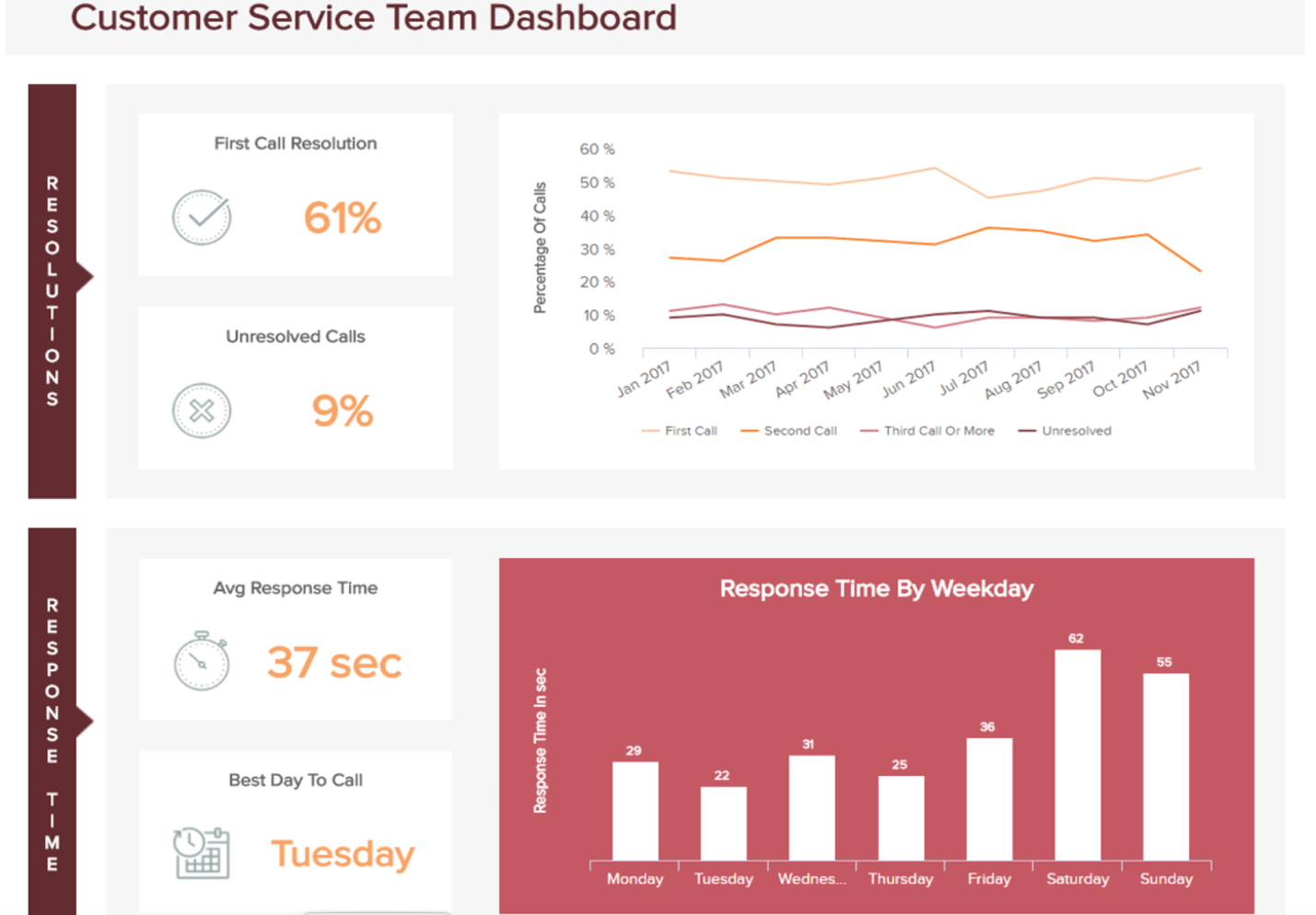
Datapine’s customer service dashboard provides instant feedback on how the customer service team is doing and what areas need improvement. The information displayed indicates that more customer service personnel can work on the weekends to reduce the number to the weekday average of 29. Though the number of unresolved calls is 9%, it still leaves about three customer issues unresolved per weekday and eleven unresolved issues per day on weekends. The web analytics generated data is the helpful information web analytics provides that managers can use to improve overall business operations.
Domo marketing campaign dashboard
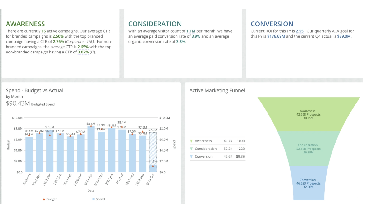
The presented dashboard provides marketing teams with granular information about campaign performance. It includes a breakdown of the amount budgeted and spent for each marketing funnel category. At the top of the dashboard, the funnel categories provide additional information about active campaigns and the number of visitors compared to the conversion rate. The active marketing funnel pictorial shows the conversion percentage.
Ubiq software engineering data analytics dashboard
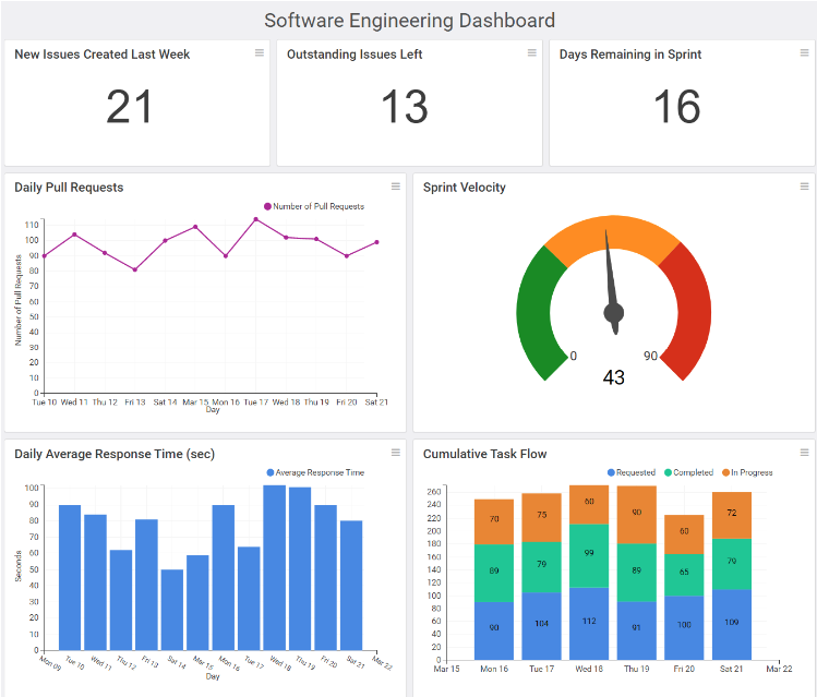
Your target audience will dictate the kind of software development KPI metrics shown in an analytics dashboard. From a management perspective, the sprint velocity indicates how fast the development team completes tasks. At the same time, a programmer would be interested in days remaining in the current sprint. A sprint is a function of Scrum project management where work is tracked within a specific block of time, or sprint. Managers and programmers alike can use the displayed analytic dashboard.
Wave Cash Flow Dashboard
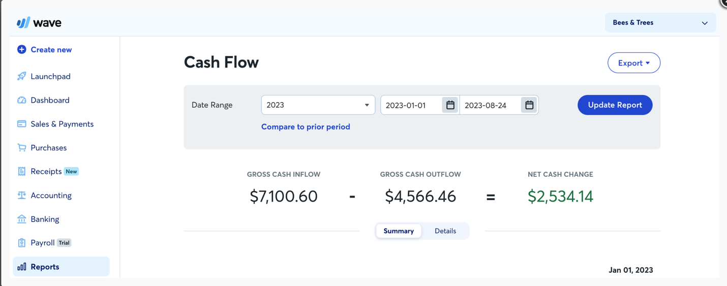
The cash flow data analytics dashboard is a financial report showing how a business uses its cash resources. The cash flow dashboard is one of many types of financial reports. The Wave money management application is designed for small businesses and provides dashboards for profit and loss, net income, and expense breakdown. There are other small business BI solutions available for other functional business areas.
Read more: Best Small Business Dashboard Solutions
What are the types of web analytics dashboards?
Data analytics dashboards are available for every type of business functional area, and are used to improve decision-making and business operations. Depending on what a business is trying to accomplish will dictate the type of dashboard a company needs. The three most common dashboards are strategic, operational, and tactical.
Strategic dashboards
The strategic dashboard focuses on long-term goals by showing current values using a color scheme to differentiate between the current value and the desired metric target. The color scheme indicates how close the current value is to the desired metric.It also includes a projected date when the current value has reached the desired metric by using progress bars or gauges that show the progress. Strategic dashboards do not include drill-downs, which show detailed information is not required at a strategic level.
Operational dashboards
Operational dashboards show the work progression of a department, branch, or production line, including any identifiable problems that hinder production or a section. Comparison visualizers, like line graphs, display progress toward an intended target with estimated due dates. When required, drill-downs help identify a problem in a section or production line.
Tactical dashboards
A tactical dashboard can also be considered a type of analytics dashboard used to analyze the performance of mid-level management personnel. Middle-level managers use tactical dashboards to help identify issues and take the appropriate corrective action to resolve the issue. Tactical dashboards use forecasting tools, filters, and drill-down tools to collect accurate information for decision-making or problem resolution.
Other types of analytics dashboards
The other types of dashboards are usually associated with a functional area of a business. Here are some examples of what is considered other types of dashboards:
- Inventory dashboards
- SEO dashboards
- E-commerce dashboards
- Financial dashboards
- Social media dashboards
- KPI dashboards
What are the benefits of web analytics dashboards?
Analytics dashboards help businesses make quick, data-driven decisions. These dashboards allow an audience to interpret and better understand what is presented easily. Web analytics dashboards are good at assisting companies in understanding user behavior better, monitoring website traffic, improving customer experience, and building better marketing campaigns while improving performance metrics.
Analytics dashboards are used to display complex data from multiple sources derived from using big data analytics computations. Overall, web analytics dashboards help businesses improve profitability and Return on Investments (ROI).
Web analytics accomplish these benefits by doing the following:
Collates your website data for immediate feedback: Businesses can see real-time results when a website is updated with new designs or features as users interact with those changes.
Immediate observation of a target audience: This allows a business to observe instant feedback used to develop improved customer profiles and personas for a specific audience.
Helps develop accurate customer-driven marketing campaigns: Using web analytics, businesses can develop effective marketing campaigns by analyzing user preferences and insights that can increase website traffic and customer conversion rates.
Helps businesses reach goals and objectives: Web analytics dashboards help businesses continually grow and improve their web presence by analyzing the latest information obtained from the dashboard.
How are data analytics dashboards created?
Data analytics dashboards can visually display a variety of metrics, like goal completions, product usage, user activations, user retention, and loyalty metrics. These are examples of the type of information an analytics dashboard can track. Therefore, the first step in creating an analytics dashboard is determining the kind of information you want the dashboard to track.
The steps for building an effective web analytics dashboard are:
- Select a KPI metric that is aligned with your business objectives or goals.
- Using the KPI metric, choose the most appropriate data source to extract the required data fields to ascertain if the website meets or exceeds the business objectives or goals.
- Select the best analytics tool for collecting, analyzing, and interpreting user behavior and website traffic to determine if the objectives and goals are being met.
- Create a new dashboard from the business intelligence homepage and save it with a descriptive name.
- Create a data model and associate it with the new dashboard.
- Select and add the most relevant dashboard widgets while carefully considering the dashboard layout. Be sure to include relevant information while making the dashboard as intuitive and user-friendly as possible.
The six listed dashboards revolve around the service it provides in business functional areas. A data or web analytics dashboard can be used in any business functional area containing large amounts of data to find patterns, make predictions, and discover previously unknown information.
Business functional areas such as sales, finance, and human resources can all benefit from a BI solution with good analytics dashboard features. Overall, data and web analytics dashboards help businesses by assessing and acting upon the website data that improves the website and the company.