Sales dashboards are centralized, visual representation of sales data. Any customer relationship management (CRM) system worth its salt will include a sales dashboard as part of its platform. In this guide, we’ll talk about why sales dashboards are important and what elements they should include before diving into a comparison of 10 of the most popular sales dashboard examples.
Finding a sales leaderboard that works for your company is key to deciding on the right CRM for your needs, and comparing different sales dashboards can help your sales team make a final selection.
What are the best sales dashboard examples?
Sales performance dashboards are an integral part of customer relationship management (CRM) software and can make or break the sales team’s experience. To help you make a decision, we’ve rounded up examples from 10 of the most popular and highly rated CRMs on the market today.
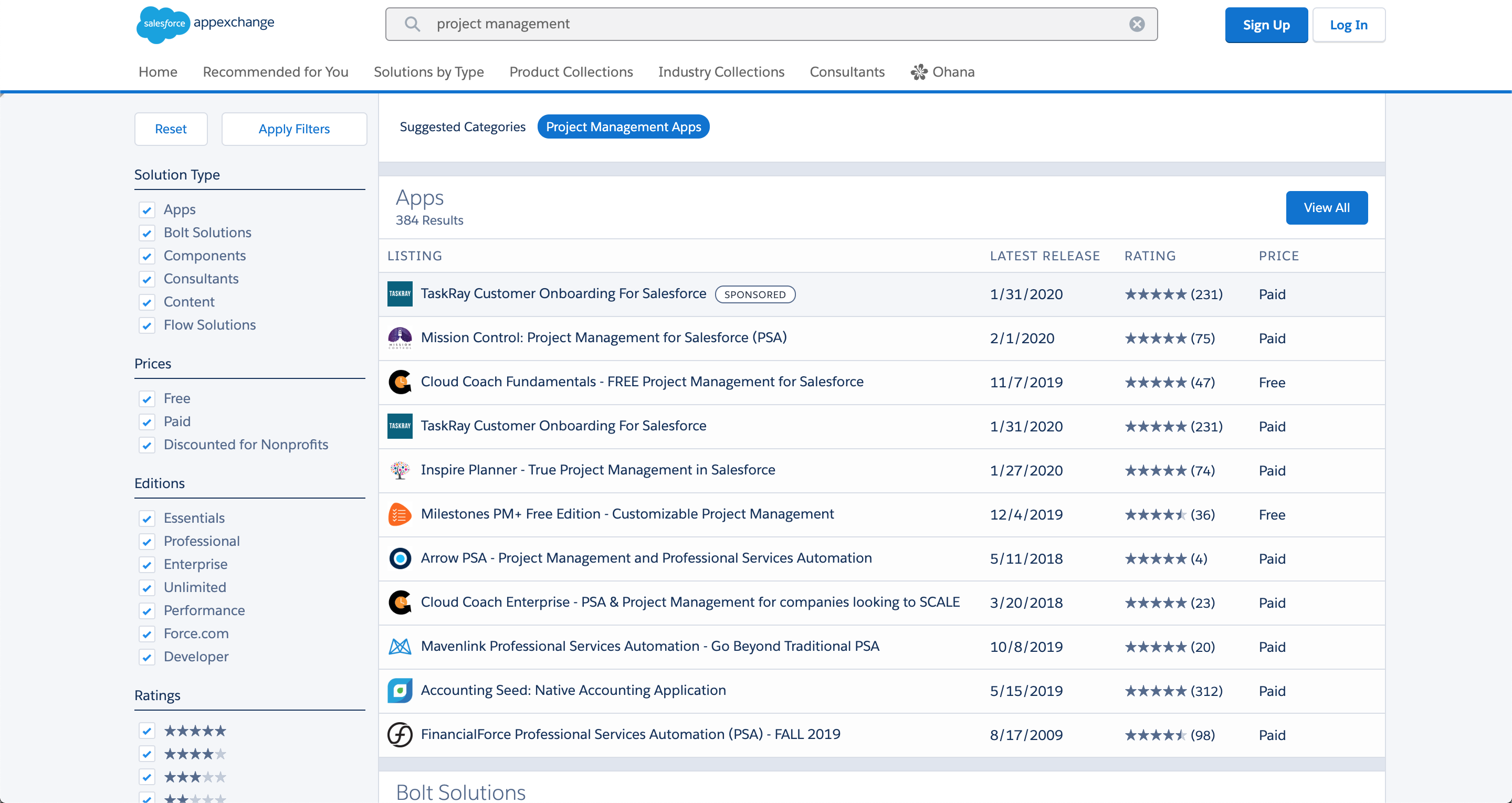
Salesforce — Best for Enterprise
Pros
Cons
Our Rating: 4/5
Salesforce’s dashboard is best suited for large enterprises that require a detailed and customizable overview of their sales operations. Its ability to provide real-time, in-depth analysis of various sales metrics makes it an indispensable tool for sales executives. While it may be too complex for smaller businesses, for large organizations, it’s a tool that turns data into strategic insights, driving informed decision-making and ultimately, business growth.
Salesforce has consistently updated its dashboard to meet the evolving needs of enterprises. For example, the introduction of AI-driven analytics has been a game-changer. It allows for more predictive insights, helping sales teams to not only understand their current performance but also to anticipate future trends.
While Salesforce’s dashboard is a powerhouse of functionality, it’s not without its drawbacks. The complexity that comes with its extensive customization options can be overwhelming for new users. This steep learning curve might deter smaller organizations or those with limited tech expertise. However, for larger enterprises with dedicated teams to manage and analyze CRM data, Salesforce’s depth and breadth are invaluable.
Activity management: This feature allows for easy management and automatic synchronization of emails and engagement activities on a single platform, providing a complete view of customer interactions.
Lead management: Salesforce Sales Cloud offers tools to meet buyers where they are, track deals across any channel, and manage sales activities with an actionable to-do list.
Account and opportunity management: This includes tailoring and guiding sellers through the business process, gathering complete data, seamlessly managing relationships, and taking action based on insights.
Forecast management: This feature enables real-time management of forecasts, allowing customization of KPIs to match business needs, uncovering pipeline trends, and making adjustments on the fly to drive accuracy.
Pipeline management: Salesforce provides tools to maintain and manage a healthy sales pipeline on a single screen, address gaps with embedded charts, prioritize deals with AI, and empower better coaching.
Reports and dashboards: Users can track lead volume, conversion rates, and every part of the sales pipeline easily. The platform allows customization of reports and dashboards for a real-time view of the business.
Why we chose Salesforce
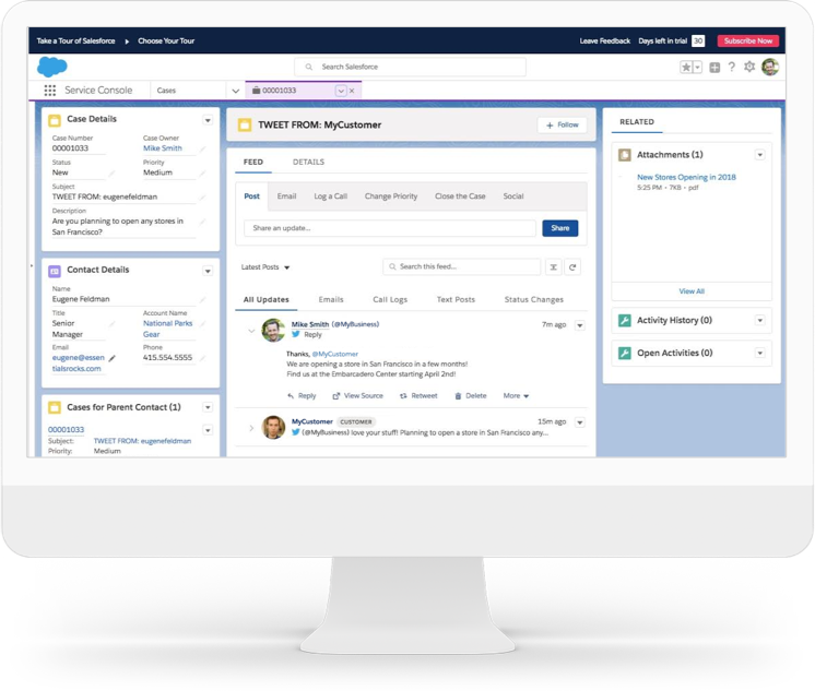
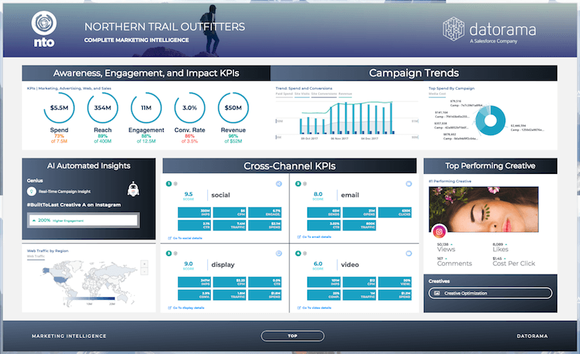
Salesforce’s dashboard is akin to a maestro conducting an orchestra of sales data. It’s not just about the numbers; it’s about transforming these numbers into actionable insights. The “State of the Union” dashboard, for instance, offers a high-level view of crucial metrics for sales executives. This includes key performance indicators (KPIs) like total closes, open pipelines, sales rep performance, sales cycle length, and top deals. It’s a real-time snapshot of what’s vital for decision-making.
The beauty of Salesforce’s dashboard lies in its customization and real-time data visualization capabilities. It’s capable of displaying everything from pipeline stages to individual rep performance. This level of detail creates a proverbial magnifying glass over sales operations.
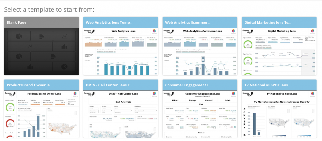
What sets Salesforce apart from its competitors is its comprehensive integration capabilities. It seamlessly connects with a myriad of other business tools and systems, creating a unified platform for all sales-related activities. This integration extends Salesforce’s functionality beyond just a CRM dashboard, making it a central hub for enterprise operations.
Our ratings
Pricing: 2.7/5
General features: 4.5/5
Advanced features: 4.5/5
Integration and compatibility: 3.5/5
UX: 3.5/5
HubSpot — Best for pre-built report templates
Pros
Cons

Our Rating: 4.5/5
HubSpot gives your sales team access to 90+ essential pre-built reports that cover basically every major sales KPI you could want to track. Choose from one of these templates or build up to three custom dashboards to get all your essential sales insights in one place.
The HubSpot sales dashboards can include metrics ranging from forecasted revenue to deal stages to contacts worked to number of calls made. The simple design puts the focus on the metrics and makes it easy for salespeople to make data-driven decisions based on real-time numbers instead of spending time assembling a spreadsheet.


Sales conversion rate dashboard: This feature allows for the calculation of progress throughout the entire sales pipeline, providing interactive tools to analyze and set goals by month and quarter.
Sales rep dashboard: Designed for individual sales representatives, this dashboard tracks key metrics like meetings booked, open opportunities, deals in the pipeline, forecasted revenue, and other performance indicators.
Sales manager dashboard: Offering an overview of key metrics for sales managers, this dashboard includes sections for today’s stats and shows monthly progress toward the sales team’s new account target and Monthly Recurring Revenue (MRR) goal.
Sales leaderboard: This feature displays the performance of all salespeople, including information on completed activities, new accounts, generated MRR, and customer retention numbers.
Deal performance dashboard: Central to this feature is the deal forecast, allowing members of the sales organization to see expected revenue closure. It also shows the number of deals at each stage of the sales process compared to the goal.
Win/loss dashboard: Provided by Solver, this dashboard offers metrics on deal size, salesperson, and industry, enabling the identification of top performers and insights into why deals were won or lost.
Why we chose HubSpot
HubSpot’s sales dashboard, with its pre-built report templates, is a strong contender for organizations looking for an integrated, user-friendly, and customizable sales reporting tool. Its ability to provide clear, actionable insights through well-designed visualizations and its seamless integration with the HubSpot CRM makes it a valuable asset for sales teams. However, its full potential is best realized when used within the HubSpot ecosystem, which might be a consideration for businesses using different CRM systems.
HubSpot’s CRM integration is a standout feature. It allows for seamless syncing of data between the CRM and the sales dashboard. This integration is particularly beneficial for generating sales reports based on customer database data, tracking sales performance, identifying top-performing sales reps, creating sales forecasts, and more. HubSpot offers a variety of pre-built templates that can save significant time and set users up for success. These templates are designed to be easily customizable and sync with live data from your tech stack, including HubSpot itself. This feature is particularly useful for those who want to get started quickly without the need for extensive customization.
The platform provides a wide range of charts for visualizing data, which is crucial for comparing values, understanding composition, and observing trends. The visualizations are designed to be easy to read and actionable, ensuring that users can understand the charts at a glance. HubSpot provides several sales dashboard examples, catering to different roles within a sales organization, such as sales reps, managers, and leaders. These examples serve as a great starting point for users to build their own dashboards.
The dashboards are designed to be accessible to all team members, not just managers or executives. This transparency allows individual contributors to understand the metrics and goals important to leadership, potentially motivating them to see the impact of their numbers on the business.
While HubSpot’s sales dashboard is impressive, it may require manual data syncing if a team uses spreadsheets instead of a CRM. This could be a limitation for organizations not fully integrated into the HubSpot ecosystem or those relying on different CRM systems.
Our ratings
Pricing: 4.8/5
General features and interface: 4.4/5
Core features: 4.5/5
Advanced features: 3.8/5
Integration and compatibility: 4.8/5
UX: 4.8/5
Oracle NetSuite — Best for specificity
Pros
Cons
Our Rating: 4/5
Oracle NetSuite offers over 50 standard sales reports that come pre-loaded in the CRM, including pretty specific topics such as customer aging history and sales by promotion code. The level of specificity makes it easy for your sales team to track their progress towards their goals and see exactly what sales activities are most effective.
The screenshot above comes from the monthly sales dashboard template, which features metrics like sales rep conversion rate, quotes expiring this month, new opportunities, top sales reps by sales, and more. This summary makes it possible for sales managers to track the performance of their team and make sure they are on track to hit their monthly targets.
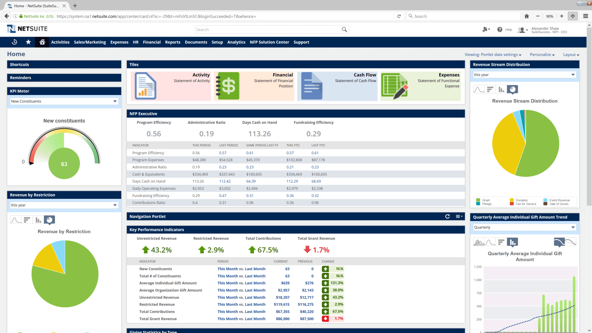
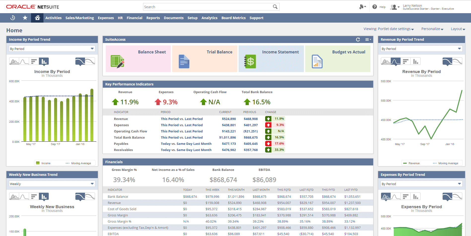
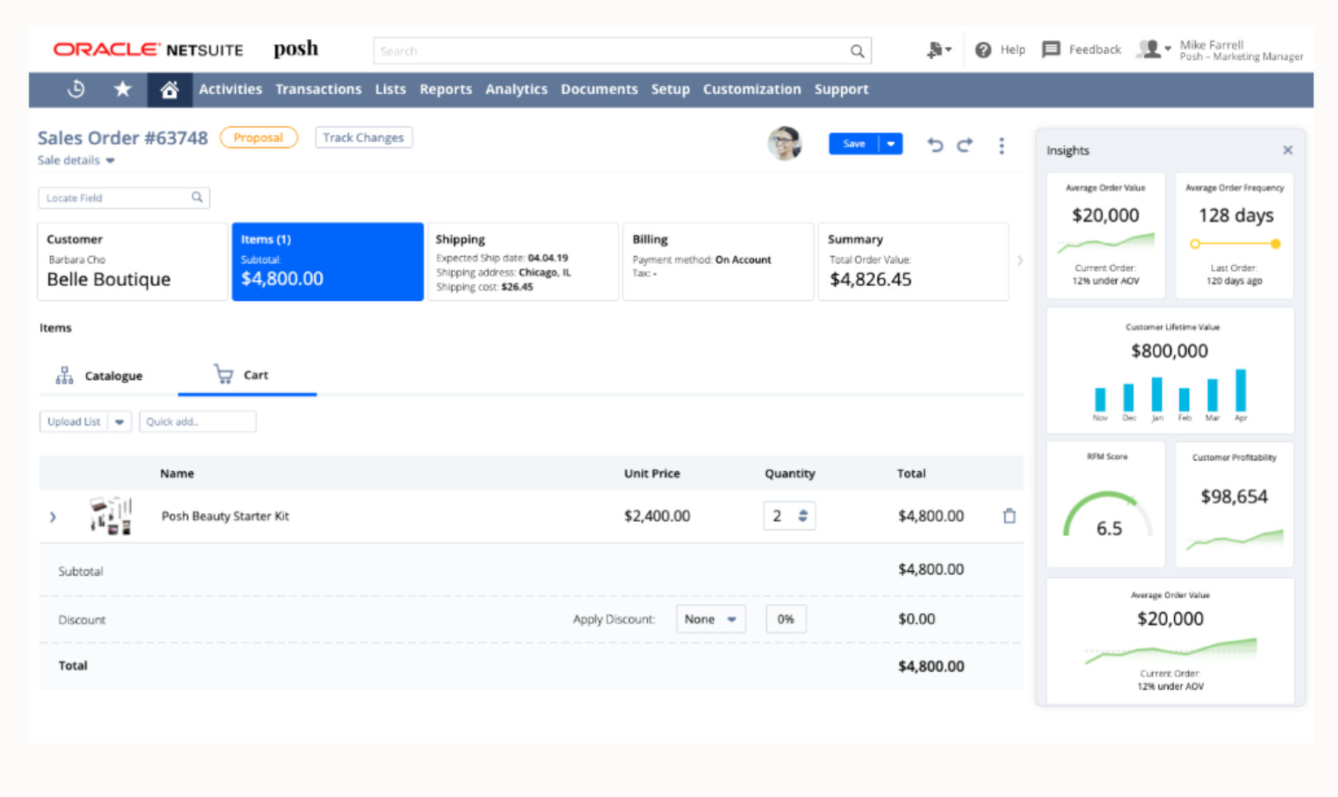
Real-time data presentation: The dashboard displays sales data in real-time, ensuring that the team always has access to the latest information.
Customizable KPIs: It allows for the display of various Key Performance Indicators (KPIs) that can be customized based on the user’s role, such as open opportunities for salespeople and overall team performance for managers.
Graphical representation of sales KPIs: Sales Key Performance Indicators are captured and presented graphically, enabling team members to quickly assess whether sales targets are being met.
Progress tracking: The dashboard aids salespeople and managers in tracking progress, identifying emerging issues, and focusing on meeting sales goals.
Enhanced lead-to-cash process: It assists in accelerating the lead-to-cash process by consolidating information in one place and turning more leads into sales.
Drill-down capabilities: Users can delve into the data presented on the dashboard to generate detailed sales reports, offering a deeper insight into sales statistics.
Why we chose Oracle NetSuite
Oracle NetSuite’s sales dashboard stands out for its real-time data visualization capabilities. It offers a comprehensive view of the sales pipeline, from lead generation to revenue realization. The key performance indicators (KPIs) are readily accessible, providing immediate insights into sales performance. This real-time aspect is crucial for businesses that need to make quick, informed decisions.
The dashboard’s customization feature is particularly noteworthy. Users can tailor their views to focus on the metrics most relevant to their roles and objectives. This flexibility enhances the user experience, allowing for a more focused approach to sales management.
Another significant aspect of Oracle NetSuite’s sales dashboard is its automated reporting feature. This automation saves valuable time and resources, enabling sales teams to focus more on strategy and less on manual data compilation. The platform’s ability to drive strategic decision-making is a testament to its robust data analysis capabilities.
When compared to its competitors, Oracle NetSuite’s sales dashboard offers a more integrated approach to sales management. Its seamless integration with other NetSuite modules, like CRM and ERP systems, provides a more unified view of business operations. This integration is a key differentiator, setting it apart from other standalone sales dashboards that might require additional software to provide a complete picture.
Our ratings
Pricing: 2.5/5
General features: 3.8/5
Core features: 4.6/5
Advanced features: 4/5
Integration and compatibility: 4.8/5
UX: 3.8/5
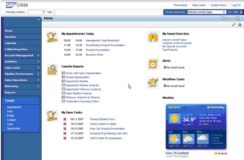
SAP CRM — Best for sales tracking
Pros
Cons
Our Rating: 4.3/5
SAP Sales Cloud might not offer the most visually appealing CRM dashboard, but it covers the most important metrics that your sales managers will want to track, including revenue by individual rep and the length of the average sales cycle over the past 12 months.
For an even more powerful dashboard experience, connect your SAP Sales Cloud with SAP Analytics Cloud (shown above) to get access to additional report styles including lead analysis, geographic sales metrics, and more. And if none of SAP’s native sales dashboards are to your liking, then you can browse third-party options on the SAP store to find the perfect one for your needs.

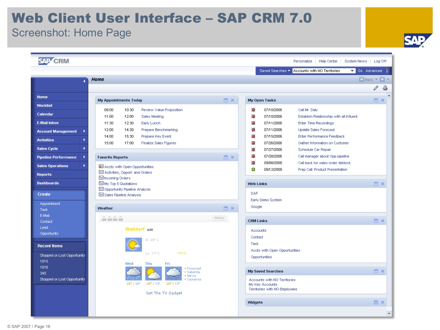
Real-time sales analytics: SAP’s sales dashboard likely offers real-time analytics, enabling sales teams to monitor performance metrics and KPIs as they change, providing up-to-the-minute insights.
Customizable reports and views: Users can probably customize their dashboard to display the most relevant data, such as sales figures, customer interactions, and pipeline status, tailored to their specific role or department.
Advanced data visualization: The dashboard likely includes advanced data visualization tools, such as graphs, charts, and heat maps, to help users quickly understand complex data sets.
Integration with sales and marketing data: SAP’s sales dashboard might offer integration with various sales and marketing tools, providing a comprehensive view of customer interactions, campaign effectiveness, and sales outcomes.
Predictive analytics and forecasting: The dashboard could include predictive analytics features, using historical data to forecast future sales trends and help in strategic planning.
Mobile accessibility and alerts: It’s likely that the dashboard is accessible on mobile devices, allowing sales teams to stay updated on key metrics on the go, and may include alert features to notify users of significant changes or milestones.
Why we chose SAP Sales Cloud
SAP Sales made a compelling case for itself. Its robust dashboard provides real-time insights into essential metrics, such as deal progress, team performance, and customer engagement. SAP Sales Cloud also stands out for its predictive analytics, which harness AI to forecast sales success and identify potential opportunities, making it a strategic tool for data-driven decision making in sales.
SAP has recently made significant strides with the introduction of the My Incentive Dashboard within SAP SuccessFactors Incentive Management. This latest release is a testament to SAP’s commitment to evolving and enhancing its offerings, particularly in the area of sales tracking and incentive management.
The My Incentive Dashboard is a standout feature, primarily due to its adoption of the Horizon Theme, which brings a fresh and modern design to the forefront. This user-friendly interface is not just about aesthetics; it’s tailored specifically for Payees, streamlining their daily tasks and responsibilities in a more intuitive and engaging manner.
One of the key improvements in this release is the streamlined navigation. SAP has made a conscious effort to declutter the user interface by eliminating the left navigation panel. Instead, essential features are now directly accessible from the Payee Portal landing page. This design choice not only simplifies the user experience but also ensures that necessary functionalities are just a click away.
The dashboard is rich with features that are crucial for Payees. It includes real-time notifications about updates related to compensation plans and important documents, ensuring that users are always in the loop. The Published Dashboards section offers actionable insights about team performance, aiding in data-driven decision-making. This is particularly useful for sales tracking, as it allows for a quick overview of team dynamics and individual performances.
Document management has also been made more efficient. Payees can now view, approve, or send documents for approval directly from the dashboard. This enhancement significantly improves the efficiency of document handling. Additionally, the dashboard facilitates easy viewing and creation of inquiries for disputes, streamlining the resolution process and making it less cumbersome for the users.
The customization of the Payee profile with personal details is another thoughtful addition. It makes the dashboard more relevant and personalized to individual needs. The dashboard provides easy access to important updates and organizational news through the Announcements feature.
Our ratings
Pricing: 3/5
General features and interface: 4.6/5
Core features: 5/5
Advanced features: 4.4/5
Integration and compatibility: 5/5
UX: 3.8/5
Monday.com — Best for simplicity
Pros
Cons
Our Rating: 4/5
Formerly known as dapulse, Monday.com has made the dashboard an integral part of the platform’s design, not just for sales but also for project management, marketing, and more. The widget-based dashboard design features simple, colorful charts that are visually appealing and present sales data in a way that is easy to understand. Widgets for the sales dashboards include qualified leads, deals won, revenue won, revenue per rep, and annual recurring revenue.
Dark mode is available not just on the dashboards but across all of Monday.com to make it easier to work in low light situations. A traditional light mode is also available for those who prefer a white background for their sales growth dashboard.
For more detailed insights, you can visit monday.com’s blog on dashboards, which provides a comprehensive overview of the features and capabilities of their sales dashboard.


Customizable workflows: Monday.com allows users to create and customize their sales workflows, enabling them to tailor the dashboard to fit their specific sales processes and needs.
Visual sales pipelines: The platform typically offers visual representations of sales pipelines, making it easier to track the progress of deals and identify bottlenecks.
Integration with other tools: Monday.com is known for its ability to integrate with a variety of other tools and platforms, which can enhance the sales dashboard’s functionality by bringing in data from multiple sources.
Real-time data tracking: The sales dashboard likely offers real-time tracking of sales activities and metrics, providing up-to-date information for decision-making.
Collaboration features: Monday.com emphasizes team collaboration, and its sales dashboard probably includes features for sharing information, assigning tasks, and communicating within the team.
Advanced reporting and analytics: The platform likely offers advanced reporting and analytics tools, enabling sales teams to generate detailed reports and gain insights into sales performance and trends.
Why we chose monday.com
Monday.com is the epitome of simplicity and efficiency when it comes to sales dashboards. Its visually engaging interface allows for easy tracking of sales pipelines, team performance, and customer relationships. The platform’s intuitive design, coupled with customizable workflows and automation capabilities, makes Monday.com a top choice for those seeking a straightforward, yet powerful, solution to manage their sales data.
The dashboard’s visual layout is both appealing and functional. The use of vibrant colors and clear, concise graphs makes it easy to track sales progress at a glance. The ability to customize these visual elements allows for a personalized experience that aligns with individual or team preferences.
On a scale of performance, I would rate monday.com highly for its user interface, customization options, and integration capabilities. However, it scores slightly lower in terms of advanced analytics compared to some of its competitors.
Monday.com has worked hard to become more than just a project management tool. Its sales dashboard reflects this growth, with enhancements in automation and integration capabilities, making it a more holistic platform for sales tracking and management.
For sales tracking, the key factors are ease of use, customization, and integration. monday.com excels in these areas, offering a streamlined experience that can adapt to different sales processes and team sizes.
The design of monday.com’s sales dashboard is centered around user experience. The drag-and-drop functionality, customizable widgets, and clear visual representations of data make it stand out in terms of design and usability. Its dashboard is best suited for teams seeking a balance between functionality and ease of use. Its intuitive design, coupled with powerful customization and integration capabilities, makes it an ideal choice for teams that prioritize a streamlined sales tracking experience.
While monday.com excels in many areas, it could improve by enhancing its analytical features to offer more in-depth insights into sales trends and patterns. Additionally, more competitive pricing options would make it more accessible to smaller businesses and startups.
Our ratings
Pricing: 3.1/5
General features and interface: 4.4/5
Core features: 5/5
Advanced features: 2.5/5
Integration and compatibility: 3.8/5
UX: 4.5/5
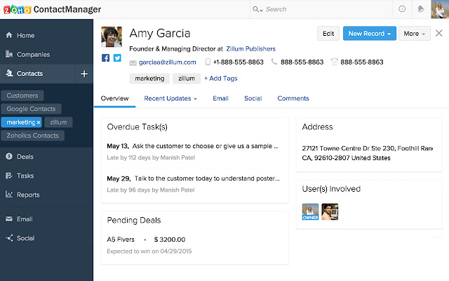
Zoho CRM — Best for integrations
Pros
Cons
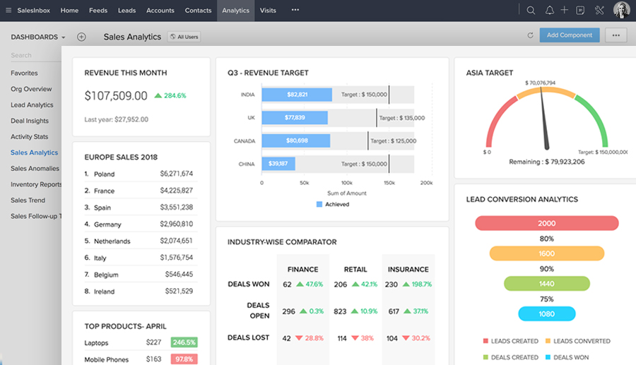
Zoho enables users to make dashboards for all sorts of functions by pulling data from other products into Zoho Analytics. Zoho CRM does offer pre-built templates for common sales metrics such as pipeline, sales by account, and campaign vs. revenue. The dashboard templates currently available are leads, accounts and contacts, cases and solutions, products, inventory, campaigns, and territory; these pre-built dashboards are public for every Zoho CRM user by default. The sales overview dashboard (pictured above) includes metrics like won deals, lost deals, conversion rate, sales pipeline, sales trend with forecast, sales target progress, and more.

Sales force automation: Zoho CRM automates critical sales operations like lead and deal management, contact and account management, ensuring streamlined sales processes.
Process management: Features like Blueprint, scoring, assignment, and escalation rules help in defining and optimizing sales and marketing processes for efficiency.
Omnichannel communication: Zoho CRM supports various communication channels including email, telephony, social media, live chat, and self-service portals for comprehensive customer engagement.
Analytics and reporting: The platform offers advanced analytics with detailed reports, charts, and KPI comparators to help businesses understand their sales performance and make data-driven decisions.
AI-powered insights: Zoho CRM integrates AI capabilities with features like predictive sales, lead and deal prediction, anomaly detection, and intelligent automation for enhanced decision-making.
Customization and integration: The CRM allows extensive customization with custom components, layouts, and views, and integrates seamlessly with Google Workspace, Office 365, and other third-party applications.
Why we chose Zoho
Zoho is best suited for businesses looking for a comprehensive, integrated CRM solution that is both powerful and user-friendly. Its ability to cater to a wide range of business needs, coupled with its affordability, makes it an excellent choice for companies seeking to enhance their sales operations.
Its a gateway to a vast ecosystem of integrations. This CRM platform seamlessly connects with over 800 applications, offering a level of versatility that is crucial for modern businesses. My analysis of these integrations reveals a system designed to enhance productivity and streamline workflows, a testament to Zoho CRM’s commitment to providing a comprehensive solution for sales teams.
The sales dashboard of Zoho CRM is intuitively designed, offering a user-friendly interface that simplifies the complexity of sales data. The dashboard provides real-time insights into sales performance, with customizable visualizations that make it easy to track key metrics. My experience navigating through this dashboard highlights its efficiency in presenting critical data at a glance, a feature that significantly aids in decision-making processes.
In evaluating Zoho CRM’s integration capabilities, several key performance areas stood out: ease of integration, range of compatible apps, and impact on sales productivity. Zoho CRM scores highly in all these categories, demonstrating its effectiveness in enhancing sales operations through integrations.
This, combined with combined with its relative affordability makes it a top contender. While other CRM platforms offer integration capabilities, Zoho CRM provides a more cost-effective solution without compromising on functionality. This balance of affordability and comprehensive features is a unique selling point in the crowded CRM market.
When compared to other leading CRM platforms, Zoho CRM strikes an impressive balance between functionality and user-friendliness. Its sales dashboard, in particular, is more intuitive than some of its competitors, making it an ideal choice for businesses seeking a straightforward yet powerful CRM solution.
The design of Zoho CRM’s sales dashboard is centered around user experience. It offers a clean, organized interface that simplifies the management of sales data, reflecting a thoughtful approach to CRM design.
Zoho CRM excels in many areas, but a more streamlined version of the platform could be beneficial for users who require a more basic CRM solution. Additionally, enhancing the customization process for niche integrations could further elevate its appeal in the market.
Our ratings
Pricing: 4.2/5
General features and interface: 4.3/5
Core features: 4.8/5
Advanced features: 4.4/5
Integration and compatibility: 5/5
UX: 4.3/5
Freshsales — Best for easy-to-read
Pros
Cons
Freshsales is the CRM offered by Freshworks, and its dashboards can be found under the sales analytics function. Freshsales provides lots of different reports for sales and marketing activities, including email campaigns, team activities, historical sales trends over time, future sales forecast, and more.
As the screenshot of the sales overview above shows, the dashboard includes contacts created over time, contacts filtered by owners, open pipeline, deals closed over time, quote vs. achievement, and more. All of the modules feature easy-to-read charts in Freshworks’ signature blue shade to provide a unified look.


Integrated workflow: Freshsales CRM offers a user-friendly system that integrates various modules, allowing for seamless workflow connectivity tailored to specific CRM requirements.
Multiple pipeline management: The CRM system supports managing multiple product or service pipelines, essential for understanding ROI and conversion scales in sales campaigns.
Scope of customization: Freshsales CRM provides dynamic information fields that can be customized according to business needs, including advanced CRM tools like territories and lead assignment.
Workflow automation: The CRM software supports advanced sales management solutions like workflow automation, allowing customization according to specific sales funnel stages and team involvement.
Email features: Freshsales CRM integrates email functionalities, including regular sync with the CRM, bulk email capabilities with templates, and shared email communication for team collaboration.
Dialing solutions: The system offers advanced dialing features like in-app dialing, auto dialing, and scheduled dialing without the need for additional hardware or software installations.
Why we chose Freshsales
Freshsales, a product of Freshworks, is renowned for its user-friendly interface, and this extends to its sales dashboard. The dashboard is designed with clarity and accessibility in mind, making it an ideal tool for sales teams who need quick, at-a-glance insights.
From my exploration and based on user feedback, the Freshsales dashboard stands out for its clean layout and intuitive design. The use of vibrant colors and clear, distinct sections makes it easy to navigate and understand. This design choice not only enhances the aesthetic appeal but also significantly improves the user experience. The dashboard effectively presents complex data in a simplified manner, ensuring that even users with minimal technical expertise can interpret the data accurately.
The platform’s uncluttered, visually appealing interface provides a clear view of critical sales metrics, from deal stages to individual team member performance. The straightforward design, coupled with its robust features, has made Freshsales an indispensable tool in any sales arsenal, enabling users to make data-driven decisions with confidence and ease.
In terms of performance, the Freshsales dashboard scores highly on ease of use and data visualization. It efficiently aggregates critical sales data, presenting it in a format that is both comprehensive and easy to digest. This aspect is particularly crucial in fast-paced sales environments where time is of the essence, and data-driven decisions need to be made swiftly.
When compared to its competitors, Freshsales distinguishes itself with its emphasis on simplicity and user-friendliness. Unlike some other CRM platforms that can be overwhelming with dense data presentation, Freshsales offers a more streamlined and focused approach. This makes it particularly suitable for small to medium-sized businesses or teams that prioritize ease of use over complex functionalities.
Over time, they have refined their dashboard, making it more responsive and tailored to sales teams’ requirements. This evolution is evident in the way the dashboard highlights key performance indicators and trends, allowing for quick analysis and action.
In my analysis, two key factors stand out for the Freshsales dashboard: design and effectiveness. The dashboard’s design maximizes readability and ease of navigation, while its effectiveness lies in how it presents essential sales data in a comprehensible format, aiding in quick decision-making.
While Freshsales excels in many areas, there is room for improvement, particularly in offering more advanced analytics capabilities. For teams that require in-depth data analysis, the dashboard could be enhanced to include more detailed analytics tools without compromising its user-friendly nature.
Our ratings
Pricing: 4.2/5
General features and interface: 3.6/5
Core features: 4.5/5
Advanced features: 2.7/5
Integration and compatibility: 3.8/5
UX: 4/5
Zendesk — Best for widget customization
Pros
Cons
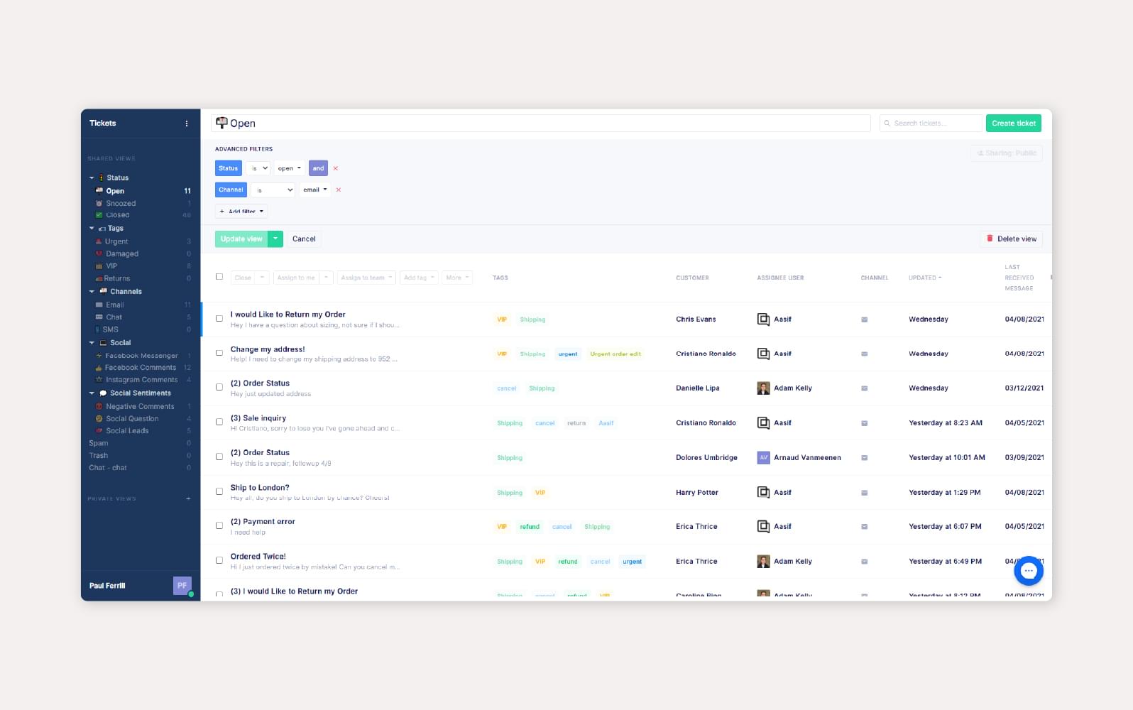
Zendesk actually offers two different kinds of sales dashboards: one directly through the CRM platform Zendesk Sell and another through the analytics platform Zendesk Explore. The basic Zendesk Sell performance dashboard (dashboard example above) includes up to 10 widgets about revenue, forecast, new deals, active deals, pipeline coverage, sales goal attainment, top deals, my smart lists, tasks, and appointments.
Meanwhile, the Zendesk Explore pre-built sales dashboard includes five tabs—deals, leads, calls, projects, and activities—each featuring a selection of different data modules that cover all the main sales metrics you would want to track.
For more detailed insights, Zendesk’s support page on this topic provides valuable information: Zendesk Support Article.
Omnichannel support: Zendesk allows businesses to manage customer interactions across multiple channels like email, chat, voice, and social media from a single interface.
Advanced analytics and reporting: Zendesk provides comprehensive analytics and reporting tools that help businesses track and analyze customer service performance.
AI-powered automation and bots: The platform includes AI-driven features like Answer Bot, which can automatically respond to customer queries, improving response times and efficiency.
Customizable customer support interface: Zendesk offers a highly customizable interface, allowing businesses to tailor the CRM to their specific needs and workflows.
Integrated knowledge base: The CRM includes an integrated knowledge base that helps customers find answers to their questions quickly, reducing the load on customer service teams.
Seamless integration with other tools: Zendesk can be integrated with a wide range of other business tools and systems, enhancing its functionality and adaptability to different business environments.
Why we chose Zendesk
Zendesk’s clean, visually engaging interface presents crucial sales data in an easily digestible format, making it simple to track sales activities, monitor team performance, and manage customer relationships. The simplicity of Zendesk Sell, combined with its powerful features, makes it an excellent choice for organizations seeking an efficient, easy-to-navigate sales dashboard solution.
Zendesk’s Sales Dashboard offers a degree of customization that, while not limitless, provides users with a reasonable level of control over their dashboard experience. According to Zendesk’s support page, while it is not possible to add entirely new, custom widgets to the Sales Dashboard, users can customize the existing set of widgets. This includes the ability to add, remove, and reorganize the layout of these widgets. Such flexibility is crucial for sales teams who need to tailor their dashboards to reflect their unique sales processes and KPIs.
From a user experience standpoint, the ability to reorganize and adjust the existing widgets on the Zendesk Sales Dashboard is straightforward and intuitive. This customization aligns well with the overall design ethos of Zendesk, which emphasizes user-friendly interfaces. However, the limitation in not being able to introduce entirely new widgets may be a point of contention for some users, especially those who require highly specialized data representations.
It’s important to note that while Zendesk offers a decent level of customization, it falls short of the complete freedom some competitors may offer. For instance, platforms that allow full widget customization provide a more granular control over dashboard analytics, which can be a significant advantage for data-driven sales teams.
Comparing this to previous iterations of Zendesk’s Sales Dashboard, the current customization options show an improvement in flexibility and user control. However, there’s still room for growth, especially in expanding the range of customizable features to include the addition of entirely new widgets.
For users prioritizing ease of use and basic customization, Zendesk’s Sales Dashboard scores well. However, for those requiring advanced customization and the ability to introduce new data widgets, this might be a limiting factor.
Our ratings
Pricing: 3.5/5
General features and interface: 4.8/5
Core features: 5/5
Advanced features: 3.3/5
Integration and compatibility: 5/5
UX: 5/5
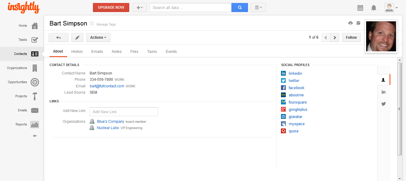
Insightly — Best for overall customization
Pros
Cons
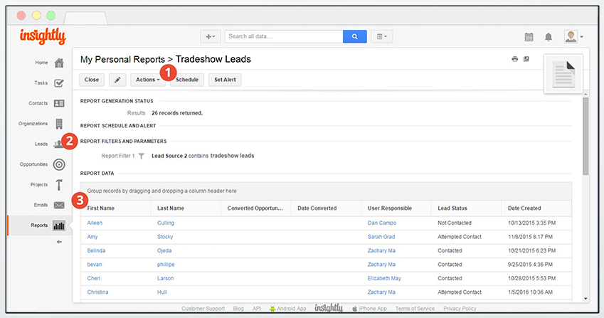
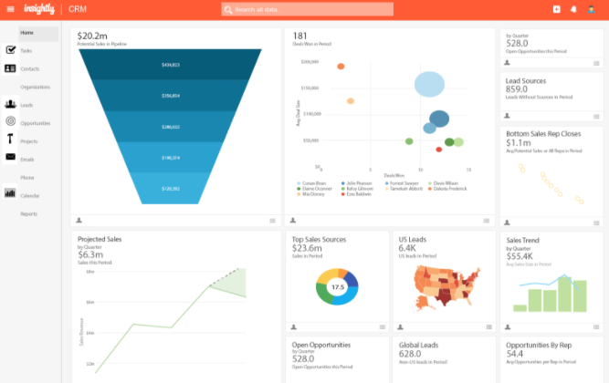
The Insightly CRM comes with standard dashboard cards, and the advanced plans have the ability to build their own customized dashboards too. There are three standard dashboards for opportunities, projects, and leads; the opportunities dashboard (pictured above) is the one that contains the most data, with a total of 10 chart “cards”.
The charts include total sales, total value by opportunity state, lost opportunities by reason, sales pipeline funnel, number of opps by state, opportunity state by value, top sales reps, win rate, sales pipeline weighted, and total sales by rep. Meanwhile, the projects and leads dashboards feature four data cards each to round out Insightly’s selection of standard dashboards.


Customizable CRM: Insightly allows extensive customization of its CRM to fit the specific needs and workflows of different businesses.
Project management integration: The platform integrates project management features, enabling users to track the progress of projects directly within the CRM.
Advanced reporting tools: Insightly offers advanced reporting capabilities, allowing businesses to generate detailed reports and analytics on their sales and customer interactions.
Workflow automation: The CRM includes workflow automation tools that help streamline and automate routine tasks, improving efficiency.
Integration with email and calendar: Insightly integrates seamlessly with popular email and calendar services, providing a unified view of customer interactions and schedules.
Mobile accessibility: Insightly provides a mobile app, ensuring that users can access their CRM data and functionalities on the go.
Why we chose Insightly CRM
Insightly stands out for its deep customization capabilities, allowing businesses to tailor the CRM to their unique processes and workflows. This flexibility is crucial for companies with specific sales strategies or those operating in niche markets. Additionally, Insightly’s integration with project management tools offers a comprehensive view of customer interactions and project statuses, enhancing the efficiency of sales teams. Its advanced reporting tools provide valuable insights, enabling businesses to make data-driven decisions. Furthermore, the ease of integrating with popular email and calendar services streamlines communication and scheduling, making Insightly a versatile choice for businesses seeking a highly customizable sales dashboard solution.
Insightly’s sales dashboard is a dynamic canvas where businesses can paint their unique operational picture. The dashboard’s customization capabilities are rooted in its ability to adapt to various business sizes and needs. Whether it’s a small startup or a large enterprise, Insightly provides a level of flexibility that allows users to tailor the dashboard to their specific requirements.
The customization extends beyond mere aesthetic changes. Users can modify the dashboard to display key performance indicators (KPIs) that are most relevant to their sales processes. This means that businesses can focus on metrics that truly matter to them, whether it’s lead conversion rates, sales cycle lengths, or customer engagement levels.
I found that Insightly’s dashboard excels in presenting data in an easily digestible format. The use of visual elements like graphs, charts, and color-coded indicators makes it simple to grasp complex data at a glance. This visual clarity is crucial for sales teams who need to make quick, data-driven decisions.
Quantitatively, Insightly’s dashboard scores high in user customization (4.5/5), data visualization (4/5), and ease of use (4/5). These scores are based on its ability to provide a personalized experience, clear data presentation, and user-friendly interface.
When compared to its competitors, Insightly is formidable in its customization capabilities. CRM platforms like Salesforce and HubSpot offer customization, but Insightly goes a step further by allowing more granular control over dashboard elements. This makes it particularly suitable for businesses that require a highly tailored approach to data management and analysis.
The major advantage of Insightly’s sales dashboard lies in its customization flexibility and intuitive design. However, it’s not without its drawbacks. New users might find the array of customization options overwhelming at first, and there’s a learning curve involved in mastering the dashboard’s full potential. Having said this, recent updates have seen enhancements in data integration capabilities and the introduction of more intuitive navigation features.
Pricing: 4.2/5
General features and interface: 3.6/5
Core features: 4.3/5
Advanced features: 2.3/5
Integration and compatibility: 4.2/5
UX: 3.8
Pipedrive — Best for deep metrics
Pros
Cons

Our Rating: 4.2/5
The Pipedrive Insights center enables you to add up to 25 metric modules (which Pipedrive calls “reports”) to a single dashboard. A sales leader can change the size of the report blocks to take up only a small portion of the dashboard, like the example pictured above, or enlarge the widget to take up the full screen.
The drag-and-drop function makes it easy to reorder the dashboard at a moment’s notice so that the most important numbers always stay above the fold. Possible metrics that you can add to the dashboard include deals started, deals lost, average value of won deals, emails sent and received, deal duration, and more.


Customizable CRM: Insightly allows extensive customization of its CRM to fit the specific needs and workflows of different businesses.
Project management integration: The platform integrates project management features, enabling users to track the progress of projects directly within the CRM.
Advanced reporting tools: Insightly offers advanced reporting capabilities, allowing businesses to generate detailed reports and analytics on their sales and customer interactions.
Workflow automation: The CRM includes workflow automation tools that help streamline and automate routine tasks, improving efficiency.
Integration with email and calendar: Insightly integrates seamlessly with popular email and calendar services, providing a unified view of customer interactions and schedules.
Mobile accessibility: Insightly provides a mobile app, ensuring that users can access their CRM data and functionalities on the go.
Why we chose Pipedrive
Pipedrive stand out for its profound focus on in-depth metrics. Its dashboard offers deep insights into the sales pipeline, tracking everything everything from deal progress to individuals rep performance. With its powerful analytics and customizable reports, Pipedrive surfaces deep, actionable insights, making it an excellent choice for businesses seeking a comprehensive understanding of their sales operations.
The dashboard’s strength lies in its ability to support sales managers in tracking team performance, identifying successful strategies, and addressing bottlenecks in real-time. This real-time tracking is crucial for agile decision-making and strategy adjustment. The forecasting feature is particularly noteworthy, offering a clear view of projected revenue, which is essential for planning sales and marketing strategies.
A key aspect of Pipedrive’s dashboard is its customization capabilities. The open API and a wide range of integrations allow for a tailored experience, ensuring that the dashboard meets the specific needs of different businesses. This flexibility is a significant advantage, especially when compared to some competitors that offer more rigid solutions.
The goals feature in Pipedrive is another highlight. It aids in setting and tracking progress towards specific objectives, enhancing focus and paving the way to success. This feature is particularly useful for teams looking to align their daily activities with broader business objectives.
Pipedrive provides a live overview of performance, goal determination, revenue forecasting, and informed decision-making. The ability to customize dashboards and reporting tools to suit specific business needs, and to share live dashboards with real-time information, adds to its appeal.
The CRM’s core measurable KPIs can be personalized based on job roles and goals. This covers a wide range of metrics like the number of deals in the pipeline, win rates, average deal size, and time to close. Such detailed metrics are invaluable for deep sales analysis and strategy development.
Pricing: 3.5/5
General features and interface: 4.3/5
Core features: 4.6/5
Advanced features: 3.5/5
Integration and compatibility: 4.8/5
UX: 4/5
Why are sales dashboards important?
Sales dashboards provide a high-level view of the most important aspects of sales performance. They allow sales managers and team members to highlight accomplishments, identify opportunities for growth, and recognize areas for improvement so they can intervene before it becomes a serious problem.
Dashboards track sales performance and help the team measure how much progress they are making towards their various goals. This provides more accountability and visibility and improves motivation across the team. These sales dashboard examples showcase titles which provide real-time data to help sales reps make evidence-based decisions quickly, without having to hunt down individual reports and documents, which saves them time and effort.
Sales dashboards also improve collaboration and communication across the organizations by providing a quick summary of sales performance that can be sent around to other teams. Sales leaderboards are easy to understand and contain only the highlights, making them more accessible to non-sales people. The data contained in these dashboards help sales leaders plan for headcount, track forecasted revenues, and more.
What should a sales dashboard include?
Sales dashboard is a broad term, and what elements are included depends a lot on the specific type of dashboard. Some of the most common types of sales dashboards include:
- Sales activity dashboard
- Sales opportunity dashboard
- Account manager dashboard
- Sales product performance dashboard
- Sales KPI dashboard
What modules and metrics you include in your sales dashboard will also vary depending on individual, team, and industry needs. For instance, a sales manager will likely want to keep an eye on overall revenue and average deal size for the year, while an individual sales representative might want to watch their personal conversion rate and monthly quota. Some common metrics to include are quota attainment, conversion/win rate, average deal size, actual revenue, forecasted revenue, sales funnel leakage, customer churn rate, sales cycle length, and more.
When considering a variety of dashboard examples, the most important sales process metrics should go above the fold (i.e. the bottom of the computer screen) so that you do not have to scroll to see them. Make sure that the modules are big enough that you can clearly see all relevant data; don’t cram in so many tiny modules that you have to zoom way in just to read the text. Experiment with different types of charts to find the one that displays the data in a way that makes sense to you and your sales managers.
Choosing the right sales dashboard
These sales dashboard examples should give you a good cross-section of what is available on the market. Whatever your specific needs or the nature of the business, there is almost undoubtedly a tool for you. From HubSpot all the way down to Zoho, the choices showcased above are among the most commonly used sales dashboards in business.
Looking for the latest in CRM solutions? Check out our CRM Software Buyer’s Guide.
Featured partners
FAQs
A sales dashboard is a tool that visualized key sales data and KPIs. It helps track perfromance, understand trends, and make data-driven decisions. Examples of metrics tracked include sales revenue, sales rep performance, and deal progress.
A sales dashboard provides real-time insights into sales operations. It enables teams to monitor and analyze their performance, identify bottlenecks, and uncover opportunities for growth. It’s a valuable tool for optimizing sales strategies and improving overall performance.