Key takeaways
- Power BI comes at a lower price point than Tableau, but scaled features and additional users will increase that price.
- Tableau is built for data analysts, while Power BI is better suited to a general audience that needs business intelligence to enhance their analytics.
- Power BI integrates seamlessly with other products in the Microsoft ecosystem, while similar integrations in Tableau might not run so smoothly.
- Tableau is quicker and more efficient when handling large datasets, and it doesn’t enforce some of the data limitations in Power BI.
The topic of Power BI vs. Tableau is a highly contested debate.
Both platforms consistently introduce new upgrades and updates meant to push the boundaries of modern business intelligence (BI) software, and the contest will likely continue for years to come.
While there is some crossover, Power BI is meant as more of an entry-level, all-purpose BI tool that’s great for concise datasets and simplified visualizations. Conversely, Tableau is better suited for senior-level data scientists and engineers who need to dive into the most complex and complicated datasets to create actionable insights for their entire team.
Check out our video overview below:
Power BI vs. Tableau: Key Differences
Ease of use
Not only does it have a highly intuitive and user-friendly interface, but it easily integrates with other Microsoft products
The drag-and-drop interface is nice, but the advanced features have a much steeper learning curve than some Tableau alternatives
Pricing
Generally more affordable for individuals and small businesses, and a free version is available
Tableau is more expensive than Power B, and its free version is more limited
Data integrations
Seamless integration with Microsoft products, but third-party support is primarily limited to the cloud
Integrates with on-premises or cloud-based data sources and many third-party apps
Use cases
Targeting a broader audience overall, Power BI is meant for beginners and mid-level data scientists, business professionals, or developers
Suited for data analysts and data scientists who work with complex datasets and need to create advanced visualizations
Visualizations
Offers various charts and dashboards but lacks the customizability of some Power BI alternatives
Generally preferred by experts due to a wide variety of chart types and a high level of customizability
Power BI: Best for ease of use
Pros
- Lower cost, especially for SMBs and startups, when compared to many Power BI alternatives
- Seamless integration with Microsoft products like Azure, SQL, and Excel
- User-friendly and designed for a general audience
- Real-time data access and intuitive drag-and-drop
- API access and pre-built dashboards for popular services
- Native apps and alerts
Cons
- Lacks some advanced analytics features when compared to Tableau and some other Power BI alternatives
- Limited visualization capabilities in the free version
- Can become more expensive with scaled features and additional users

Power BI: Best for ease of use
Overall Reviewer Score
4.3/5
Pricing
4.4/5
General features and interface
4.5/5
Core features
4.6/5
Advanced features
3.8/5
Integration and compatibility
4.4/5
UX
3.8/5
Pros
- Lower cost, especially for SMBs and startups, when compared to many Power BI alternatives
- Seamless integration with Microsoft products like Azure, SQL, and Excel
- User-friendly and designed for a general audience
- Real-time data access and intuitive drag-and-drop
- API access and pre-built dashboards for popular services
- Native apps and alerts
Cons
- Lacks some advanced analytics features when compared to Tableau and some other Power BI alternatives
- Limited visualization capabilities in the free version
- Can become more expensive with scaled features and additional users
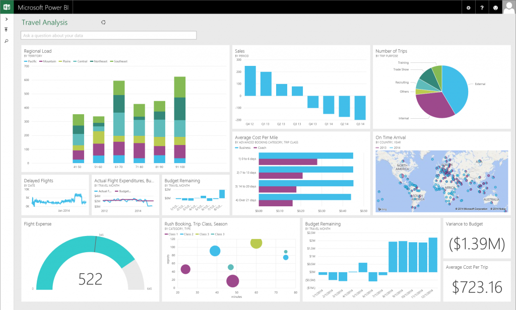
Microsoft Power BI combines software services, apps, and connectors to transform disparate data sources into coherent, visually immersive, interactive insights.
It integrates easily with Excel spreadsheets, cloud-based, and on-premises data warehouses, enabling users to connect to their data sources, visualize and discover significant insights, and share them across their organization or with anyone they choose.
The platform comprises several components, including:
- Power BI Desktop for report creation.
- Power BI service for sharing and viewing reports and dashboards online.
- Power BI Mobile apps for accessing business insights on the go.
Power BI supports a flexible and efficient workflow, spanning the gamut from data connection and report building in Power BI Desktop to publishing and sharing through the Power BI service.
- Native support for Microsoft products: Integration with Microsoft ecosystems like Azure and Office 365.
- Highly affordable pricing: Offers a strong free version and scalable premium options, especially when compared to some of the most popular Power BI alternatives.
- User-friendly interface: Easy to use with intuitive drag-and-drop functionalities.
- Focus on the most recent data: Real-time data access for up-to-date insights.
- Use default templates or customize your own: Comprehensive API access and pre-built dashboards for data sources.
- Gain actionable insights: Advanced natural language query capabilities for easy data interrogation.
Also Read: Top Tableau Alternatives For Visualizing & Analyzing Data

Tableau: Best for data visualization
Overall Reviewer Score
4.3/5
Pricing
4.2/5
General features and interface
4.3/5
Core features
5/5
Advanced features
4.5/5
Integration and compatibility
4.7/5
UX
3.3/5
Pros
- Integration with Salesforce ecosystem
- Various data source options, including Alibaba Data Lake and Google Ads
- Granular control over visualizations than many Tableau alternatives
- Massive user community and excellent customer support
- Strong performance with large data sets
- Supports R and Python
Cons
- Steeper learning curve than some of the popular Tableau alternatives
- Higher Cost
- No versioning or change management
Tableau is a visual analytics tool that simplifies data analysis and sharing insights through its intuitive drag-and-drop interface. It allows users to quickly analyze data from multiple sources without needing advanced programming skills and easily create interactive dashboards to display data trends and patterns.
While new users experience a learning curve, Tableau is often preferred among experts for its powerful data visualization features, versatile data connectivity, and ability to clean and shape data as needed. The development team is already experimenting with ways to inject next-gen artificial intelligence (AI) into Tableau, and regular updates mean that Tableau will remain a major brand in business intelligence for years to come.
Originating from a Stanford project, Tableau has grown into a leading business intelligence platform, being acquired by Salesforce in 2019.
- Geospatial analytics: Tableau enables the plotting of geographical data for deep location-based insights.
- Hyper: A fast SQL engine for real-time analytics and quick data processing, especially when compared to the current line of Tableau alternatives.
- Data management: An add-on for Tableau ensuring data accuracy and automated updates.
- Tableau Reader: A free application for interacting with shared Tableau visualizations.
- Tableau Pulse: Provides natural language search within Tableau for easy visualization creation.
- Miscellaneous features: Tableau includes cross-database join, nested sorting, and drag-and-drop integration.
Also Read: Top Power BI Alternatives & Competitors
How is Power BI different from Tableau?
Power BI uses the existing Microsoft systems like Azure, SQL, and Excel to build data visualizations that don’t break the bank. This is a great choice for those who already work within the Microsoft products like Azure, Office 365, and Excel. It’s also a fairly good low-price option for SMBs and startups that need data visualization but don’t have a lot of extra capital.
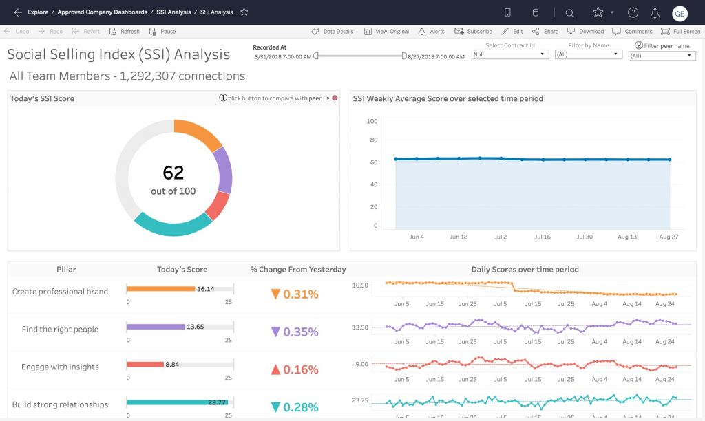
Tableau specializes in making great visualizations, but much of its advertising is focused on corporate environments with data engineers and bigger budgets. It has a public (free) version, but with limited capabilities. Essentially, the more you pay, the more you can access in Tableau. This includes benchmarked data from third parties, live data connections, etc. The software also has a non-profit tool and versions for academic settings.
How is Power BI similar to Tableau?
Power BI and Tableau share the goal of transforming data into actionable insights through advanced visualizations. Both platforms offer data analytics and have a wide range of dashboard and reporting features that cater to diverse user needs.
They are both designed to make data analysis accessible, supporting decision-making processes across various organizational levels. Each tool emphasizes user-friendly interfaces, albeit with different approaches to usability and complexity.
Also read: What is Data Visualization & Why is it Important?
Tableau vs. Power BI: Pricing
Power BI price/user/month
Tableau price/user/month
Tableau Enterprise price/user/month
Tableau+ price
Desktop: Free
Public: Free
Viewer: $35
Contact sales
Pro: $10
Viewer: $15
Explorer: $70
Premium: $20
Explorer: $42
reator: $115
Embedded: Starting at $735/month (licensed by capacity)
Creator: $75
Analysis
Power BI
Power BI offers a free version with limited capabilities, making it accessible for individuals or small teams just starting with data analytics. The Pro version at $10/user/month is aimed at professionals needing to collaborate on and share analytics within and outside their organization.
For larger enterprises, Power BI Premium offers advanced capabilities and dedicated cloud resources, with a per-user plan at $20/user/month and their Embedded plan starting at $735 per month.
Tableau
Much like Power BI, Tableau also offers a free version with limited functionality. However, their pricing is designed specifically around the common roles within an organization. Their Viewer role, priced at $15/user/month, is designed for users who only need to access and interact with dashboards and reports.
With slightly more functionality, the Explorer role, at $42/user/month, allows for more interaction and some editing capabilities within Tableau’s platform. The Creator role, at $75/user/month, is for those requiring full access to Tableau’s comprehensive suite of data prep and analytics tools. By offering a tiered pricing structure, organizations can easily manage costs based on the specific needs and roles of their team members.
Power BI vs. Tableau: Deployment options
Power BI
Power BI is accessible via its desktop app, website, smartphone, or tablet. Depending on your role and needs, you might use one or all of these methods to build and publish visualizations.
The most basic setup is an Azure tenant (which you can keep even after your trial is over) that you connect to your Power BI through an Office365 Admin interface. Although that sounds daunting, most companies who use the software will already have the framework in place to get the server running quickly.
Power BI is fairly easy to use, and you can quickly connect existing spreadsheets, data sources, and apps via built-in connections and APIs.
Tableau
Much like Power BI, Tableau is also accessible through a desktop app, website, smartphone, or tablet. Tableau lets you set up your initial instance through a free trial, which gives you full access to the parts of the tool.
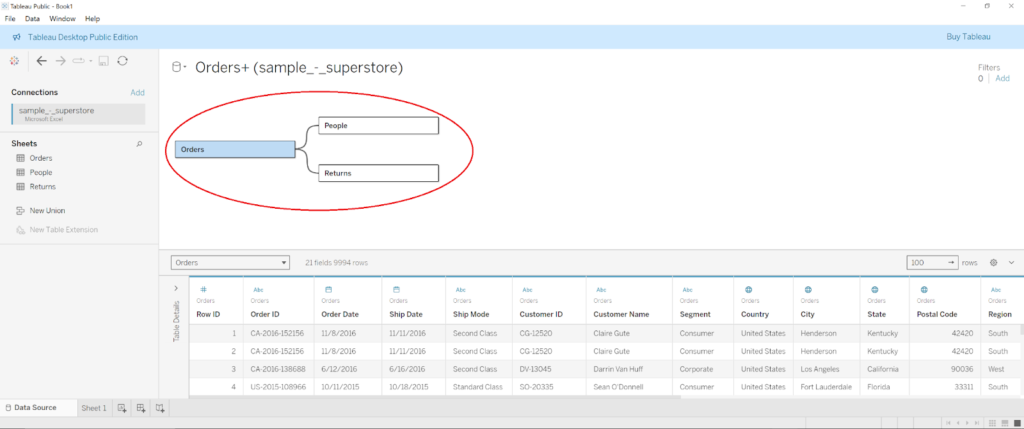
You’ll see a list of all of your available connections right on Tableau’s opening dashboard. Connect your data sources to start building a worksheet where your visualizations will live. If you’ve built your visualizations in Tableau Desktop, you can share them with your team via Tableau Server or Tableau Online.
Also read: Looker vs. Tableau: An In-Depth Data Analysis Showdown
Tableau vs. Power BI: Integrations and key connections
Power BI
Power BI has API access and pre-built dashboards for speedy insights for some of the most-used technologies out there, including Salesforce, Google Analytics, email marketing, and Microsoft products. You can also connect to services within your organization or download files to build your visualizations. Use the “Get Data” button to connect any data to Power BI, but you’ll need to go through a short authorization process in order to get fully connected.
Tableau
Tableau invested heavily in integrations with popular enterprise tools and widely-used connections. You can view all of the connections included with your account level right when you log into the tool. Tableau’s connection interface is a little more involved than Power BI, primarily because you’ll need to identify which data to pull into the tool when you make the connection. It might be helpful to understand what data you want to look at and why before you start making those connections.
Can Power BI connect to Tableau?
Some companies elect to use both Tableau and Power BI to improve their data visualizations. If that describes your company, you may want the option to examine Power BI models or datasets in Tableau. You can connect the two, although you may run into some issues if you have multi-factor authentication enabled or if a session remains idle for too long. Before attempting to connect the two, you’ll also need to make sure you have the latest versions of both platforms installed so that they can communicate correctly.
Power BI vs. Tableau: Dashboards and BI reporting
Power BI
Power BI has real-time data access and some pretty handy drag-and-drop features. The whole tool is built to speed up time to visualizations, and it gives even the most novice users access to powerful data analytics and discovery without much prior knowledge and experience.
Real-time data access means teams can react instantly to business changes fed to Power BI from the CRM, project management, sales, and financial tools. Considering that most SaaS products, especially dashboard products, are moving toward live data access, Power BI certainly has the leg up here.
Tableau
Tableau’s features are just as powerful. However, since some are hidden behind various menus, the platform is slightly less intuitive overall. Use the dashboards and reports to forecast revenue based on past customer behavior and employ calculations to transform existing data based on your requirements. Tableau gives you live query capabilities and extracts, which is particularly helpful for data analysts who are used to stopping all work for the query process.
The interface uses a drag-and-drop table view to ask questions about the data. You put your data types in the X and Y axes, and then Tableau instantly builds your visualization.
The company line is that they “keep the focus on your questions,” but it really feels like Tableau lives somewhere between query-based (and developer-dependent) data visualization and drag-and-drop. They balance it nicely, however, because, despite the UX’s somewhat cluttered appearance, Tableau is fairly easy to use, as long as you’re familiar with your data sets or willing to study.
Tableau vs. Power BI: Other BI and productivity features
Power BI
Power BI has native apps that allow users to access data from anywhere and receive alerts about changes. You can also use the “publish to web” feature to add visualizations to your blog or website directly. And don’t worry if the tool doesn’t make sense at first: there’s extensive online support with guided learning and documentation, including the Power BI YouTube channel webinars.
One of the coolest features included in Power BI is the natural language query tool. This tool is like Google for your data. You can ask questions about the data, like “How much do we invest in each customer?” or “Where do our highest-value customers live?” The tool will find answers to the questions.
Tableau
Tableau also has extensive support tools that teach you everything from setting up the software to initial data analysis. You can access and manipulate data via the mobile app, and whole teams can collaborate around shared dashboards. Tableau doesn’t have a natural language query, but when Salesforce acquired the company, the tool integrated the Einstein AI for data discovery.
Power BI vs. Tableau: Latest upgrades
Power BI
The 2025 updates for Power BI have introduced a range of new features aimed at enhancing the user experience and visualization capabilities:
- Increased Copilot support: Power BI added Microsoft Copilot, an AI-powered tool meant to improve productivity, to the iPad and Android tablet versions of Power BI. They also made the process used by Copilot to generate visual answers more transparent.
- Updated navigation: Accessing reports in OneDrive and SharePoint is now easier. Updates have been made when navigating between folders, and both folders and files can be pinned in Power BI’s file picker.
- New visualizations: Users can now generate donut charts via Donut PRO and create heat map visualizations with Heatmap. They also added the option to “Explore this data” via the visual options menu, which lets users gain deeper insights from their data.
Tableau
Released in August 2024, Tableau’s recent updates have focused on expanding its data visualization and integration capabilities while enhancing user flexibility and improving data management:
- Cloud analytics: Tableau Cloud Manager, which was unveiled in waves to its customers, makes it easier to expand and manage data within the cloud.
- Traditional reporting: Embrace a more traditional reporting style with Table Viz Extension, which lets users add grid views and detail tables to their dashboards.
- Geospatial data analysis: Track geospatial data via interactive dashboards with Spatial Parameters.
- New visualizations: Use Viz Extensions to load even more visualization types onto a Tableau worksheet Marks card. Developers can also utilize Viz Extensions to create and deliver custom visualizations.
Also read: Tableau vs. Google Data Studio
Which is better?
Power BI emerges as the more budget-friendly option, especially attractive for those already embedded within the Microsoft ecosystem. Its integration with other Microsoft products like Excel and SharePoint enhances its appeal due to the seamless connectivity and familiarity for users within that environment. The relatively low cost of the Pro version makes Power BI accessible to a wider range of users, from small businesses to large enterprises.
Although more expensive, Tableau offers superior data visualization capabilities and flexibility in handling vast amounts of data efficiently. It offers a broader range of data source integrations and an engaged community that can be a valuable resource for users. The pricing structure is designed to accommodate different types of users within an organization, from those who only need to view dashboards to those requiring full creation and analysis capabilities.
When considering Power BI visualizations vs Tableau, the latter is a clear winner—but there are other factors at play here.
According to a recent Salesforce survey, customers who chose Tableau over Power BI experienced a 33% increase in insights-driven decision-making, a 32% increase in business user productivity, and a 27% increase in IT systems flexibility. Nonetheless, Power BI is still a great choice in many different scenarios.
Making your choice
The choice between Power BI and Tableau may ultimately depend on specific business needs, budget considerations, and the required scale of data handling.
Power BI is a cost-effective, user-friendly option for those deeply integrated with Microsoft’s suite of products, making it a sensible choice for many small to medium-sized businesses. Conversely, Tableau is a powerful tool for organizations that prioritize advanced data visualization and analytics capabilities and are willing to invest more in their BI tools.
Each platform has strengths and can meet various business intelligence needs, from simple reporting to complex data analysis. Consideration of the total cost of ownership, including licensing and the potential need for premium support, will help inform the best choice for your organization’s specific requirements.