Checkout optimization focuses on removing friction at the moment that matters most: payment. Small changes in your checkout flow can unlock meaningful gains in conversion rate, revenue, and repeat purchases.
Below are proven checkout process optimization tactics you can scan, test, and roll out quickly, whether you run a single-owner Shopify store or a global marketplace.
1. Reduce checkout fields and ask only for what you need
What to do: Strip out non-essential form fields and only ask for what you absolutely must collect (for example, start with email and shipping details first). Delay optional or less critical inputs until after the sale or hide them behind “advanced options.”
Why it matters: According to the Baymard Institute’s cart abandonment research, approximately 18% of US online shoppers have left a purchase because the checkout process felt too long or complicated. Moreover, Baymard’s usability benchmark reveals the average checkout contains more than 14 form elements displayed to users, even though an effective checkout can work with as few as seven to eight fields. Reducing what users must think about can directly reduce abandonment.
2. Enable guest checkout with post-purchase account creation
What to change: Allow shoppers to complete their purchase without creating an account, then prompt them to create one after checkout using the information they already entered.
Why it matters: Baymard’s cart abandonment research shows 19% of US online shoppers have abandoned an order because the site required them to create an account. For first-time buyers, mandatory registration introduces unnecessary effort and uncertainty at the moment of payment. Providing a guest checkout option removes this barrier while still preserving the option to build customer accounts after trust has been established through a successful purchase.
Including a guest checkout option is not enough. Most online stores technically offer guest checkout, but usability issues such as poor placement, unclear labels, or low visual priority cause shoppers to miss it or assume account creation is required. Effective guest checkout implementations follow these best practices:
- Make “Checkout as Guest” the most prominent option on the account step so users immediately understand they can proceed without registering.
- Use clear, explicit language that includes the word “Guest.” Avoid vague labels that require interpretation.
- Present guest checkout as a primary button, not a secondary text link, especially on mobile devices.
- Place the guest option above sign-in and account creation to prevent users from assuming registration is mandatory.
- Avoid gating guest checkout behind an email field or account lookup, which can create confusion and hesitation.
- Ensure the guest option is visible without scrolling on mobile, where missed options are more likely to lead to abandonment.
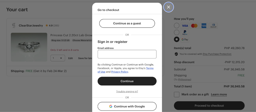
Etsy is a strong example of effective guest checkout because the option is impossible to miss. The “Continue as a guest” button appears at the top of the checkout modal, styled as a primary action and clearly separated from sign-in and registration paths. This placement removes ambiguity about whether an account is required and lets first-time buyers proceed without hesitation, while still offering login options for returning customers.
3. Add digital wallets as a payment option
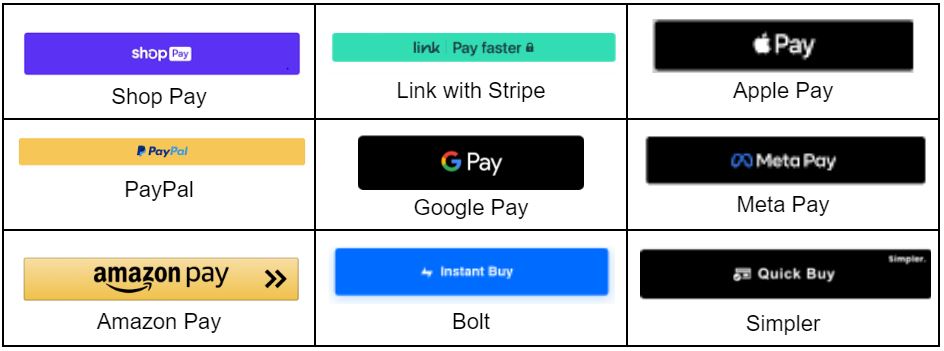
What to change: Display accelerated payment options such as Apple Pay, Google Pay, and other supported digital wallets prominently during checkout, especially on mobile devices.
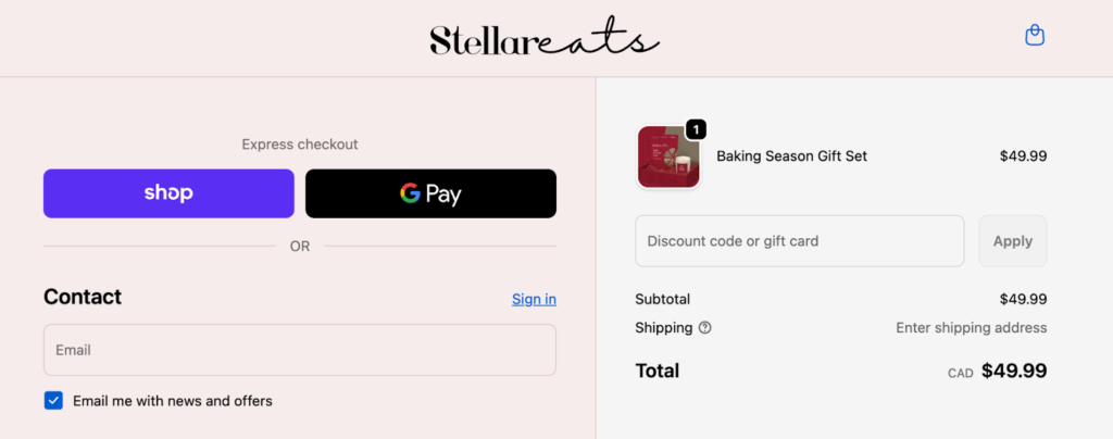
Why it matters: Baymard shows that 19% of US online shoppers abandon an order because they do not trust the site with their credit card information or because their preferred payment method is unavailable. Digital wallets address both issues at once by reducing manual data entry and shifting sensitive payment handling to trusted, device-level platforms. This is particularly impactful on mobile, where typing card details increases friction and error rates.The checkout page below is a strong example of digital wallet optimization because express payment options are surfaced immediately and given visual priority. Shop Pay and Google Pay appear at the top of the checkout flow, allowing shoppers to bypass manual form entry and complete their purchase in a few taps.
By positioning wallets before traditional email and card fields, the checkout reduces friction, especially on mobile, while still supporting standard payment paths for users who prefer them.
4. Save cards and enable one-click repeat purchases
What to change: Allow returning customers to securely save payment details through tokenization and offer one-click or low-friction repeat purchases on future checkouts.
Why it matters: Baymard research shows that returning customers expect a faster, more efficient checkout experience than first-time buyers. Requiring shoppers to repeatedly re-enter card details, billing addresses, and other payment information creates unnecessary friction and undermines loyalty.
In usability testing, Baymard consistently finds that users perceive repeat checkouts as inefficient when sites fail to recognize returning customers or streamline payment steps. Enabling saved payment methods reduces effort, shortens checkout time, and supports higher conversion rates and order values among repeat buyers.
Expert Tip
Use hosted payment fields provided by your payment processor to store tokenized card data. This approach limits your exposure to sensitive data and helps reduce PCI compliance scope while still delivering a faster checkout experience.
5. Reveal the full price early
What to change: Show shipping costs, taxes, and any additional fees directly in the cart using a shipping or tax estimator, rather than waiting until the final checkout step.
Why it matters: Baymard Institute research shows that 14% of US online shoppers abandon carts because they can’t see or calculate the total order cost upfront, underscoring the importance of showing shipping, tax, and fees before the final checkout step. When shoppers reach the final step and see a higher-than-expected total, trust erodes, and the likelihood of completion drops sharply. Surfacing the full price earlier helps set expectations, reduces frustration, and allows buyers to make informed decisions before entering checkout.
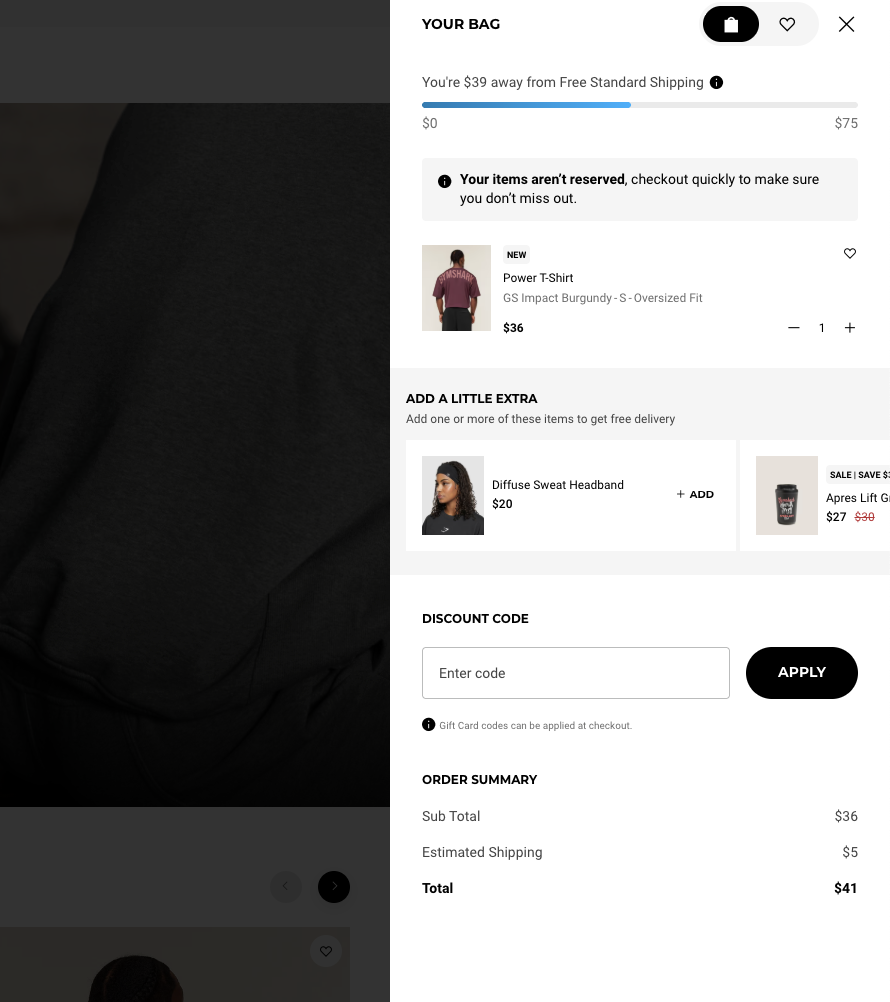
This example reinforces pricing transparency by clearly showing shoppers how close they are to free shipping and what their final cost will be before checkout. The cart displays an estimated shipping cost, a running total, and a progress bar that updates as items are added, which helps set expectations early and prevents last-step surprises.
By pairing upfront cost visibility with a free-shipping threshold indicator, the checkout reduces abandonment while encouraging higher order values through informed add-on decisions.
6. Localize payment methods by region
What to change: Offer regionally preferred payment methods, such as local wallets, bank transfers, or buy now, pay later options, based on where shoppers are located.
Why it matters: Payment preferences vary widely by country, and unfamiliar or unavailable options can create hesitation at checkout. Baymard’s checkout usability research shows that shoppers are more likely to complete purchases when they recognize and trust the payment methods offered. Supporting local payment norms helps reduce friction, improve trust, and increase completion rates in international markets.
Expert Tip
Start by enabling the top one or two preferred payment methods in each target region, then expand coverage based on demand and performance.
7. Optimize checkout for mobile and speed
What to change: Design checkout flows with a mobile-first layout, reduce page weight, and remove or defer non-essential third-party scripts that slow down load times.
Why it matters: Mobile checkouts amplify usability issues found on desktop. Small delays, excessive scripts, or crowded layouts can break momentum and increase abandonment on smaller screens. Faster, streamlined mobile experiences reduce friction and help shoppers move through checkout with fewer interruptions.
8. Use inline validation and smart defaults
What to change: Validate form fields in real time and prefill inputs such as addresses and country codes whenever possible.
Why it matters: Baymard’s checkout usability testing shows that delayed error messages and unclear validation cause frustration and slow progress. Inline validation helps shoppers correct mistakes immediately, while smart defaults reduce typing and cognitive effort. Together, these patterns make checkout feel faster and more forgiving, especially on mobile.
Expert Tip
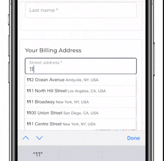
Leverage browser autofill, address lookup tools, and postal code APIs to reduce manual entry and prevent avoidable errors. The checkout example below uses address autocomplete to reduce manual entry and prevent errors. By suggesting verified addresses as users type, the form speeds up completion, improves accuracy, and minimizes frustration — especially on mobile, where typing is slower and more error-prone.
9. Show clear shipping options and a free shipping threshold
What to change: Clearly display shipping costs, delivery timelines, and progress toward free shipping directly in the cart and checkout.
Why it matters: Uncertainty around shipping remains a common cause of checkout hesitation. When shoppers understand delivery speed, cost, and how close they are to free shipping, they are less likely to abandon and more likely to add items to their cart. Free shipping thresholds also encourage higher order values by giving shoppers a concrete incentive to continue shopping rather than drop off.
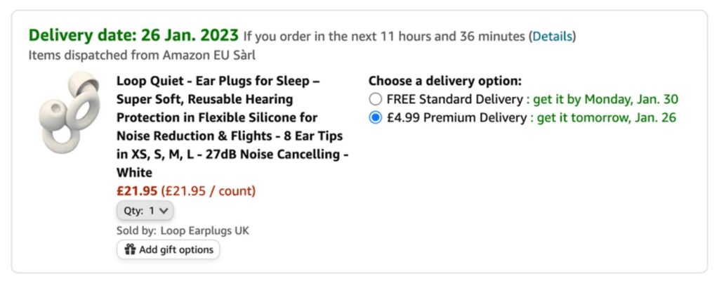
This Amazon example above shows how clear shipping options and delivery timelines set expectations early and motivate shoppers to complete their purchase.
Amazon prominently highlights the estimated delivery date alongside a countdown, reinforcing how quickly the item will arrive and appealing to the shopper’s desire for immediate fulfillment. By making speed visible and easy to understand, Amazon reduces uncertainty and keeps buyers focused on the value of fast delivery rather than second-guessing shipping details.
While most merchants can’t match Amazon’s logistics, the principle still applies: clearly communicate delivery timelines and use urgency cues, such as limited-time delivery windows or free shipping thresholds, to encourage shoppers to act before hesitation sets in.
10. Limit third-party scripts on checkout pages
What to change: Remove, defer, or restrict non-essential third-party scripts — such as marketing tags, chat widgets, and tracking pixels — during checkout.
Why it matters: Each additional script introduces potential latency, rendering delays, or failure points at the most sensitive stage of the transaction. Reducing script load improves page speed, reliability, and payment success rates, especially on mobile connections where performance issues are amplified.
Enterprise Tip
Move analytics and tracking to non-blocking or server-side collection so performance insights are preserved without slowing checkout.
11. Balance fraud prevention with customer friction
What to change: Apply step-up authentication, additional verification, or manual review only when transactions present elevated risk.
Why it matters: Aggressive fraud controls can block legitimate customers and create false declines, which directly impact revenue and customer trust. Shoppers expect checkout to be fast and predictable, and unexpected verification steps often feel punitive when risk is low. Risk-based approaches help protect revenue without sacrificing experience.
12. Add trust signals and support at checkout
What to change: Display security indicators, recognizable payment badges, clear return policies, and visible support options during checkout.
Why it matters: Checkout is the moment of highest commitment and risk perception for shoppers. Visible trust signals reassure buyers that their payment is secure and that help is available if something goes wrong. This reassurance can reduce last-step hesitation and improve completion rates, especially for first-time customers.
Here are some best practices you can implement:
- Display security indicators near payment fields, not buried in the footer. SSL indicators and secure checkout messaging are most effective when shown at the moment shoppers enter card details.
- Use recognizable payment and security logos such as Visa, Mastercard, PayPal, Apple Pay, or Visa Secure. Familiar brands signal legitimacy faster than generic security icons.
- Reinforce protection with guarantees, including money-back promises, easy returns, or satisfaction guarantees, to reduce perceived risk at the final step.
- Surface clear return and refund policies during checkout, not just on product pages. Shoppers want reassurance that they can recover if something goes wrong.
- Include verified customer reviews or ratings when possible. Social proof helps first-time buyers feel confident completing their purchase.
- Link to privacy, shipping, and support pages directly from checkout so shoppers can resolve doubts without leaving the flow.
- Avoid cluttering checkout with too many badges. Use a small, intentional set of well-known trust signals rather than overwhelming shoppers with unfamiliar logos.
- Tailor trust signals to your brand values when relevant. Certifications such as B Corp, sustainability labels, or compliance badges can reinforce credibility when aligned with customer expectations.
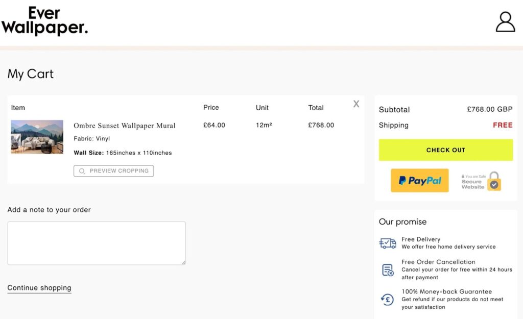
This Ever Wallpaper checkout page uses multiple trust signals to reassure shoppers at the point of payment. Secure payment badges, including PayPal and a visible “Secure Website” indicator, signal that transactions are protected. Clear pricing and a free shipping callout remove uncertainty about added costs, while the “Our promise” section reinforces buyer protection with free delivery, free order cancellation within 24 hours, and a 100% money-back guarantee.
By combining payment security, transparent policies, and post-purchase assurances in one visible area, the checkout reduces perceived risk and helps shoppers feel confident completing a high-value order.
13. Make coupons simple and transparent
What to change: Use a single, clearly labeled coupon or promo code field with immediate success and error feedback.
Why it matters: Promo codes can create friction when they are hidden, unclear, or fail silently. Shoppers who suspect a discount exists but can’t easily apply it often pause checkout or leave to search for codes, increasing abandonment risk. Clear coupon handling reduces confusion and keeps shoppers moving forward without breaking the checkout flow.
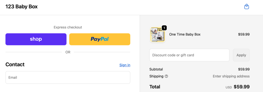
This checkout keeps promotions simple by using a single, clearly labeled coupon field that shows exactly where to enter a discount code. By avoiding hidden links or multiple promo fields, the design reduces confusion and prevents shoppers from pausing checkout to search for missing discounts.
14. Use low-friction upsells
What to change: Offer relevant add-ons as one-click options during checkout or immediately after purchase, without adding extra form steps.
Why it matters: Well-timed upsells can increase average order value without meaningfully increasing friction. When offers are simple, clearly priced, and optional, shoppers are more likely to accept them than when upsells require re-entering information or navigating away from checkout.
Expert Tip
Add a warranty, gift wrap, or premium shipping option as a single checkbox during checkout or as a post-purchase confirmation offer.
15. Measure, test, and roll out changes safely
What to change: Track step-level abandonment, payment failures, and performance metrics, then test improvements incrementally rather than all at once.
Why it matters: Checkout optimization works best when changes are validated with real data. Staged rollouts and controlled tests reduce the risk of unintended conversion losses while allowing successful improvements to scale.
Roadmap:
- 30 days: Enable guest checkout, add digital wallets, reduce form fields
- 60 days: Introduce saved payments, add a shipping estimator, optimize mobile performance
- 90+ days: Invest in platform upgrades, fraud tuning, and localized global payments
Checkout optimization timelines by business type
Checkout optimization priorities vary based on business size, sales model, and operational complexity. A small Shopify store needs fast, low-effort improvements, while an enterprise marketplace must focus on reliability, compliance, and global payments. Use the guidance below to identify which changes to prioritize, then follow the timeline in the table to plan rollouts safely.
For small ecommerce stores
Primary goal: Reduce friction and improve first-time checkout conversion.
Key actions:
- Enable guest checkout to remove sign-up barriers
- Add digital wallets for faster payment
- Show shipping estimates in the cart to set expectations early
Growing DTC brand (mid-market)
Primary goal: Increase conversion while reducing payment declines.
Key actions:
- Enable saved payment methods for returning customers
- Add free-shipping thresholds to encourage higher order values
- Use inline validation and address autofill to reduce errors
- A/B test single-page versus multi-step checkout flows
Marketplace or high-volume merchant
Primary goal: Maintain reliability, compliance, and global payment performance.
Key actions:
- Use composable checkout services for flexibility and resilience
- Apply advanced, risk-based fraud scoring
- Route payments regionally to improve authorization rates
- Monitor checkout uptime and failures in real time
B2B or large-order checkout
Primary goal: Support complex buying workflows without slowing approvals.
Key actions:
- Support purchase orders and net payment terms
- Enable multi-ship addresses for bulk orders
- Add quote-to-order workflows for negotiated pricing
Subscription businesses
Primary goal: Reduce churn caused by payment failures and billing confusion.
Key actions:
- Send pre-billing notifications before renewals
- Use retry and dunning automation to recover failed payments
- Clearly display billing schedules and renewal terms during checkout
How to choose your checkout optimization path
Start by matching your checkout priorities to your business model, not just your platform. Smaller stores benefit most from removing obvious friction and speeding up first-time purchases, while larger or more complex operations should focus on reliability, regional payments, and risk management. Use the table below to identify the path that aligns with your current scale, then work through the 30/60/90 timeline in order to avoid over-optimizing early or introducing unnecessary risk.
How to read this table:
- 30-day actions focus on quick wins that remove obvious friction.
- 60-day actions require moderate effort and testing.
- 90+ day actions typically involve platform changes, integrations, or deeper optimization
| Business type | Primary goal | 30 days (quick wins) | 60 days (medium effort) | 90+ days (platform work) |
| Small shop (Shopify/Wix) | Reduce friction and improve first-time conversion | Enable guest checkout; add digital wallets; show shipping estimates | Reduce form fields; improve mobile layout; add trust signals | Add free-shipping threshold; test post-purchase upsells; review checkout performance |
| Growing DTC brand (mid-market) | Increase conversion and reduce declines | Enable saved payments; add inline validation; simplify coupon handling | Test free-shipping thresholds; A/B test checkout layout; limit third-party scripts | Localize payment methods; tune fraud rules; implement performance monitoring |
| Marketplace / high-volume merchant | Reliability, compliance, and global payments | Audit checkout failures; improve monitoring; identify regional payment gaps | Add risk-based fraud controls; enable regional wallets or BNPL; move analytics server-side | Deploy composable checkout services; add payment failover; expand regional routing |
| B2B / large orders | Support complex purchasing workflows | Add PO numbers; clarify invoicing; improve business buyer messaging | Enable net terms; support multi-ship addresses; add saved carts | Integrate quote-to-order flows; add approval workflows; optimize account UX |
| Subscription businesses | Reduce churn from payment failures | Clarify billing cadence; send pre-billing notifications; improve failure messaging | Implement retry and dunning automation; enable saved payments; add wallet support | Enable card updaters; improve churn reporting; expand payment methods |