Learn how to create a comprehensive yet organized Gantt chart in Excel that will help track the progress of project tasks, set a timeline for completion, and more.
Key takeaways
Featured partners
A Gantt chart is a visual project management tool that maps out tasks, timelines, and dependencies in a single, easy-to-scan view. It helps teams track progress, allocate resources effectively, and stay aligned on deadlines, especially in projects with multiple moving parts.
I’ve seen Gantt charts used across industries, from software development to marketing and construction, because they make complex timelines easier to manage and communicate. Many teams rely on dedicated project management tools like Asana, Wrike, or Smartsheet to build them.
However, based on common project workflows and hands-on use, one of the most accessible and overlooked tools for creating Gantt charts is Microsoft Excel. With the right setup, Excel can handle task tracking, timelines, and basic dependencies, which makes it a practical option for teams that want a flexible solution without adopting new software.
How to create a Gantt chart in Excel: A step-by-step guide
Building a Gantt chart, whether in dedicated software or Excel, can feel complex at first, especially if you’re working with timelines, dependencies, and multiple tasks. However, my experience with Excel proved that it offers a straightforward way to create a functional Gantt chart without requiring advanced technical skills.
You only need a basic understanding of spreadsheets to get started. With the right structure and a few formatting, you can build a clear, usable chart that supports day-to-day project tracking.
The steps below outline a simple method for creating a Gantt chart in Excel. This process was completed using Microsoft Excel version 16.99.2, so some layout elements or features may vary slightly depending on your version.
Step 1: Gather project data and lay it out in a spreadsheet
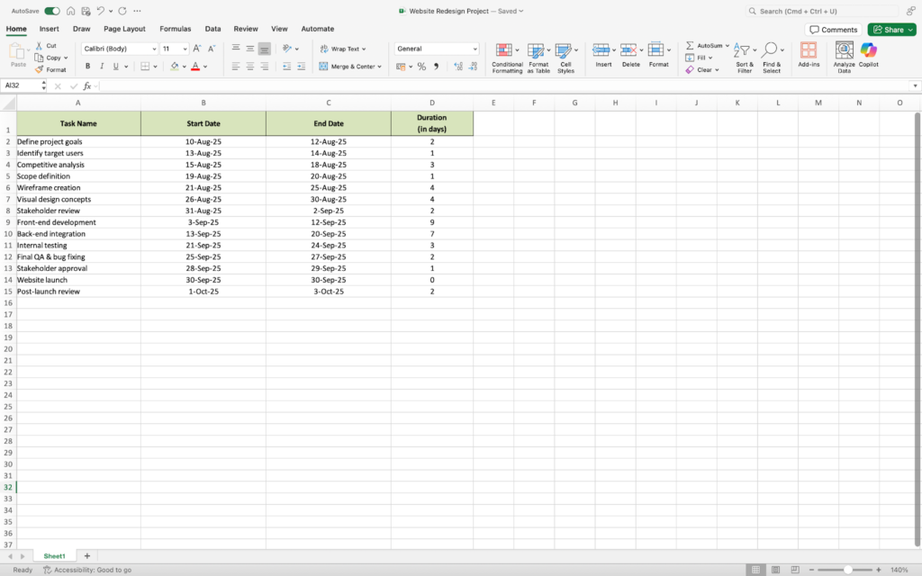
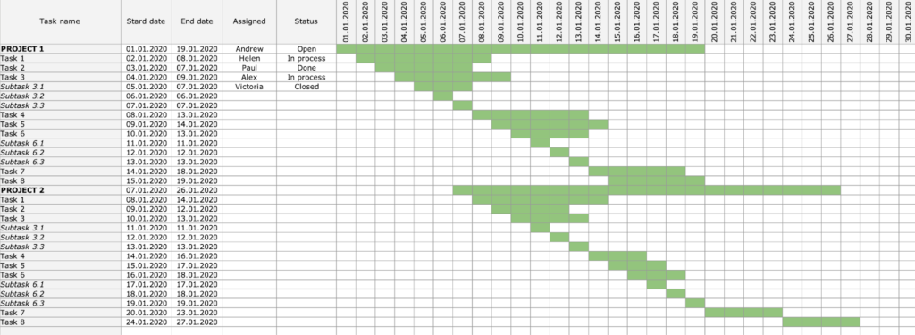
Start by organizing all the information you’ll need for your Gantt chart in a simple table. At a minimum, this should include task names, descriptions, start and end dates, and duration. You can also add task owners to clarify responsibility and improve accountability across your team.
Getting this structure right up front makes the rest of the process much smoother. In my experience, most formatting issues later on can be traced back to incomplete or inconsistent data in this first step.
For example, if you’re working on a website redesign project, your task list might be organized into phases like planning, design, development, and launch. Each phase includes specific tasks with defined timelines, as shown below.
Phase 1: Planning and discovery
| Task Name | Description | Start Date | End Date | Duration (Days) |
|---|---|---|---|---|
| Define project goals | Meet with stakeholders to set objectives | Aug 10, 2025 | Aug 12, 2025 | 3 |
| Identify target users | Define audience personas and user needs | Aug 13, 2025 | Aug 14, 2025 | 2 |
| Competitive analysis | Research competitor websites and trends | Aug 15, 2025 | Aug 18, 2025 | 4 |
| Scope definition | Finalize deliverables, timeline, and constraints | Aug 19, 2025 | Aug 20, 2025 | 2 |
Phase 2: Design
| Task Name | Description | Start Date | End Date | Duration (Days) |
|---|---|---|---|---|
| Wireframe creation | Sketch structure/layout of key pages | Aug 21, 2025 | Aug 25, 2025 | 5 |
| Visual design concepts | Create visual style and branding assets | Aug 26, 2025 | Aug 30, 2025 | 5 |
| Stakeholder review | Present and revise based on feedback | Aug 31, 2025 | Sep 2, 2025 | 3 |
Phase 3: Development
| Task Name | Description | Start Date | End Date | Duration (Days) |
|---|---|---|---|---|
| Front-end development | Code layout and visual components | Sep 3, 2025 | Sep 12, 2025 | 10 |
| Back-end integration | Connect to CMS, databases, and APIs | Sep 13, 2025 | Sep 20, 2025 | 8 |
| Internal testing | Functional testing by dev team | Sep 21, 2025 | Sep 24, 2025 | 4 |
Phase 4: Launch and review
| Task Name | Description | Start Date | End Date | Duration (Days) |
|---|---|---|---|---|
| Final QA and bug fixing | Last round of testing and issue resolution | Sep 25, 2025 | Sep 27, 2025 | 3 |
| Stakeholder approval | Final walkthrough and sign-off | Sep 28, 2025 | Sep 29, 2025 | 2 |
| Website launch | Go live with redesigned site | Sep 30, 2025 | Sep 30, 2025 | 1 |
| Post-launch review | Monitor performance, gather feedback | Oct 1, 2025 | Oct 3, 2025 | 3 |
Copy this information directly into an Excel spreadsheet to start building your Gantt chart.
Here is a sample of how it would appear in Excel.
Note that task duration can be calculated differently depending on the project, so you may choose the formula that best fits your needs. Just make sure your table includes data on how long each task takes.
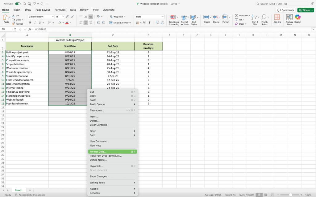
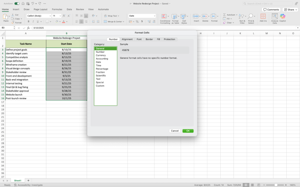
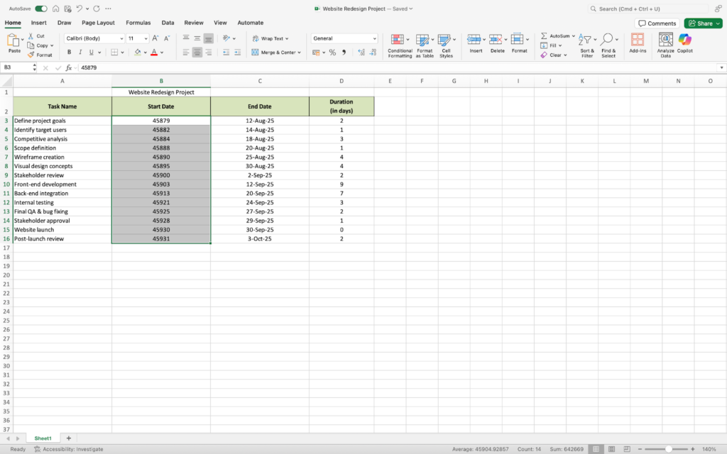
Step 2: Convert dates to general numbers
Before creating your chart, you’ll need to convert your date values into general numbers. This allows Excel to interpret the dates as numeric values, which is necessary for building the stacked bar chart correctly.
To do this, highlight the cells containing your start dates (for example, B2 through B15). Right-click and select Format Cells, then choose General from the list of number categories and click OK.
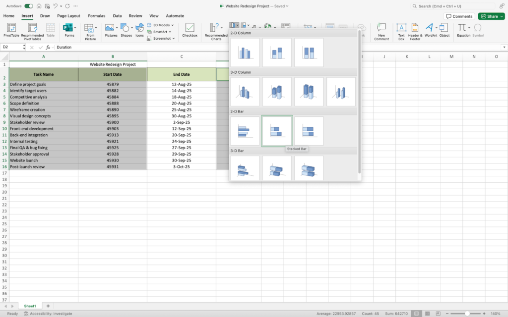
Step 3: Add a stacked bar chart
Now we can start creating a Gantt chart.
Excel offers a variety of bar chart types, but a Stacked bar chart should be used to construct a Gantt chart. This will be the substructure of your Gantt chart.
To create an Excel stacked bar chart:
- Highlight the cells with the information you want to include in your Gantt chart. (In this example, we will be including the task names, start date, and duration.)
- Select the Insert tab from the Excel menu.
- Select the 2D Bar group within the Charts group, followed by the Stacked Bar option.
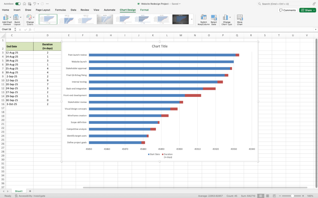
Step 4: Format the chart as a Gantt chart
A lot of numbers and text in the current Gantt chart seem off. You can easily format your chart using the customization options Excel offers.
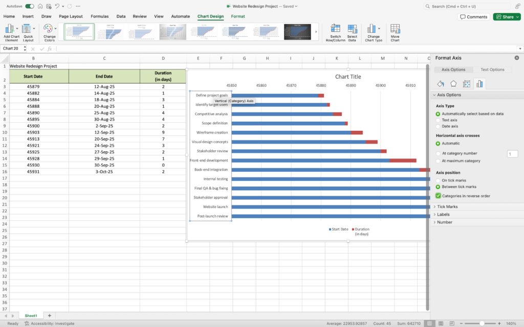
First, you might notice that the task list is in reverse order. To fix this:
- Right-click on where the task names are and the Format Axis box should appear that displays Axis Options and Text Options.
- Go to Axis Options.
- Under Axis position, check the box that says Categories in reverse order.
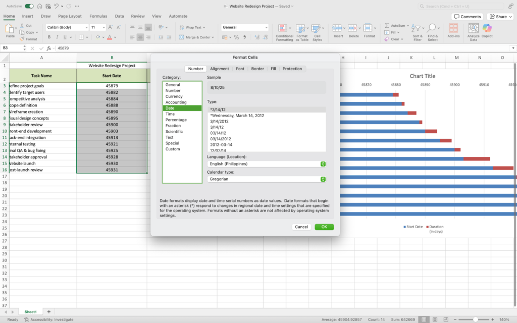
Next thing you might want to change is the date. To do this:
- Go back to your table and highlight the start dates.
- Right-click and select Format Cells.
- Revert the format back to Date from General.
This is how your chart should look now.
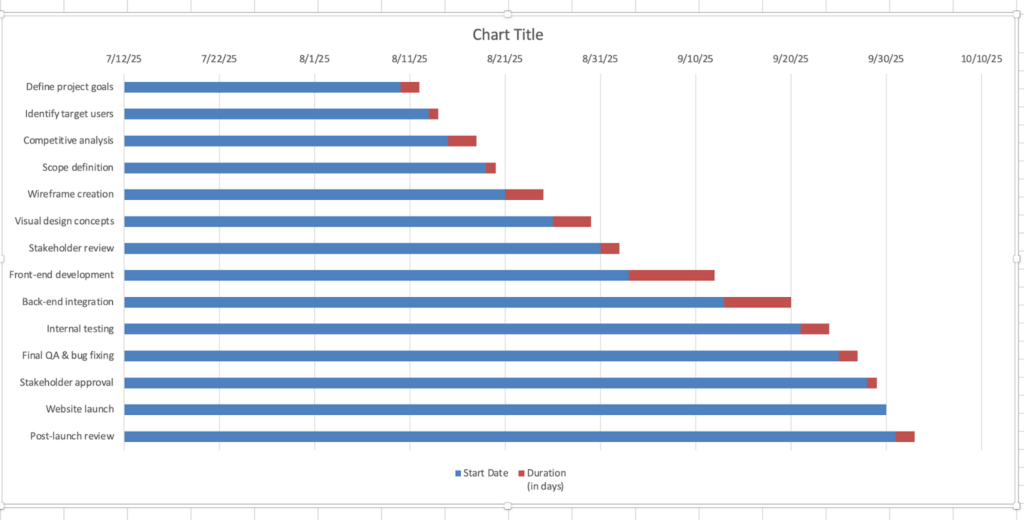
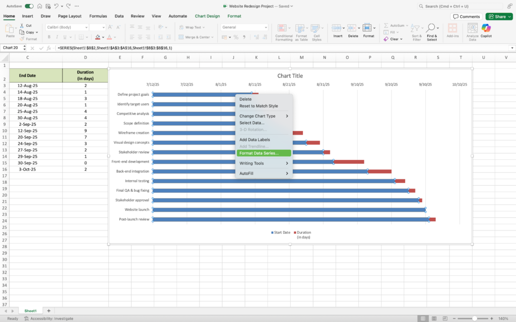
You can edit the chart further to make it look like an actual Gantt chart.
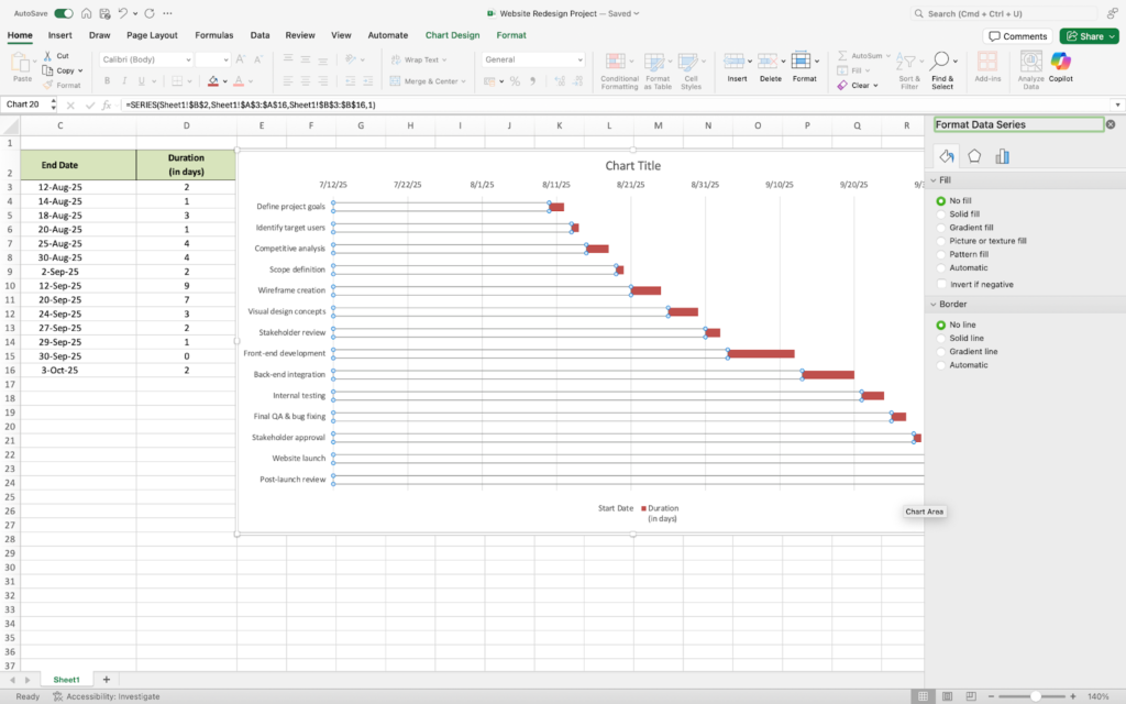
- Right-click on the blue area.
- Select Format Data Series.
- Click on the Fill icon and select No Fill and No Line.
Step 5: Polish your chart
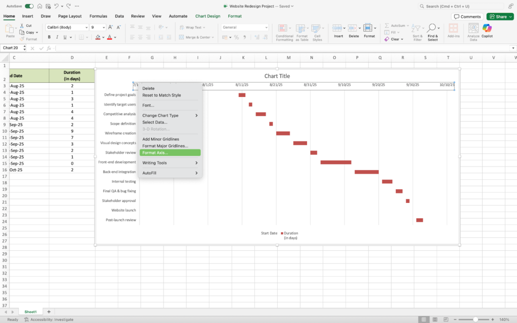
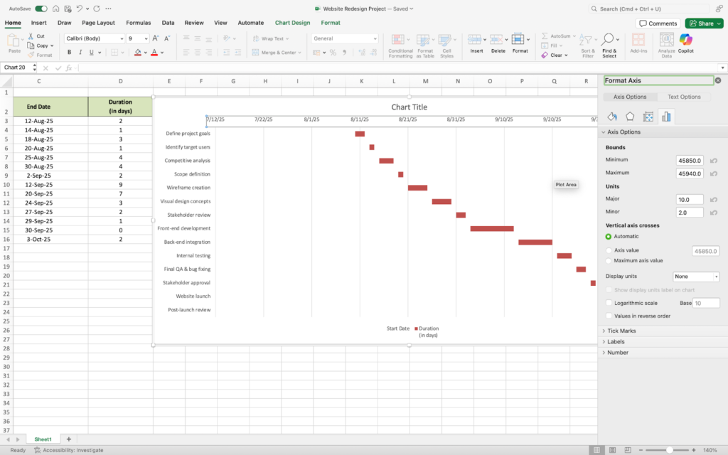
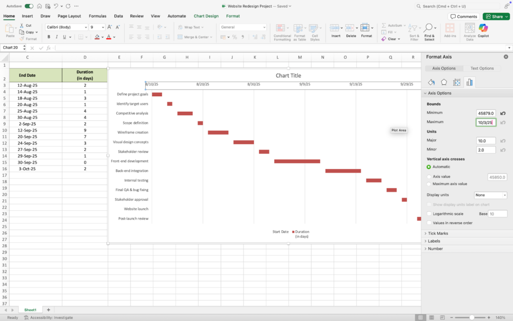
The chart we have now has dates that start in July. Our project kicks off in August, and we want our chart to reflect that. You can fix this by following these steps:
- Right-click on the dates.
- Select Format Axis. A dialogue box will pop up where you can see Text Options. You will find options for Bounds and under it is Minimum and Maximum.
- Input the start date of your project (in this case 8/10/25) as minimum and the end date (10/3/25) as maximum.

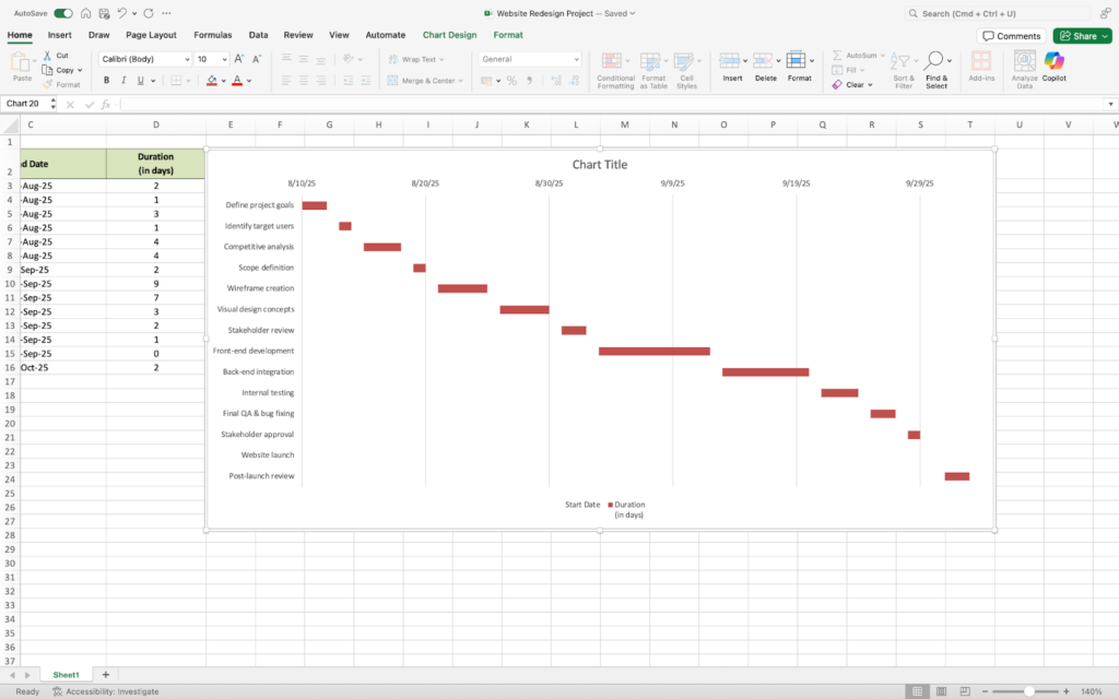
You can add finishing touches to your chart and customize it as needed, like changing the chart title and removing unnecessary labels.
Here’s what our Gantt chart looks like.
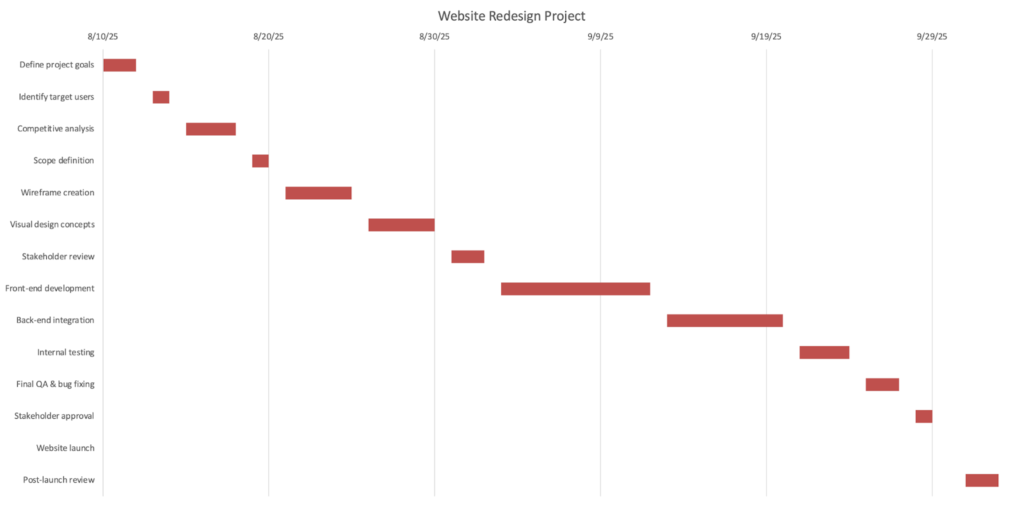
In practice, small formatting tweaks, like adjusting date bounds early or simplifying labels, make a big difference in readability. When working on larger projects, these quick refinements can save time and make your chart easier for stakeholders to understand at a glance.
Free Gantt chart templates for Excel
Creating a Gantt chart in Excel is straightforward, but using a template can give you a head start and save you even more time. Many project management tools offer free Excel Gantt chart templates you can customize for your needs.
Smartsheet
Smartsheet’s Gantt chart template for Excel is designed for simplicity. It is ideal for organizing and tracking personal projects or short-term work initiatives. Simply input your data into the chart and get an overview of your project’s timeline.

GanttPRO
[Visit GanttPRO]GanttPRO is one of the top Gantt chart software on the market. It provides ready-made templates that come with a list of pre-defined tasks and structure tailored for different industries, providing clear guidance as you customize it to fit your unique project needs.
What are the benefits of using Gantt charts in Excel
Several factors make Excel a strong choice for creating Gantt charts. Here are some of the key benefits:
- Familiar and easy to adopt: Excel is a tool that almost everyone who has used Microsoft programs is familiar with. It is a core part of the Microsoft Office suite and is one of the most widely used alongside Word and PowerPoint. Its widespread familiarity means most people can use Excel without a steep learning curve. It can be challenging, however, if you’re not used to creating charts in Excel, but the step-by-step guide above should provide basic guidance to help you get started.
- Accessible without additional cost: Using Excel doesn’t require purchasing additional software. If you have a Microsoft Office license, Excel is already installed on your device, and you have access to all its features. For short-term projects or internal initiatives, this can eliminate the need for additional tools altogether.
- Flexible and customizable: Excel allows users to customize labels, colors, and date ranges, among others, so you can match your project needs and company branding. It also has an intuitive layout that makes it easy for you to find common functions and features. For example, you can use color coding to quickly show task status (e.g., not started, in progress, complete), making updates easier to communicate.
- Offline functionality and local device support: Excel works without an internet connection. All your work stays within your local files, which you can access anytime. This is particularly useful for project teams dealing with sensitive data.
What are the limitations of using Gantt charts in Excel
While Excel offers simplicity, convenience, and cost savings for creating Gantt charts, it also comes with limitations.
- Scalability issues: Excel’s capacity for handling huge amounts of data is limited, so as the number of tasks increases, your Gantt chart can become harder to manage, read, and keep accurate. The tool may slow down in loading and performing calculations with very large datasets. It also becomes cluttered and harder to understand with too much text.
- Manual updates: While you can automate certain actions in Excel using formulas, conditional formatting, and macros, it still falls short compared to tools typically used to create a Gantt chart, like Smartsheet, Asana, or Trello. Dates, dependencies, and progress changes have to be manually updated, which can be time-consuming for larger projects. For example, shifting one task’s timeline may require updating multiple dependent tasks manually, increasing the risk of errors. Excel can be great as a starting point, but it lacks the automation purpose-built tools offer.
- Limited real-time collaboration: The lack of collaboration features in Excel makes it difficult for multiple users to make changes to the same chart simultaneously. In standalone versions, Excel relies on local storage rather than online shared documents. Even with shared files, version control can become an issue, especially when multiple stakeholders need to review or update the plan frequently. If, for example, two team members edit the same cell, Excel may overwrite one person’s changes or create duplicate versions of the file.
Frequently asked questions
Bottom line: The advantage of creating a Gantt chart in Excel
Building a Gantt chart in Excel offers a practical and efficient way to keep work moving smoothly. Excel is highly customizable and budget-friendly, with an interface that is familiar to many project management professionals. Its intuitive design lets you focus on planning rather than spending time learning software. Whether you’re the type of leader who’s tech savvy or someone less experienced with technology, Excel makes it possible for you to stay organized and keep your team aligned from start to finish.